Board 8 > Jesse Ranks User-Nominated Cover Art - The Rankings
| Topic List | |
|---|---|
|
Jesse_Custer 04/12/17 10:27:08 PM #1: |
Welcome to my cover art ranking, it's time to judge a book by its cover! Any medium is eligible for this ranking, and the nominations included covers for video games, board games, movies, albums, and more. For each cover, I assigned a score from 1 to 10 (5 being neutral) on Originality, Aesthetics, Story, and my personal opinion. I then averaged out the factors for a total score and ranked all the covers based on that score. Tie scores were broken by whichever cover got the highest Personal score from me (and there were plenty of ties).
Scores ranged from a low of 1.31 for last place to a high of 7.5 for first place. Generally, a score of 5 is average quality, and anything above 6 is pretty good. As I'm a tough grader, there were plenty of covers that scored below a 5. Covers scoring a 5 and up will start just after we enter the top 50, and the distinctly above average covers scoring at least a 6 will start shortly before we enter the top 25. I will include a full list of the nominations in my next post. Enjoy! ... Copied to Clipboard!
|
|
Jesse_Custer 04/12/17 10:32:00 PM #2: |
Snake5555555555:
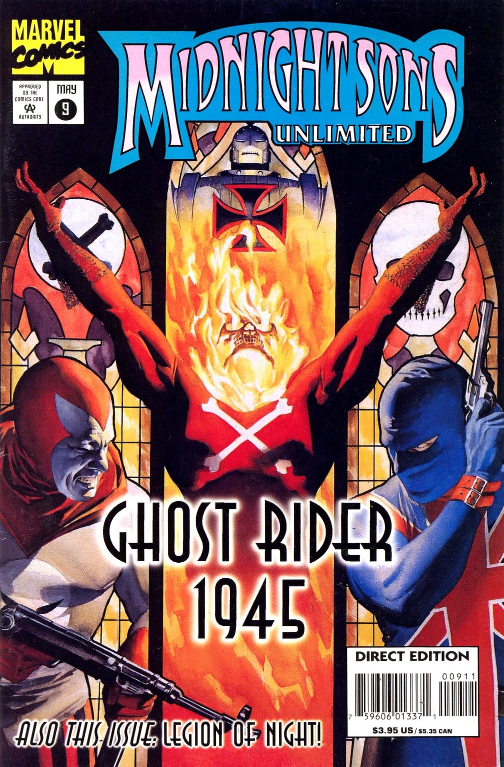
Midnight Sons Unlimited #9 https://40.media.tumblr.com/05702c3ae7df0ff9f6424dd1d26c886c/tumblr_nsu9ep8MU21udpjbao1_1280.jpg Yattering - Genocide http://www.leastworstoption.com/wp-content/uploads/cover-yattering03.jpg Punisher Vol 10 3 (Cloonan Variant) http://vignette2.wikia.nocookie.net/marveldatabase/images/a/a2/Punisher_Vol_10_3_Cloonan_Variant.jpg/revision/latest?cb=20160701092518 Exodus - Shovel Headed Kill Machine http://shop.nuclearblast.com/static/articles/100/100215.jpg/1000x1000.jpg Combat - Mission of Mayhem http://monstermangraphic.com/wp-content/uploads/photo-gallery/thumb/Combat_CDCOVER_Scott_Jackson.jpg Steiner: Baroness - Blue Record https://en.m.wikipedia.org/wiki/Blue_Record#/media/File%3ABaroness_-_Blue_Record.jpg Baroness - Yellow & Green https://en.m.wikipedia.org/wiki/Yellow_%26_Green_(Baroness_album)#/media/File%3ABaroness_-_Yellow.jpg http://cdn3.pitchfork.com/albums/17934/homepage_large.e380250b.jpg FL81: Lost Horizon - Awakening the World http://www.oncelosthorizon.com/awakeningtheworld/album_1_big.jpg Highland Glory - From the Cradle to the Brave https://upload.wikimedia.org/wikipedia/en/0/06/Highland_Glory_From_the_Cradle_to_the_Brave.png Hibria - Defying the Rules http://www.hibria.com.br/site/wp-content/uploads/2015/07/1-DTR-400x400.jpg Rhapsody of Fire - Legendary Tales https://upload.wikimedia.org/wikipedia/en/b/bb/Rhapsody_-_Legendary_Tales_Front_Cover.jpg Gundammike: Captain America Annual Vol 1 #8 http://vignette1.wikia.nocookie.net/marveldatabase/images/7/76/Captain_America_Annual_Vol_1_8.jpg/revision/latest?cb=20080530185419 Tales of the Green Hornet Vol; 2 # 3 https://d1466nnw0ex81e.cloudfront.net/n_iv/600/897793.jpg The Transformers #5 (Marvel Comics) http://www.battlegrip.com/wp-content/uploads/2014/05/transformers02.jpg Teenage Mutant Ninja Turtles #19 (Mirage Comics) https://static4.comicvine.com/uploads/scale_large/1/15317/350916-20281-127089-1-teenage-mutant-ninja.jpg Terminator: The Burning Earth trade cover https://s-media-cache-ak0.pinimg.com/originals/d2/9d/3c/d29d3cc733ef3d5078df5ab4bd96d013.jpg Anagram: Harry Potter and the Chamber of Secrets (Finnish) https://s-media-cache-ak0.pinimg.com/564x/df/94/04/df9404a1d2137eb7cb2a0580d5624cdb.jpg Action Comics #1 https://upload.wikimedia.org/wikipedia/en/5/5a/Action_Comics_1.jpg Johnbobb: God of War: Ascension http://media.ign.com/games/image/object/121/121511/GOW_Ascension_m1.jpg The Imaginarium of Doctor Parnassus http://images3.static-bluray.com/movies/covers/1 ... Copied to Clipboard!
|
|
Jesse_Custer 04/12/17 10:33:24 PM #3: |
LOLIAmAnAlt:
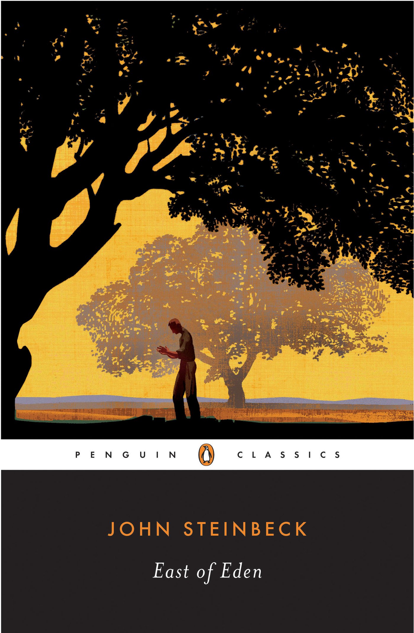
Destruction - Live Without Sense http://www.metal-archives.com/images/5/2/8/2/5282.jpg?4122 Raka_Putra: Harry Potter and the Chamber of Secrets (Indonesian) https://sgimage.detik.net.id/community/media/visual/2017/03/02/c8eb0eca-a9fd-4050-b83d-1f9ba2ad65f0.jpg?a=1 Pirates of Penzance (1983 movie) http://imagecache5d.allposters.com/watermarker/55-5583-VJ7VG00Z.jpg?ch=972&cw=618 Murphiroth: The Legend of Zelda: Breath of the Wild https://m.imgur.com/R86Qdqt?r NieR: Automata https://m.imgur.com/YtrfDEG?r Oathbringer https://m.imgur.com/kJNdyo9?r Serj Tankian - Imperfect Harmonies https://m.imgur.com/hFqPnjQ?r Skindred - Union Black https://m.imgur.com/bYkE1Kg?r NBIceman: Caligula's Horse - Bloom http://caligulashorse.com/wp-content/uploads/2015/07/BLOOM-Teaser-V1.png Iamthemorning - Lighthouse https://f4.bcbits.com/img/a2967892724_10.jpg John Steinbeck - East of Eden https://images-na.ssl-images-amazon.com/images/I/81eMMNVkt7L.jpg Mike Rutherford - Acting Very Strange http://www.progarchives.com/progressive_rock_discography_covers/834/cover_91085122010.jpg Final Fantasy XV (JP) https://gamefaqs.akamaized.net/box/9/1/4/75914_front.jpg Great_Paul: Adrenaline https://cf.geekdo-images.com/images/pic3476604_md.jpg Ashes: Rise of the Phoenixborn https://cf.geekdo-images.com/images/pic2479679.jpg The Grizzled https://cf.geekdo-images.com/images/pic3184278_md.png Warioware: Touched https://upload.wikimedia.org/wikipedia/en/3/37/WarioWare_Touched.PNG I'm Just Sitting on a Fence https://images-na.ssl-images-amazon.com/images/I/41Tic6c5khL.jpg Bane_Of_Despair: Bjork- Post http://static.stereogum.com/uploads/2015/06/Bjork-Post.jpg Kendrick Lamar- To Pimp a Butterfly http://static.highsnobiety.com/wp-content/uploads/2015/03/kendrick-lamar-album-artwork-to-pimp-a-butterfly-000.jpg Chiodos- Bone Palace Ballet http://www.equalvision.com/wp-content/uploads/2007/09/BonePalaceBallet.jpg Radiohead- Kid A https://i.scdn.co/image/9ac59bbe069572073faf9e388f3282a06b7dc071 Slaves- Through Art We Are All Equals https://thesonicsensory.files.wordpress.com/2014/07/slaves-through-art-we-are-all-equals.jpg Mastodon- Emperor of Sand https://cdn.shopify.com/s/files/1/0797/5345/products/MSTD_EOS_CD_grande.jpg?v=1485367105 scarletspeed7: Astro City #33 http://comicsalliance.com/best-dc-comics-covers-2016/#photogallery-1=11 Planetary #11 http://mlkshk.com/r/NJ1L Flash #22 http ... Copied to Clipboard!
|
|
Jesse_Custer 04/12/17 10:34:00 PM #4: |
TexWolf_1729:
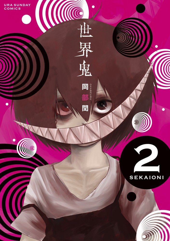
Soul Music - Terry Pratchett https://wiki.lspace.org/mediawiki/images/thumb/d/d9/Cover_Soul_Music.jpg/240px-Cover_Soul_Music.jpg Fullmetal Alchemist volume 13 http://vignette3.wikia.nocookie.net/fma/images/8/83/FMA_13.jpg/revision/latest?cb=20151008043846 Sekai Oni volume 2 https://images-na.ssl-images-amazon.com/images/I/712G%2BAGo1lL.jpg Good Night World volume 3 https://static1.comicvine.com/uploads/scale_large/6/67663/5608570-03.jpg Berserk volume 1 http://vignette4.wikia.nocookie.net/berserk/images/b/b1/Volume_1.jpg/revision/latest?cb=20131003082804 metalslug: Dead space https://gamefaqs.akamaized.net/box/5/8/0/91580_front.jpg Fatal Frame V https://gamefaqs.akamaized.net/box/1/0/9/385109_front.jpg DS2: Scholar https://gamefaqs.akamaized.net/box/2/9/8/508298_front.jpg Umineko https://static.giantbomb.com/uploads/scale_small/9/97089/2273914-main.png Salamander Portable https://gamefaqs.akamaized.net/box/8/2/7/80827_front.jpg YsF JP Box http://www.hardcoregaming101.net/ys/ysfelghanacoverwin.jpg And that's all! ... Copied to Clipboard!
|
|
Snake5555555555 04/12/17 10:34:08 PM #5: |
Tagg
--- Death or glory becomes just another story http://tinyurl.com/jqx883t - http://tinyurl.com/zqwzc9a - http://tinyurl.com/l75ybt5 ... Copied to Clipboard!
|
|
Johnbobb 04/12/17 10:34:49 PM #6: |
Snake5555555555 posted...
Tagg --- Khal Kirby, warlord of the Super Star Khalasar PSN/Steam: CheddarBBQ http://i.imgur.com/sRNNOSP.png ... Copied to Clipboard!
|
|
Bane_Of_Despair 04/12/17 10:39:37 PM #7: |
oh nice
--- Bane Lord have mercy on my soul, I've had a good run but I can't run anymore. Just put me down ... Copied to Clipboard!
|
|
NBIceman 04/12/17 10:41:31 PM #8: |
Hype.
Let's see if I managed to get last place with Acting Very Strange. --- ... Copied to Clipboard!
|
|
Jesse_Custer 04/12/17 11:03:28 PM #9: |
NBIceman posted...
Let's see if I managed to get last place with Acting Very Strange. Sorry! 75. I'm Just Sitting on a Fence - Great_Paul https://images-na.ssl-images-amazon.com/images/I/41Tic6c5khL.jpg Originality: 0.5 Aesthetic: 0.5 Story: 0.25 Personal: 4 Average: 1.31 This cover tells the gripping story of a guy just sitting on a fence. Basically, it's virtually impossible to have less of a sense of story than this. You could do a completely blank white cover and it would still have a greater Story score because it would be a statement. But this looks like a bad Yearbook photo, and Dax’s expression gives little hint of his, um, unique personality. He's got a vaguely awkward smile, but it looks like it could just be due to sun in his eyes or something, and it's not anything that rises to the level of actual personality. It also pretty much goes without saying that this isn't a creative concept for a cover. It screams cheap self-publishing, and isn't even bad in a way that makes it unique. It's also an aesthetically poor cover, down to the ugly shade of yellow chosen for the PowerPoint-like presentation, and the photograph manages to even take all color out of the sky, with the most drab surroundings imaginable. It's actually an impressive achievement to find a cover that could score so low in all three of the objective factors. But I am compelled to bump its total score up based on the Personal factor. I don't actually like anything about the cover in terms of its appearance, but it gave me a bit of a laugh not only because of how bad it is, but also because of my familiarity with a couple of his videos, which Paul introduced me to before. But it's difficult for a single picture to capture the essence of DaxFlame. ... Copied to Clipboard!
|
|
scarletspeed7 04/12/17 11:03:47 PM #10: |
Tag
--- "Reading would be your friend." ~Dave Meltzer ... Copied to Clipboard!
|
|
Drakeryn 04/12/17 11:07:35 PM #11: |
tag
--- another place and time, without a great divide, and we could be flying deadly high ... Copied to Clipboard!
|
|
Jesse_Custer 04/12/17 11:25:36 PM #12: |
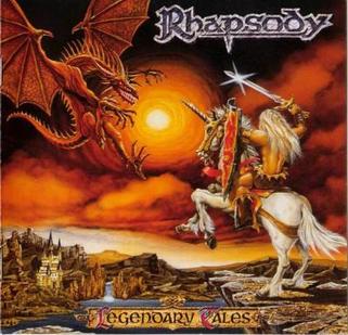
74. Rhapsody of Fire - Legendary Tales - FL81
https://upload.wikimedia.org/wikipedia/en/b/bb/Rhapsody_-_Legendary_Tales_Front_Cover.jpg Originality: 0.75 Aesthetic: 4 Story: 5 Personal: 1 Average: 2.69 This could almost pass as the cover for some generic fantasy novel, as opposed to the metal album that it actually is. Or perhaps the shirtless guy on the horse makes this seem more like the cover of a cheap romance novel. If you lose the dragon that looks like a badly drawn Ridley, maybe some lonely women would buy that book and fantasize about the warrior’s loins. And it doesn't get much more metal than that, does it? There's not much in the way of artistic talent to this picture. The coloring around the sun (that is the sun, right?) and that lighting effect on the sword are particularly amateurish. I suppose the horse and warrior look okay, but with minimal details. There's also not a ton of story going on here, but enough for a higher score in that factor as we see the warrior facing off against a dragon to protect his kingdom. I'm a bit surprised they didn't make the warrior seem more metal, cliche though that would be. As it stands, this is a bland battle scene that seems detached from the material. ... Copied to Clipboard!
|
|
scarletspeed7 04/12/17 11:27:22 PM #13: |
I think the art of the actual warrior is the worst part of it.
--- "Reading would be your friend." ~Dave Meltzer ... Copied to Clipboard!
|
|
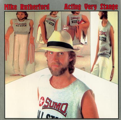
Jesse_Custer 04/12/17 11:40:14 PM #14: |
One more for tonight.
73. Mike Rutherford - Acting Very Strange - NBIceman http://www.progarchives.com/progressive_rock_discography_covers/834/cover_91085122010.jpg Originality: 6 Aesthetic: 0.25 Story: 4 Personal: 0.75 Average: 2.75 This cover wound up taking advantage of my scoring system to score higher than it probably deserved, mainly the Originality factor. I can't deny that the weird visual distortions are unique, although the overall layout and presentation is distinctly 80s and fairly generic. Also, there's at least some sense of story here with the funhouse mirror like images seeming to represent distorted aspects of the guy’s personality. I’m sure that's reading more into this image than was actually intended, but I have to give it the benefit of the doubt. Of course, just looking weird isn't that much of a story, especially when it's not presented in a thematically meaningful way. On an Aesthetic basis, this cover does much worse because it looks so dated and unappealing. It's actually a pretty boring picture in the lower half with a purely white background, and aside from the visual distortions, there's nothing worth discussing to the rest of the cover. As for the weird pictures, the one that really jumps out on the left with the long sausage fingers seems disconnected from the rest of the image. Basically the whole thing looks inexplicably bad, and I'm not sure what they were going for with this cover. ... Copied to Clipboard!
|
|
Murphiroth 04/12/17 11:44:58 PM #15: |
... Copied to Clipboard!
|
|
Great_Paul 04/13/17 12:55:30 AM #16: |
The one time I get last place when I wasn't actually trying for it xD
--- Bear Bro It's kinda coincidental how like in most games pigs are evil. ... Copied to Clipboard!
|
|
Raetsel_Lapin 04/13/17 12:56:21 AM #17: |
Tag.
--- g:\>[peacekeeping]/calculation g:\>[solution\extermination] ... Copied to Clipboard!
|
|
Jesse_Custer 04/13/17 8:56:25 AM #18: |
72. Soul Music - Terry Pratchett - TexWolf_1729
https://wiki.lspace.org/mediawiki/images/thumb/d/d9/Cover_Soul_Music.jpg/240px-Cover_Soul_Music.jpg Originality: 4.75 Aesthetic: 1.75 Story: 4.25 Personal: 0.75 Average: 2.875 I found this artwork so messy that I had some difficulty even understanding what I was looking at. It appears to be a skeleton riding a motorcycle through the sky with an electric guitar on his bike, which seems like it would make for the ultimate metal cover if this was an album instead of a book (and making me think metal is pretty much always going to hurt my personal score). But despite having what I consider very amateurish artwork, the cover isn't exactly ugly either, so the Aesthetic factor isn't as low as it could be. Perhaps I'm stretching to find some story here, but the inclusion of the guitar in what seems to be a music themed book (given the title) at least suggests something more interesting than a wannabe Ghost Rider. Perhaps it's some blend of fantasy and rock culture. It's not much of a story, but it's a hint of a story. Still, it just looks sloppy. ... Copied to Clipboard!
|
|
Johnbobb 04/13/17 8:58:35 AM #19: |
That cover strikes me as a bad Bat Out of Hell knockoff
--- Khal Kirby, warlord of the Super Star Khalasar PSN/Steam: CheddarBBQ http://i.imgur.com/sRNNOSP.png ... Copied to Clipboard!
|
|
Gatarix 04/13/17 10:48:13 AM #20: |
tag
--- You put your RESOLVE HAT back on, which conveniently is the same hat as your NORMAL HAT. {Drakeryn} ... Copied to Clipboard!
|
|
Gundammike 04/13/17 6:11:30 PM #21: |
Tag
--- You will respect the power of a Newtype Super Saiya-jin Jedi Master!" ... Copied to Clipboard!
|
|
Jesse_Custer 04/13/17 6:16:03 PM #22: |
71. Destruction - Live Without Sense - LOLIAmAnAlt
http://www.metal-archives.com/images/5/2/8/2/5282.jpg?4122 Originality: 5 Aesthetic: 1.25 Story: 5.5 Personal: 0.25 Average: 3.0 I can't think of anything I actually liked about this cover. Not sure how else to describe it than a fat guy with Martin Scorsese eyebrows and poor dental care using strings to control what looks like lights (I can't even tell with certainty if they're lights because the image is so poorly cropped). I guess he's supposed to be some kind of sinister puppet master, but he just looks like some drooling guy with brain damage. And I don't even know where to begin with that pathetic excuses for fingers, so I won't even try. It's hardly the worst artwork I've seen, but it's really amateurish. There's some sense of story, but it's not clear enough for a higher score. Puppet strings can be an effective metaphor, but typically they are used to control, well, puppets, not just some mechanical equipment that would already be off stage. It just doesn't make much sense. To sum up this cover, I'll leave it to esteemed critic Jay Sherman:  ... Copied to Clipboard!
|
|
Jesse_Custer 04/13/17 6:36:00 PM #23: |
70. Berserk volume 1 - TexWolf_1729
http://vignette4.wikia.nocookie.net/berserk/images/b/b1/Volume_1.jpg/revision/latest?cb=20131003082804 Originality: 2.5 Aesthetic: 3.5 Story: 2.25 Personal: 4 Average: 3.06 This cover suffers from being highly generic, looking like so many other covers with a badass hero in a badass position with plenty of badass weapons. Basically, this cover really wants you to know this guy is a badass and there's not much more to it than that. It's all empty calories with no substance. And it would be easier to get away with that if the artwork was at least more impressive, but it looks kind of incomplete and rushed, particularly the attempt to create a lighting effect on the arms. The only reason the Story score didn't come in even lower is there's the slightest hint of something more interesting in the way that cape-like outfit transforms into a dark blue background behind the character, suggesting there's some complexity to the heavily armed tough guy. But I could just be reaching to find something to talk about here. Yawn. ... Copied to Clipboard!
|
|
Bane_Of_Despair 04/13/17 6:46:48 PM #24: |
oh damn I forgot that was the cover for vol 1
If it was a cover with his berserker armor I bet it would have done a bit better. I do quite like me some Berserk in general though. --- Bane Lord have mercy on my soul, I've had a good run but I can't run anymore. Just put me down ... Copied to Clipboard!
|
|
Jesse_Custer 04/14/17 9:06:21 AM #25: |
69. Dead space - metalslug
https://gamefaqs.akamaized.net/box/5/8/0/91580_front.jpg Originality: 5.25 Aesthetic: 2.75 Story: 4.75 Personal: 0.25 Average: 3.25 It's safe to say I disliked this cover. I've spent more time than I cared to trying to figure out what I'm even looking at, and as near as I can tell, it's just a hand and some of an arm. The art isn't good enough for me to understand what's going on in the background, and way too much of this image is just blackness. The only reason I didn't go even lower with the Aesthetic score is a competent drawing of the hand and some details of the armor on the arm. I guess it looks unique enough to warrant a slightly above average score on the Originality factor. It seems like it's probably a generic survival horror game, but bonus points for showing the aftermath of some horrific attack instead of the zombies themselves. And there's some semblance of a story here that a disaster has happened, but there's just not enough going on here to score higher. ... Copied to Clipboard!
|
|
Snake5555555555 04/14/17 11:20:37 AM #26: |
I really like how the Dead Space cover shows the dismemberment aspect of the gameplay with the severed arm.
I'm a sucker for space horror though. --- Death or glory becomes just another story http://tinyurl.com/jqx883t - http://tinyurl.com/zqwzc9a - http://tinyurl.com/l75ybt5 ... Copied to Clipboard!
|
|
Jesse_Custer 04/14/17 8:35:11 PM #27: |
68. Teenage Mutant Ninja Turtles #19 (Mirage Comics) - Gundammike
https://static4.comicvine.com/uploads/scale_large/1/15317/350916-20281-127089-1-teenage-mutant-ninja.jpg Originality: 5.75 Aesthetic: 0.5 Story: 5.5 Personal: 1.5 Average: 3.31 If you're the kind of person who thinks there's too much action in Ninja Turtles storylines and have always wanted to see one of the turtles just lying around looking hung over, then this is the cover you've been waiting for! Apparently, this is an actual moment from the issue involving … spoiler alert … prepare yourself for this … Worse than the concept, however, is some of the most abysmal artwork I think I've ever seen on a comic cover. That mouth, just zoom in on that wide open turtle mouth, it looks so ugly. The pose is awkward, the attempt to draw body features such as an elbow joint failed so badly that body parts look out of proportion with each other, and it’s not even clear what that shit over his eyes and part of his body is supposed to be, rags, a paper grocery bag? I really can't tell, but it looks awful. Of course, if the goal was simply to get someone’s attention to pick up the comic and flip through it to see what's going on, then perhaps it accomplishes that. ... Copied to Clipboard!
|
|
Jesse_Custer 04/15/17 9:46:01 AM #28: |
67. Salamander Portable - metalslug
https://gamefaqs.akamaized.net/box/8/2/7/80827_front.jpg Originality: 5.5 Aesthetic: 5 Story: 2.5 Personal: 0.5 Average: 3.375 What exactly is the story here? There's an angry looking snake-like creature, but all it really conveys is that it's about to attack. And we have no context to know who it's going to attack or that makes it more than, say, a generic monster in a Final Fantasy game. Despite how derivative that creature is, the Originality score was benefitted by the varied colors in the background. But on an Aesthetic level, the colors seem to clash, I can't tell what that bright yellow area is supposed to be (part of the creature’s body?), and while the monster looks good, it's also not what I consider an attractive image. So despite some nice details, I'd say that comes out to an average Aesthetic score. Lastly, my low Personal score is a gut reaction. There were a few covers on the list I just didn't like looking at and this was one of them. ... Copied to Clipboard!
|
|
Simoun 04/16/17 5:41:03 AM #29: |
tag
--- It's not so cliche anymore when it's happening to you. ... Copied to Clipboard!
|
|
Jesse_Custer 04/16/17 9:30:27 AM #30: |
66. Gorillaz - Humanz - Johnbobb
https://cdn.shopify.com/s/files/1/0105/4542/products/humanz_1200x.jpg?v=1490721569 Originality: 3.25 Aesthetic: 4.5 Story: 1.25 Personal: 4.5 Average: 3.375 This is the first one that probably seems kind of weird to see ranked so low. I truly hated to have to rank anything Gorillaz-related so low, and while I didn't care for this cover personally, I still liked it a lot more than some of the other covers that placed higher. But putting aside any knowledge of the band and just looking at this cover in isolation, it's really bland and dull. The Brady Bunch presentation of each member of the band’s face separated by squares is hardly a novel concept. The only thing that makes it more unique is the appearance of the characters themselves, but even their usually strong personalities barely come through in these lifeless stills. They did this concept with a more interesting and unique presentation on the cover art for the Please single by U2 (it was only a matter of time until I squeezed in a reference to them): https://en.m.wikipedia.org/wiki/Please_(U2_song)#/media/File%3AU2please.jpg The artwork is also disappointing here, which is kind of inexplicable for a band whose cartoon characters have played such an integral role and who look great in all the music videos. They almost look like they're falling asleep, as if bored by the cover they're on. I'm honestly surprised that this is the official cover art, should be a good album though! ... Copied to Clipboard!
|
|
Johnbobb 04/16/17 12:33:47 PM #31: |
I think the best thing about the Humanz cover is how it plays off of the evolution of the band over the last decade. Compared to Demon Days:
https://upload.wikimedia.org/wikipedia/en/d/df/Gorillaz_Demon_Days.PNG https://upload.wikimedia.org/wikipedia/en/a/a6/HumanzGorillaz.png I know the history there can't be taken into account for fairness, but it's definitely cool. --- Khal Kirby, warlord of the Super Star Khalasar PSN/Steam: CheddarBBQ http://i.imgur.com/sRNNOSP.png ... Copied to Clipboard!
|
|
Jesse_Custer 04/16/17 2:56:14 PM #32: |
I actually forgot about the parallel to the Demon Days cover. I know they're a similar concept, but I prefer the one for Demon Days.
... Copied to Clipboard!
|
|
scarletspeed7 04/16/17 3:37:30 PM #33: |
I don't know why, but that last cover reminds me of really bad CGI animation in an early 2000s animated film. Can't put my finger on which one.
--- "Reading would be your friend." ~Dave Meltzer ... Copied to Clipboard!
|
|
Bane_Of_Despair 04/16/17 3:39:14 PM #34: |
I dunno I'm actually quite alright with Humanz cover, especially Noodle and Murdoc
--- Bane Lord have mercy on my soul, I've had a good run but I can't run anymore. Just put me down ... Copied to Clipboard!
|
|
Jesse_Custer 04/16/17 10:13:27 PM #35: |
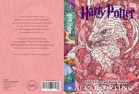
65. Harry Potter and the Chamber of Secrets (Finnish) - Anagram
https://s-media-cache-ak0.pinimg.com/564x/df/94/04/df9404a1d2137eb7cb2a0580d5624cdb.jpg Originality: 6 Aesthetic: 1 Story: 5.75 Personal: 1 Average: 3.44 Apparently this is a thing. This one had to have been nominated as a joke, and it's only by taking advantage of my scoring system that it didn't place lower. Anyway, it looks like there are a bunch of these ridiculous covers with characters having Pinocchio length noses, such as this one, which might be the worst: https://s-media-cache-ak0.pinimg.com/564x/ae/58/fd/ae58fd25968ee5592ccf498f9b79386c.jpg It's difficult to tell what they were going for with this art style, which is admittedly rather unique, but even if it was intended as child-friendly, it doesn't look right. Beyond the needlessly exaggerated facial features, the faces look grotesque, particularly those two (I assume human) creatures to the left, which look like a male and female version of the same exact character. The girl’s face is amateurish, and Harry Potter is barely recognizable as Harry Potter. And that's not even getting started on that freak show whose dental bills must be astronomical. The coloring is also really weird, and it almost looks like they forgot to color in parts of the picture like the legs of that guy on the left. I do feel like there's some aspect of story here, as that deranged looking woman seems to smile for a picture displaying a Harry Potter book while clutching a surprised Harry. I'm not sure whether they're trying to say that Harry Potter books somehow exist in the same universe as the characters, but it still feels like a story. ... Copied to Clipboard!
|
|
Raka_Putra 04/16/17 10:29:22 PM #36: |
Oh yeah, tag! I forgot to nominate more but I'm excited nonetheless.
--- Fuhlt nicht durch dich Sarastro Todesschmerzen, So bist du meine Tochter nimmermehr-- eeeeeeeeeeeeeeehr. ... Copied to Clipboard!
|
|
Jesse_Custer 04/17/17 12:21:33 AM #37: |
64. Combat - Mission of Mayhem - Snake5555555555
http://monstermangraphic.com/wp-content/uploads/photo-gallery/thumb/Combat_CDCOVER_Scott_Jackson.jpg Originality: 4.5 Aesthetic: 4.5 Story: 4.25 Personal: 0.5 Average: 3.44 There's really not much to say about this cover, it's some monsters brandishing weapons, apparently on a “mission of mayhem.” Ruthless monsters attacking isn't much of a story, nor is it something I consider an original or interesting concept on its own. There are some hints of civilization laid to ruins in the background such as a tilting power line, but far too little to read into for a deeper story. It actually looks more like the cover for some survival horror game than it does an album cover, but either way, it does nothing to intrigue me to check out what it's intended to promote. Honestly I can't think of anything else to comment on for this one. ... Copied to Clipboard!
|
|
Snake5555555555 04/17/17 2:58:04 AM #38: |
Figured it would drop first, I know it's not the best but I kinda like the monster designs.
--- Death or glory becomes just another story http://tinyurl.com/jqx883t - http://tinyurl.com/zqwzc9a - http://tinyurl.com/l75ybt5 ... Copied to Clipboard!
|
|
LOLIAmAnAlt 04/17/17 3:07:07 AM #39: |
Jesse_Custer posted...
71. Destruction - Live Without Sense - LOLIAmAnAlt Fun fact, I used to work with a guy who looked exactly like that dude Eyebrows, bald head, eyes, teeth, chin, huge size. He has even made that face I found this picture after he had left the company It was weird man. --- lllllllllllllllllllllllllllllllllllllllllllllllllllllllllllllllllllllllllllllll lllllllllllllllllllllllllllllllllllllllllllllllllllllllllllllllllllllllllllllll ... Copied to Clipboard!
|
|
LOLIAmAnAlt 04/17/17 3:08:11 AM #40: |
and I am also kicking myself for forgetting to nominate more.
I have some really bad ones in mind right now. --- lllllllllllllllllllllllllllllllllllllllllllllllllllllllllllllllllllllllllllllll lllllllllllllllllllllllllllllllllllllllllllllllllllllllllllllllllllllllllllllll ... Copied to Clipboard!
|
|
Jesse_Custer 04/17/17 11:29:06 AM #41: |
63. Warioware: Touched - Great_Paul
https://upload.wikimedia.org/wikipedia/en/3/37/WarioWare_Touched.PNG Originality: 5.5 Aesthetic: 3.5 Story: 1 Personal: 4.25 Average: 3.56 What's the story you can take away here? Someone using a stylus pen to tug on a mustache? That may be showing off a game feature, but it's not a story. At most, the image gives some hints into the ornery nature of Wario’s personality, but even that barely comes through with a partial depiction of his face. The artwork is also lacking, with overly simplistic lines to show movement of the stylus pen, ugly background coloring, and scribble around the border that looks like it was drawn by someone’s cat holding the stylus pen. I'm sure the border was an intentional design choice, but that doesn't make it a good one, and there's not enough of Wario to make this cover work. The one saving grace of this cover is it is somewhat novel in presentation given the decision to show only some of Wario’s features without an actual face. No doubt this was intended to accentuate his personality, although I think they could have done a better job with that. ... Copied to Clipboard!
|
|
Jesse_Custer 04/17/17 5:42:00 PM #42: |
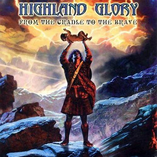
62. Highland Glory - From the Cradle to the Brave - FL81
https://upload.wikimedia.org/wikipedia/en/0/06/Highland_Glory_From_the_Cradle_to_the_Brave.png Originality: 3.75 Aesthetic: 4.75 Story: 5.75 Personal: 0.5 Average: 3.69 What is this, The Lion King meets Braveheart? As odd a scene as it is, there's still something cliche about it all, from the pose to the Biblical setting in the background. The overall presentation also looks lazily drawn, and the character in the center doesn't mesh well with the background. About the only thing I can say for this cover is it has some sense of story as we see the lightning in the sky surrounding the baby held up by the stupid kilt-wearing guy. It's not much of a story, but it's enough to keep this cover from placing any lower. I simply don't care about this cover enough to try to come up with anything else to say about it. ... Copied to Clipboard!
|
|
Jesse_Custer 04/17/17 9:00:02 PM #43: |
61. Hibria - Defying the Rules - FL81
http://www.hibria.com.br/site/wp-content/uploads/2015/07/1-DTR-400x400.jpg Originality: 1 Aesthetic: 4.5 Story: 5.25 Personal: 4.5 Average: 3.81 This looks like an ad for some mediocre video game from the NES era. Only you, the baddest dude, can defeat the ninja clan and save the city. That's kind of a story, but this scene is so generic and cliche that it's almost difficult to believe someone over the age of 13 wasted any time drawing it. In fact, I'm pretty sure only a 13 year old would bother to draw a ninja on a motorcycle wielding a morning star. It's a competent drawing, much better than I could do, but the hero’s face looks kind of goofy, and the ruined city in the background seems rushed. The best thing about it is the lighting effects from the bike headlights and the sense of motion around the wheels. But it's still tough to take seriously. ... Copied to Clipboard!
|
|
scarletspeed7 04/17/17 9:04:18 PM #44: |
The perspective on that one is really weird, too.
--- "Reading would be your friend." ~Dave Meltzer ... Copied to Clipboard!
|
|
Jesse_Custer 04/18/17 8:35:02 AM #45: |
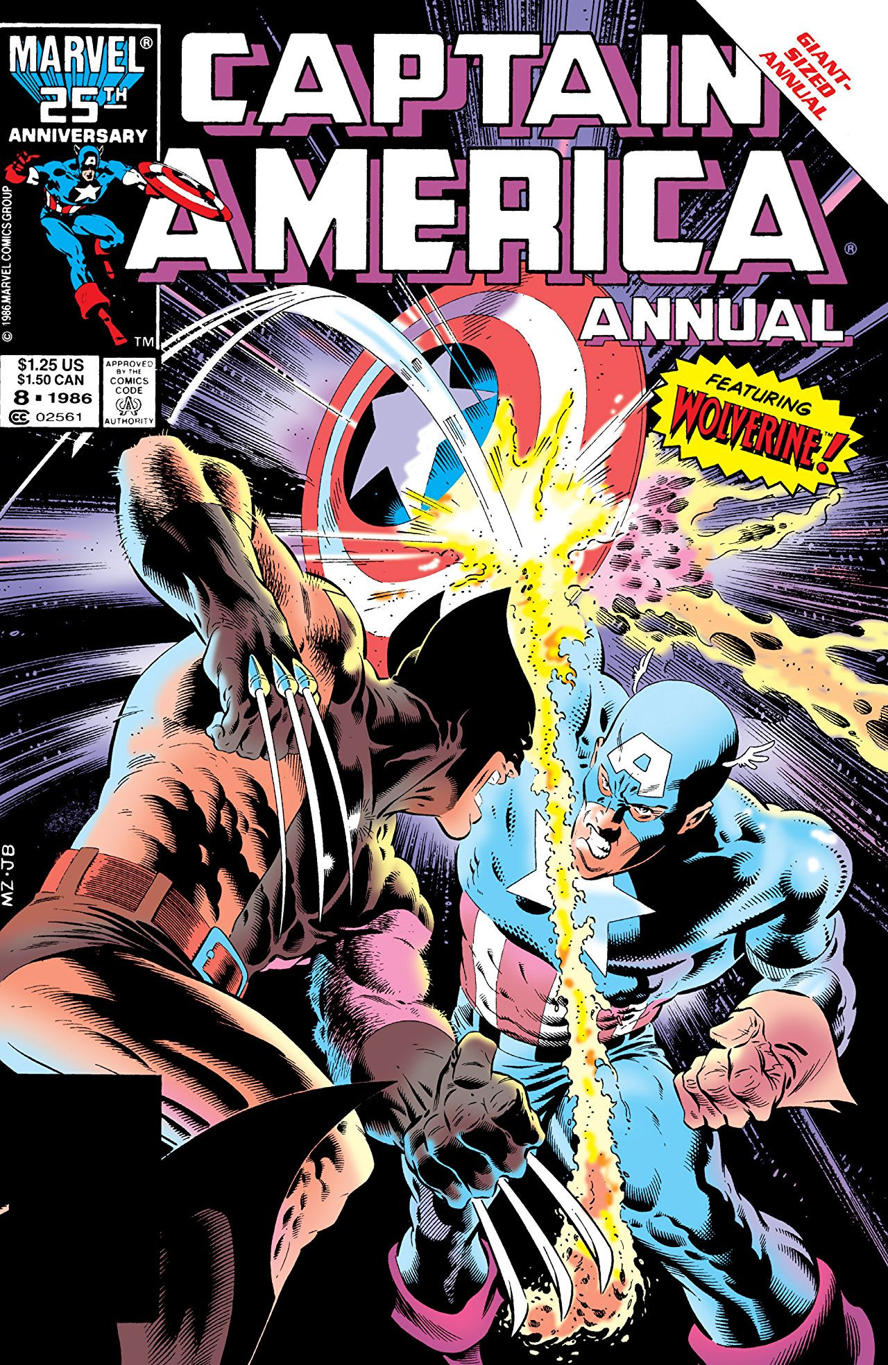
60. Captain America Annual Vol 1 #8 - Gundammike
http://vignette1.wikia.nocookie.net/marveldatabase/images/7/76/Captain_America_Annual_Vol_1_8.jpg/revision/latest?cb=20080530185419 Originality: 0.5 Aesthetic: 4.75 Story: 5 Personal: 5 Average: 3.81 There are so many comic covers that look exactly like this, depicting a battle between two heroes who are inevitably going to make up and get along after resolving whatever misunderstanding that drove them to try to kill each other for a few panels. It's hardly ever an interesting story and this cover doesn't even try to sell it as some kind of high stakes battle, with only the words “featuring Wolverine!” displayed, as if his appearance in a comic is a rare occurrence. The only thing about this scenario that could create any sense of intrigue is seeing what happens when Wolverine’s adamantium claws try to slice through Cap’s shield, but the cover suggests the answer is nothing. The artwork also does this cover no favors. I've seen plenty of generic battle covers that at least conveyed more of a sense of tension and drama. This looks pretty tame as all-out comic brawls go, and the facial expressions of the character are too simplistic. The shadow effects also could have been done much better, although there are at least some details here to show the rippling muscles of the characters. Basically, this is the kind of cover that gives people who don't know anything about comics the (wrong) idea that it's just a bunch of mindless fighting. ... Copied to Clipboard!
|
|
Jesse_Custer 04/18/17 1:26:31 PM #46: |
Up to covers scoring in the 4 range.
59. Exodus - Shovel Headed Kill Machine - Snake5555555555 http://shop.nuclearblast.com/static/articles/100/100215.jpg/1000x1000.jpg Originality: 5 Aesthetic: 6 Story: 4.25 Personal: 0.75 Average: 4.0 It seems like this cover is meant to portray some dark, nightmarish scene, but it almost felt like self-parody to me, with its literal depiction of a “kill machine,” the pile of skulls out of some Terminator movie, the over-the-top blood-stained vehicle randomly firing bullets into the air, and that monster thing operating the vehicle. I don't get much of a sense of story from this other than it being some kind of post-apocalyptic world, which without any context, doesn't convey much sense of meaning. The best thing about the cover is the artwork, particularly the details on the vehicle and the smoke clouds in the sky. But despite the technical skill of the artist, it's not something I really consider an aesthetically pleasing cover, with an excessive amount of dark coloring that makes most of the picture blend together. I’m sure the coloring was an intentional choice, but it doesn't make for an image that's winning me over. ... Copied to Clipboard!
|
|
Gundammike 04/18/17 1:31:49 PM #47: |
Jesse_Custer posted...
It's hardly ever an interesting story and this cover doesn't even try to sell it as some kind of high stakes battle, with only the words “featuring Wolverine!” displayed, as if his appearance in a comic is a rare occurrence. Actually this annual came from a time before Marvel started whoring Wolverine out to every comic they published, so Wolvie only popped up in Uncanny X-Men and this was a rare appearance outside of those pages. --- You will respect the power of a Newtype Super Saiya-jin Jedi Master!" ... Copied to Clipboard!
|
|
Gatarix 04/18/17 1:44:41 PM #48: |
Jesse_Custer posted...
In fact, I'm pretty sure only a 13 year old would bother to draw a ninja on a motorcycle wielding a morning star. I would totally bother drawing a ninja on a motorcycle wielding a morning star (though it would end up looking way goofier than that pic) --- You put your RESOLVE HAT back on, which conveniently is the same hat as your NORMAL HAT. {Drakeryn} ... Copied to Clipboard!
|
|
Jesse_Custer 04/18/17 1:50:53 PM #49: |
Gundammike posted...
Jesse_Custer posted...It's hardly ever an interesting story and this cover doesn't even try to sell it as some kind of high stakes battle, with only the words “featuring Wolverine!” displayed, as if his appearance in a comic is a rare occurrence. Interesting, I'm not much of a Marvel guy, but it's tough to imagine a time when a Wolverine appearance was unusual. I vaguely remember hearing he was on the cover of an issue he didn't even appear in at one point. ... Copied to Clipboard!
|
|
Snake5555555555 04/18/17 1:53:21 PM #50: |
Jesse_Custer posted...
Interesting, I'm not much of a Marvel guy, but it's tough to imagine a time when a Wolverine appearance was unusual. I vaguely remember hearing he was on the cover of an issue he didn't even appear in at one point. Yeah, they even had to write "Wolverine does not appear in this issue" on the cover. http://tinyurl.com/wolverinedoesnotappear --- Death or glory becomes just another story http://tinyurl.com/jqx883t - http://tinyurl.com/zqwzc9a - http://tinyurl.com/l75ybt5 ... Copied to Clipboard!
|
| Topic List |
#/media/File%3ABaroness_-_Yellow.jpg)
#/media/File%3AU2please.jpg)