| Topic List | |
|---|---|
|
Jesse_Custer 04/18/17 1:54:17 PM #51: |
Snake5555555555 posted...
Jesse_Custer posted...Interesting, I'm not much of a Marvel guy, but it's tough to imagine a time when a Wolverine appearance was unusual. I vaguely remember hearing he was on the cover of an issue he didn't even appear in at one point. Lol, that's an amazing disclaimer. ... Copied to Clipboard!
|
|
Jesse_Custer 04/18/17 4:23:27 PM #52: |
58. Pirates of Penzance (1983 movie) - Raka_Putra
http://imagecache5d.allposters.com/watermarker/55-5583-VJ7VG00Z.jpg?ch=972&cw=618 Originality: 3.5 Aesthetic: 4.25 Story: 4.25 Personal: 4.5 Average: 4.125 Perhaps they were going for a retro vibe with this cover, but it still looks more dated than the covers for most classic musicals of the 1950s, despite having been released in the 80s. The bursting through the cover concept has long been a cliche in various medium, and the only reason I didn't go even lower on the Originality score is the unusually dynamic presentation. It's also not a particularly impressive cover visually, although there are a few technical elements to help the Aesthetic score, such as a portion of the ripped background covering some of the arm of the guy holding the sword in the upper right. But for the most part, the torn page effect doesn't look that nice, and has been done much better. There's also not much of a story here, it's basically just a bunch of characters. But there's enough personality to most of them, especially the pirate in the center, to keep it from getting a lower score. ... Copied to Clipboard!
|
|
Jesse_Custer 04/18/17 9:11:17 PM #53: |
57. Yattering - Genocide - Snake5555555555
http://www.leastworstoption.com/wp-content/uploads/cover-yattering03.jpg Originality: 6.25 Aesthetic: 3.75 Story: 6.5 Personal: 0.25 Average: 4.19 This is one of those covers that definitely has objective value, but it's really not for me on a personal level, which hurt its total score. Honestly, I found it unpleasant to even look at, but I could see this one placing higher on a different list. Since this is virtually the opposite of what I'd call aesthetic, with almost oppressively muted colors, there's just so high I could go for that factor. That being said, the shading is good and there are some nice details, aside from one of those little faces that looks more derpy than unsettling (the one below the woman’s underarm), which I doubt was the intention. So I gave the cover some credit for the technical quality of the art, but as I said, this is as high as I can go for Aesthetics. Regardless, there is a definite sense of story to this cover. The image is vague enough to be open to interpretation, and it could easily be the cover for a horror movie. It's also a fairly unique picture, and I can't say I've seen anything quite like it before. ... Copied to Clipboard!
|
|
Jesse_Custer 04/18/17 10:32:42 PM #54: |
Not sure if I'm going too fast with these today, but I've been bored, so one more.
56. Mastodon- Emperor of Sand - Bane_Of_Despair https://cdn.shopify.com/s/files/1/0797/5345/products/MSTD_EOS_CD_grande.jpg?v=1485367105 Originality: 5.75 Aesthetic: 5 Story: 5.25 Personal: 0.75 Average: 4.19 Like the last one, this isn't a bad cover, but it didn't work for me on a personal level. The artwork has some nice details, particularly on that metal chestplate, and the cracked earth looks good. But there are some rough spots that are difficult to tell exactly what you're looking at such as the left hand (I think it's a hand?), which doesn't seem to have distinct fingers like the other hand. I also don't like the way the flames in the background were depicted with such intense shades of yellow, red, and orange, as they take too much emphasis off the character, who seems to be the intended focus. There's some sense of story to the bizarre appearance of the character and the hellish environment, although that benefitted the Originality score to a greater degree. Unless I'm overlooking something, I can't figure out if there's any meaning to what the character is wearing or those spikey things that seem to be coming out of its back, but I feel like it must be symbolic of something. Or maybe it's just supposed to look cool, but it's lost on me. ... Copied to Clipboard!
|
|
Snake5555555555 04/18/17 11:11:01 PM #55: |
Genocide is one of the more twisted album covers out there for me. The oppressive smoke, the mystery machinery, the fences with untold destruction occurring behind them, and then the horrifying figure dead center on the cover, clearly suffering.
--- Death or glory becomes just another story http://tinyurl.com/jqx883t - http://tinyurl.com/zqwzc9a - http://tinyurl.com/l75ybt5 ... Copied to Clipboard!
|
|
Jesse_Custer 04/19/17 8:48:28 AM #56: |
55. Kemet - Matagot - Simoun
http://www.beastsofwar.com/wp-content/uploads/2013/10/Kemet-Cover.jpg Originality: 5.25 Aesthetic: 5.25 Story: 5 Personal: 1.5 Average: 4.25 At first, I thought this was the cover for a metal album instead of a board game. And it's a safe bet that if something makes me think metal, it's not going to be something I particularly like. I wouldn't call this a conventional image, but it's not all that unique either. The most novel thing about it is probably the red tinted coloring, which is a bit harsh on the eyes. But it's basically just a big battle scene, and I'm certain I've seen plenty of images of this nature before. There's also not a lot of Story apparent from this cover beyond a war involving supernatural creatures, which is perhaps more of a concept than a story. The artwork is a mixed bag. On the one hand, there's some impressive details used to depict the sheer scope of this battle, with a ton of figures drawn into the background. On the other hand, the characters in the forefront don't look that great. That creature smiling in the lower left has a goofy expression, and the faces in general are lacking in much detail. And as I mentioned before, the coloring is almost oppressive. So that kind of evens out to a neutral Aesthetic score despite having some really good elements. ... Copied to Clipboard!
|
|
Simoun 04/19/17 8:58:14 AM #57: |
Wow I didn't expect Kemet to be the first to go. But I do admit that it is a tad generic.
Kemet is a 1-2 hour lite wargame where attacking is the best offense and defense. Like seriously, if you main protoss you get the idea as it gives you the ability to teleport everywhere around the map at anytime, making border tensions useless. --- It's not so cliche anymore when it's happening to you. ... Copied to Clipboard!
|
|
Jesse_Custer 04/19/17 10:04:28 AM #58: |
54. The Transformers #5 (Marvel Comics) - Gundammike
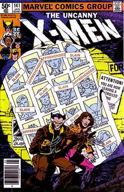
http://www.battlegrip.com/wp-content/uploads/2014/05/transformers02.jpg Originality: 4.5 Aesthetic: 5.25 Story: 5.5 Personal: 2.75 Average: 4.5 There's no factor in my scoring system that directly depends on whether a cover has a bad concept, but that factored into my personal score for this one. This might seem like nitpicking on a minor detail, but I think it's ridiculous that the character not only decided to use his arm cannon to write that the Transformers were all dead on a random wall, but also that he just wrote the words “are all dead,” which only makes sense if you look at the title of the comic above. Are we to believe the logo “The Transformers” is magically floating above the character, or that this is some attempt at breaking the fourth wall with the character defacing the cover? Either way, it doesn't work because there's a disconnect between the wall within the comic universe and the title of the comic. Oh, and despite having the penmanship of an elementary school student, the character took the time to add a nice little period to the end of his incomplete sentence “are all dead.” It's always important to remember punctuation when you're engraving words into a wall after all. Bad gimmick aside, this cover obviously has some hint of a story, but it's a fairly generic one involving a dark possible future. And other comics have done this concept better, such as: https://upload.wikimedia.org/wikipedia/en/2/2a/X-Men_v1_141.jpg The artwork is pretty good for the Decepticon (at least I think that's a Decepticon, I have some vague recollection of having a figure of this character when I was a kid). But the rest of the cover is pretty bland with an unimpressive wall, and the shading elements don't look right. So there's just so high I'm willing to go on the Aesthetic score for a decently drawn character. And that's all I've got to say about that cover. Period. ... Copied to Clipboard!
|
|
Great_Paul 04/19/17 10:07:26 AM #59: |
Awww yeah Kemet. Excellent game.
--- Bear Bro It's kinda coincidental how like in most games pigs are evil. ... Copied to Clipboard!
|
| #60 | Post #60 was unavailable or deleted. |
|
Simoun 04/19/17 10:38:43 AM #61: |
Great_Paul posted...
Awww yeah Kemet. Excellent game. hell yeah! Do you also play Inis or Cyclades? --- It's not so cliche anymore when it's happening to you. ... Copied to Clipboard!
|
|
Bane_Of_Despair 04/19/17 10:42:01 AM #62: |
Likewise didn't expect mastodon to be my first out, good thing it was my bonus pick!
--- Bane Lord have mercy on my soul, I've had a good run but I can't run anymore. Just put me down. ... Copied to Clipboard!
|
|
Great_Paul 04/19/17 10:45:24 AM #63: |
Simoun posted...
Great_Paul posted...Awww yeah Kemet. Excellent game. I own Cyclades (and Titans) but haven't played it yet. A guy I regularly game with has Inis arriving this week as part of a combined order we did. I'm excited to finally try both, but I don't know if either can top Kemet for me (aka my #5 of all time). *Sorry Jesse for the off topic discussion :P --- Bear Bro It's kinda coincidental how like in most games pigs are evil. ... Copied to Clipboard!
|
|
Jesse_Custer 04/19/17 10:46:45 AM #64: |
Great_Paul posted...
*Sorry Jesse for the off topic discussion :P No need to apologize, discussion is always good! ... Copied to Clipboard!
|
|
Gatarix 04/19/17 11:09:18 AM #65: |
Jesse_Custer posted...
54. The Transformers #5 (Marvel Comics) - Gundammike haha I think this is firmly in "so bad it's good" territory --- You put your RESOLVE HAT back on, which conveniently is the same hat as your NORMAL HAT. {Drakeryn} ... Copied to Clipboard!
|
|
Gundammike 04/19/17 11:52:19 AM #66: |
Jesse_Custer posted...
Bad gimmick aside, this cover obviously has some hint of a story, but it's a fairly generic one involving a dark possible future. No possible dark future at all. In the previous issue the Decepticons were battling the Autobots, and due to the fact that they had just recently found a source of fuel to replenish themselves, were soundly beating the Autobots. Suddenly, the fuel the 'Cons had gotten started to poison them, as they had forced Sparkplug Witwicky to make it for them & he sabotaged it, and the Autobots managed to win the fight. And we the reader were thinking that this is how the story all wraps up, as The Transformers comic was just a 4-issue mini-series(back then sales numbers were unavailable to the average joe, so we couldn't know that the comic sold extremely well & Marvel decided to make it a permanent thing. So, as I said the Autobots had won, when on the last pages, Shockwave debuts on the scene in gun mode and blast everyone . Issue 5 opens with all of the Autobots minus Optimus dead with their bodies hanging from the ceiling, and all of the Decepticons minus Megatron dead in the Ark's medical bay. Megatron is barely clinging to life, and Shockwave basically forces him to say "Yeah, I fucked up big time, you'd make a better Decepticon leader" and Shockwave assumes command. Optimus is also barely clinging to life, except Shockwave just has his head there to force Optimus to use the Creation Matrix (the comics' version of the Matrix of Leadership back before the Matrix actually became a thing in the movie) to allow Shockwave to create the Constructicons, the Coneheads, etc. So, as I said, not a dark possible future, but basically the stark present reality at that moment. --- You will respect the power of a Newtype Super Saiya-jin Jedi Master!" ... Copied to Clipboard!
|
|
Jesse_Custer 04/19/17 12:09:59 PM #67: |
It can be tricky to infer a story from just the cover, but I'm trying to avoid considering the actual plot even if I have knowledge of it (which in this case I did not). Going on just the cover for the Transformers one, it seemed to me like one of those alternate realities where all the heroes have lost.
... Copied to Clipboard!
|
|
Gundammike 04/19/17 12:12:47 PM #68: |
Jesse_Custer posted...
It can be tricky to infer a story from just the cover, but I'm trying to avoid considering the actual plot even if I have knowledge of it (which in this case I did not). Going on just the cover for the Transformers one, it seemed to me like one of those alternate realities where all the heroes have lost. Going by just the cover is best. I was just clearing up the "possible dark future" comment for you or anyone actually interested in knowing. --- You will respect the power of a Newtype Super Saiya-jin Jedi Master!" ... Copied to Clipboard!
|
|
Jesse_Custer 04/19/17 5:31:21 PM #69: |
53. Adrenaline - Great_Paul
https://cf.geekdo-images.com/images/pic3476604_md.jpg Originality: 4.25 Aesthetic: 4.75 Story: 4.5 Personal: 4.5 Average: 4.5 That smiling character with the hammer makes me think of Pac-Man wearing some kind of body armor. The goofiness of that character seems completely out of place in what looks from this cover like a shooting game, so much so that it's distracting from the other details. But even spending awhile trying to take it all in, I don't see much of a story here beyond a battle involving some yellow smiling creature, which doesn't have any apparent significance in this context. I'm not that impressed with the artwork either. The blur effect used to create the appearance of motion, such as for the bullet cartridge in the air and the swinging hammer, doesn't look quite right, the coloring is drab in some places while needlessly bright in others, and the tone of the picture is disjointed as I already mentioned. So while it's technically decent artwork for the most part, it has some problems that kept the Aesthetic score just below average. None of that is to say this is really a bad cover, but it's not a particularly effective one either. ... Copied to Clipboard!
|
|
Gatarix 04/19/17 5:36:24 PM #70: |
I love that cover
It's like "Pac-Man: THE GRITTY REALISTIC REBOOT" --- You put your RESOLVE HAT back on, which conveniently is the same hat as your NORMAL HAT. {Drakeryn} ... Copied to Clipboard!
|
|
Great_Paul 04/19/17 5:58:23 PM #71: |
At least it's better than the original cover art
https://cf.geekdo-images.com/images/pic3061997_md.png --- Bear Bro It's kinda coincidental how like in most games pigs are evil. ... Copied to Clipboard!
|
|
Jesse_Custer 04/19/17 6:02:41 PM #72: |
Great_Paul posted...
At least it's better than the original cover art Wow, that's quite a smile. ... Copied to Clipboard!
|
|
Raka_Putra 04/19/17 7:18:53 PM #73: |
One down, one more to go.
And yeah the dated look is (most likely) intentional. --- Fuhlt nicht durch dich Sarastro Todesschmerzen, So bist du meine Tochter nimmermehr-- eeeeeeeeeeeeeeehr. ... Copied to Clipboard!
|
|
Jesse_Custer 04/19/17 10:39:18 PM #74: |
52. Punisher Vol 10 3 (Cloonan Variant) - Snake5555555555
http://vignette2.wikia.nocookie.net/marveldatabase/images/a/a2/Punisher_Vol_10_3_Cloonan_Variant.jpg/revision/latest?cb=20160701092518 Originality: 4.75 Aesthetic: 4.5 Story: 4.5 Personal: 4.75 Average: 4.62 When it comes to Punisher covers, there have been some gems, such as this amazing cover that Snake introduced me to, which got second place way back when I first did a comic ranking topic: https://i.annihil.us/u/prod/marvel/i/mg/6/60/582b5f18b2d44/portrait_incredible.jpg On the other end of the spectrum, there have been some Punisher covers we’d all like to forget like this one: https://images-na.ssl-images-amazon.com/images/I/61YByElpKTL._SY344_BO1,204,203,200_.jpg The Punisher cover nominated for this topic is neither a work of art like that first one nor a train wreck like the second, but rather is just okay. My first impression was this could have just as easily been a Wolverine cover (not that we need any more of those). I get what they're going for, the Punisher is a ruthless hunter like the wolves around him stalking his prey. But unless you take the cover literally and assume this is a story about Frank befriending a pack of wolves, there's not much of a story here. It tells us something about the character that anyone familiar with the Punisher already knows, without placing the character in a unique light. I'm also not that impressed with the artwork, which has some sloppy details, particularly the face of the wolf to the left of Frank. And the coloring is really dull, although I can't exactly fault the cover for that because it was clearly intentional to make the red blood stand out. Some things that help the cover artistically are a nice amount of detail to the leaves and trees, and a cool use of shadow behind Frank’s fingers on the tree. But that only makes me wonder why more attention wasn't paid to Frank or the wolves instead of minor details. It's certainly not a bad concept or cover, but it didn't do enough to grab me like that brilliant cover from Rucka’s run. ... Copied to Clipboard!
|
|
Jesse_Custer 04/19/17 10:59:22 PM #75: |
Might as well take this to the top 50 tonight. I'm going to have a late start on posting anything tomorrow.
After this one, there's only one cover left at #50 to score below a 5, and then we'll be essentially moving into a new tier. 51. Umineko - metalslug https://static.giantbomb.com/uploads/scale_small/9/97089/2273914-main.png Originality: 5 Aesthetic: 5.5 Story: 3 Personal: 5.25 Average: 4.69 Let's start with what worked here. I liked the coloring and that line pattern on the dress. And although it's pretty simplistic in terms of detail, I liked the way the artist depicted the woman’s face in the portrait. Another nice detail is the elegant frame around the picture as it would be displayed on the wall. Having said that, this is not a cover that takes any chances or does anything particularly interesting. It's simply a portrait of a woman as far as I can see, and if it has more significance to the story than it appears, I have no way of knowing that from looking at this picture. So all I can get in the way of story is whatever personality comes through, and given that the concept is a painting of a woman posing for a picture, without her actually doing anything or reacting to anything, there's not going to be much in the way of personality. Nothing else I can really say about this one. ... Copied to Clipboard!
|
|
Snake5555555555 04/19/17 11:20:47 PM #76: |
Fair assessment, it's a cool concept for me but you're right that it doesn't stand out too greatly. I almost nominated the Maleev variant on issue 1 instead which might have done better.
--- Death or glory becomes just another story http://tinyurl.com/jqx883t - http://tinyurl.com/zqwzc9a - http://tinyurl.com/l75ybt5 ... Copied to Clipboard!
|
|
Simoun 04/20/17 9:14:20 AM #77: |
Great_Paul posted...
Simoun posted...Great_Paul posted...Awww yeah Kemet. Excellent game. That's awesome! I'm having my first 5p Kemet game next month. It's always been 3p until then. I tried out Inis at a cafe a few weeks ago. Definitely a different breed and worth checking out. --- It's not so cliche anymore when it's happening to you. ... Copied to Clipboard!
|
|
Jesse_Custer 04/20/17 10:15:26 AM #78: |
50. Final Fantasy XV (JP) - NBIceman
https://gamefaqs.akamaized.net/box/9/1/4/75914_front.jpg Originality: 3.75 Aesthetic: 5.75 Story: 4.25 Personal: 5.25 Average: 4.75 Having played some of Final Fantasy XV (until I got bored from driving around running errands), I can understand the selection of this image for the cover. But that doesn't make it a particularly interesting image that tells you anything insightful about the game or the characters. All it really tells us is four buddies are on some kind of a journey and they have a car, which admittedly is a major aspect of the plot, but that's not a deep story. It doesn't tell you the motivations or emotional state of the characters, and barely even highlights their friendship as opposed to being mere companions on a JRPG quest. It's also a fairly generic image that looks like it could have just been a random screenshot from the game taken at any point. As for the Aesthetic score, yes, the game does have amazing graphics, but that doesn't come through all that well in a single frame. This image does little to impress me, and it's not really eye-catching. The coloring is also fairly drab and makes the world of the game look kind of uninteresting. But it is technically proficient enough for a decent Aesthetic score. As Final Fantasy covers go, I can think of plenty I like better. In fact, I prefer this one for Final Fantasy XV: https://static1.gamespot.com/uploads/original/123/1239113/3094163-ffxv1.jpg ... Copied to Clipboard!
|
|
Jesse_Custer 04/20/17 11:38:02 AM #79: |
49. Oathbringer - Murphiroth
https://m.imgur.com/kJNdyo9?r Originality: 5.25 Aesthetic: 5 Story: 5.25 Personal: 4.75 Average: 5.06 This is one of those covers that probably means something to you if you're familiar with the book, but without any familiarity, I found it kind of boring. The only aspects of this cover that interested me were the weird blur effect on the sword and that yellow stuff along the walls, which was enough for a slightly above average score in Originality. There are some nice visual details, but I think the stones that make up the wall could have looked a lot better. While that is just a background that shouldn't matter much, it's such a large part of the cover. And I'm not all that impressed with the character either, who shows little hint of emotion, but the image does get across the idea that she is kind of spiritually powerful magic user. Ultimately, the biggest problem with the cover is that it doesn't make me want to check out the material, it's just a cover that seems to exist because every book needs a cover. ... Copied to Clipboard!
|
|
scarletspeed7 04/20/17 11:55:58 AM #80: |
That cover feels like Just Another Fantasy Novel cover.
--- "Reading would be your friend." ~Dave Meltzer ... Copied to Clipboard!
|
|
Gatarix 04/20/17 12:10:56 PM #81: |
Pretty much.
Also BRANDON SANDERSON takes up more than a third of the cover, which is probably good marketing, but aesthetically ugh. --- You put your RESOLVE HAT back on, which conveniently is the same hat as your NORMAL HAT. {Drakeryn} ... Copied to Clipboard!
|
|
Jesse_Custer 04/20/17 12:24:25 PM #82: |
Gatarix posted...
Also BRANDON SANDERSON takes up more than a third of the cover, which is probably good marketing, but aesthetically ugh. This is a good point I'm surprised I didn't mention. Now I'm picturing the designer asking how does this look, with BRANDON SANDERSON repeatedly saying my name should be bigger. ... Copied to Clipboard!
|
|
Murphiroth 04/20/17 12:31:49 PM #83: |
Eh, names in big print are a fairly standard thing in fantasy/sci-fi so I don't really think it's Sanderson's doing!
The cover would definitely mean more in context but you picked up on the important details of the effect on the sword and the yellow stuff on the walls. Although I'd point out that she's generating the yellow stuff and/or possibly melting the wall. Not sure, there's several possibilities. I didn't expect it to do super well without familiarity with the source but the cover was released right around the time of noms. --- ... Copied to Clipboard!
|
|
Jesse_Custer 04/20/17 4:04:15 PM #84: |
48. God of War: Ascension - Johnbobb
http://media.ign.com/games/image/object/121/121511/GOW_Ascension_m1.jpg Originality: 5 Aesthetic: 5.75 Story: 5.5 Personal: 4.5 Average: 5.19 The God of War games have never appealed to me, but I admit this is a nice looking cover. Everything including Kratos and his chains looks believable. I would score it even higher on Aesthetics given the quality of the artwork if the image didn't have such a limited color palette and a dull background that keeps it from grabbing your attention. It’s just kind of there, without anything special, even if it is technically proficient. In terms of story, you get some feel for the tortured and rage-filled nature of the character who looks like he could burst out of those chains at any moment. But there's not enough visual cues on the cover to tell more of a story beyond a sense of characterization. Since the cover doesn't have a lot going on, that's all I've got to say about it. ... Copied to Clipboard!
|
|
Jesse_Custer 04/20/17 9:21:07 PM #85: |
47. DS2: Scholar - metalslug
https://gamefaqs.akamaized.net/box/2/9/8/508298_front.jpg Originality: 5.25 Aesthetic: 5 Story: 5.75 Personal: 4.75 Average: 5.19 In general, I’m not a fan of dark tinted covers like this where it's hard to make out the details, even if it was clearly an intentional design choice. There are some nice details in the barely illuminated areas by the shoulders of the fur on the outfit. But other parts of the picture have what looks like an attempt at creating texture gone wrong, such as around the hands and crown. I don't know how to explain it other than the image looks kind of grainy in places, if that makes any sense. It's tempting to consider this a more original cover just because of the darkness, but I don't feel a single figure standing in dim lighting is that bold a premise. It made a bit more of a difference for the Story factor, which along with the grim pose of the character holding his crown, suggests either a King with a dark secret or perhaps even someone reluctantly assuming the throne. There’s really not much they could have done differently to make this a better cover with the concept, which wasn't designed to stand out. ... Copied to Clipboard!
|
|
scarletspeed7 04/20/17 9:29:06 PM #86: |
God of War dropping this low is a little surprising but I would have expected higher aesthetic and shit for originality and story, so I guess it balanced out.
--- "Reading would be your friend." ~Dave Meltzer ... Copied to Clipboard!
|
|
Jesse_Custer 04/21/17 9:20:19 AM #87: |
46. Terminator: The Burning Earth trade cover - Gundammike
https://s-media-cache-ak0.pinimg.com/originals/d2/9d/3c/d29d3cc733ef3d5078df5ab4bd96d013.jpg Originality: 4.25 Aesthetic: 5.75 Story: 5.75 Personal: 5 Average: 5.19 I would never have pegged this for an Alex Ross cover if I didn't see his name right there. It's not a bad looking cover overall, but this doesn't really have his unique realistic style. Still, the flames look pretty cool, better than the Terminator actually. The Originality score suffers from this basically being a rehashing of scenes from the Terminator movies, with the cliche of tons of skulls underfoot to show the devastation to humanity in this apocalyptic world. Regardless of how many times I've seen this type of image (not just in Terminator movies), there is a decent sense of story to it, which I hardly need to explain. But in the absence of any characters with genuine personality, all it tells us is the nature of the world in which the comic is set, and that's not enough for a higher Story score. ... Copied to Clipboard!
|
|
Jesse_Custer 04/21/17 11:11:16 AM #88: |
45. The Grizzled - Great_Paul
https://cf.geekdo-images.com/images/pic3184278_md.png Originality: 5.25 Aesthetic: 4.5 Story: 5.5 Personal: 5.5 Average: 5.19 For some reason, the goofy artwork reminds me of the old Schoolhouse Rock videos, which isn't necessarily a bad association for me. But it's not what I would call objectively good artwork. I realize it's an intentional design choice, but it's so rough and cartoonish, with things like literal dots for eyes, that I can't go any higher on the Aesthetic score. The tradeoff is that the unique art style helped the Originality score a bit, but even that factor is limited by this just being a bunch of soldiers sitting around. I was tempted to score the Story factor lower at first because there's not a lot going on here. But it occurred to me that the cartoonish faces do at least have a decent amount of personality. Also, the cover gives an intriguing message, “Can Friendship be stronger than War?” The fact that they chose to capitalize friendship and war seems significant to me, and suggests a story about the close bond between these soldiers at odds with the harsh reality of wartime. So that's good enough for a better than average Story score despite nothing really happening. ... Copied to Clipboard!
|
|
Jesse_Custer 04/21/17 12:30:40 PM #89: |
Thinking about putting up a nomination topic for my next project today, since I'm basically done with my work on this one aside from actually posting the write-ups. I'll keep posting write-ups at about this pace.
... Copied to Clipboard!
|
|
Gundammike 04/21/17 12:40:22 PM #90: |
Jesse_Custer posted...
It's not a bad looking cover overall, but this doesn't really have his unique realistic style. The Terminator: The Burning Earth mini-series was actually Alex's first comic book work, so he hadn't fully developed & realized his signature style yet. --- You will respect the power of a Newtype Super Saiya-jin Jedi Master!" ... Copied to Clipboard!
|
|
Simoun 04/21/17 12:40:34 PM #91: |
The Grizzled is awesome, especially with 5 people :D
--- It's not so cliche anymore when it's happening to you. ... Copied to Clipboard!
|
|
Jesse_Custer 04/21/17 4:42:09 PM #92: |
44. Chiodos- Bone Palace Ballet - Bane_Of_Despair
http://www.equalvision.com/wp-content/uploads/2007/09/BonePalaceBallet.jpg Originality: 6.25 Aesthetic: 5.5 Story: 5.25 Personal: 4 Average: 5.25 It seems like they were going for a creepy vibe with this one, but I feel like the artwork for the two undead characters is oddly cartoonish. Their bodies seem out of proportion and the faces look silly, unless that was the intent. That held back the Aesthetic score a bit, although there are still some nice details to help, particularly the way the checkerboard floor transitions into a different black and white pattern to create a sense of depth, as well as that swirling blackness with a ghostly face that adds a sense of atmosphere to the scene. I don't get enough of a feeling of personality from these goofy characters to award a high score for Story, but the overall tone of the scene helps. The strongest sense of story comes not from the characters themselves, but the way they're dressed. Something about the characters’ appearance makes me think of Disney’s Haunted Mansion (which isn't a bad comparison coming from me), but I still don't care for the cover much on a personal level. Originality is the strongest factor here, as the cover stands out with a fairly unique style, but it's not exactly groundbreaking either. ... Copied to Clipboard!
|
|
Jesse_Custer 04/21/17 9:08:15 PM #93: |
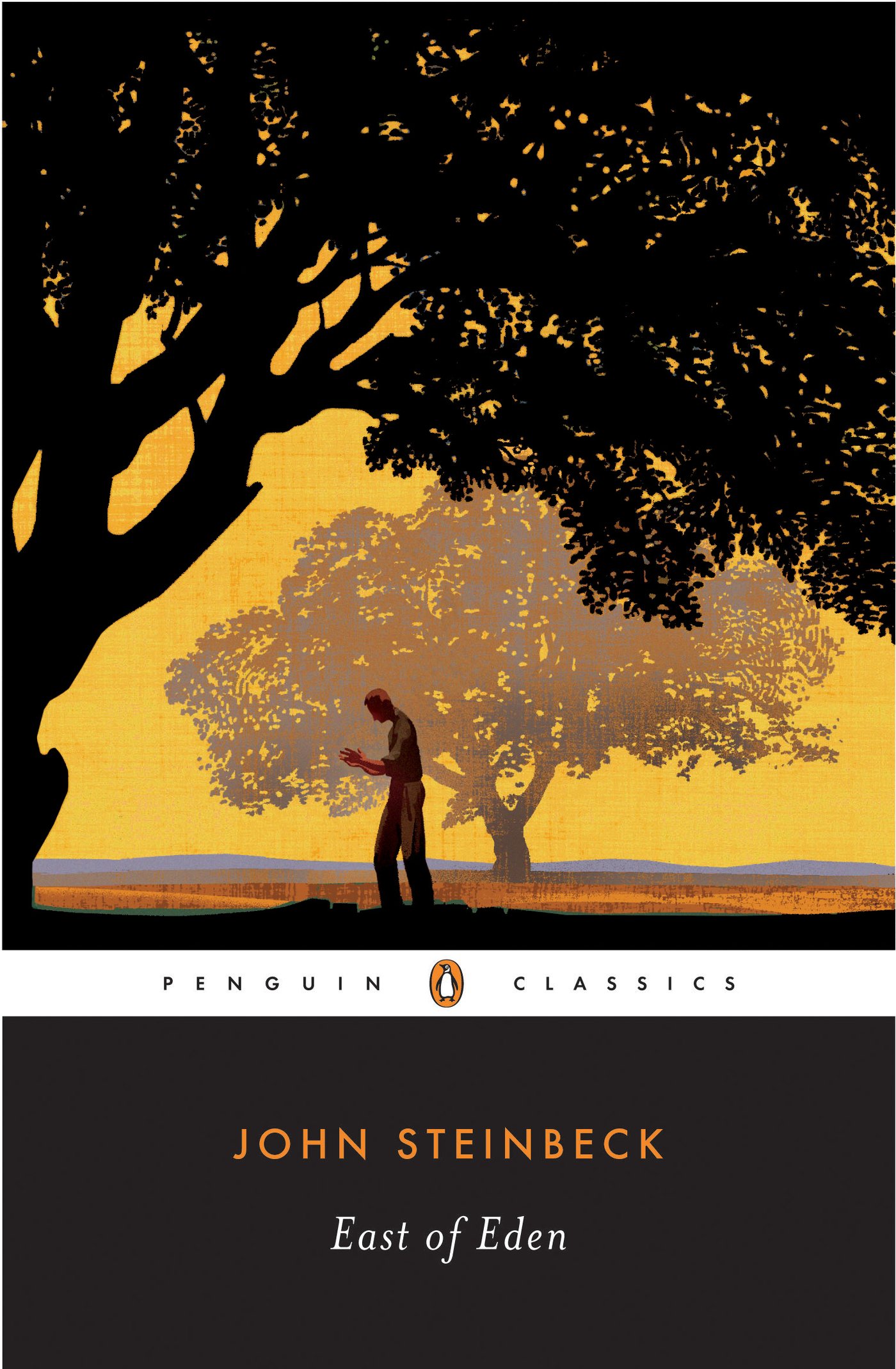
43. John Steinbeck - East of Eden - NBIceman
https://images-na.ssl-images-amazon.com/images/I/81eMMNVkt7L.jpg Originality: 5.25 Aesthetic: 5.5 Story: 5.5 Personal: 4.75 Average: 5.25 I found this cover kind of dull. You can't tell much simply from the pose of the character, whose face isn't illustrated with any details. The yellow coloring lacks variation. And the trees have some nice details, but that's the most interesting thing going on visually. That being said, the trees have a very nicely layered appearance with different shading to make one appear closer than the other, which is enough for a respectable Aesthetic score. I'm probably being generous with the Story score by inferring a sense of more going on to the guy standing in the middle of the field, but oddly enough, the minimalism of the picture gives me a sense that this is a significant moment for the lone character. And well, I can't think of anything else to say about it, so I'll leave it at that. ... Copied to Clipboard!
|
|
scarletspeed7 04/21/17 10:04:27 PM #94: |
What is Pa Kent doing on that East of Eden cover?
--- "Reading would be your friend." ~Dave Meltzer ... Copied to Clipboard!
|
|
Simoun 04/21/17 10:44:20 PM #95: |
Hey Jesse, was it you who made a topic about ranking user-nominated batman stuff? I just seem to recall something like that and it disappeared midway or something
--- It's not so cliche anymore when it's happening to you. ... Copied to Clipboard!
|
|
Jesse_Custer 04/21/17 11:22:13 PM #96: |
Simoun posted...
Hey Jesse, was it you who made a topic about ranking user-nominated batman stuff? I just seem to recall something like that and it disappeared midway or something Yeah, I wound up needing a break during that one, but somewhere along the line, it seems I erased my file with the write-ups. If there was anything specific for that project you were curious about, I could at least give an opinion on it. ... Copied to Clipboard!
|
|
Jesse_Custer 04/21/17 11:29:52 PM #97: |
While on the subject of other projects, I never got around to putting up that new nominations topic I mentioned earlier. I'm tempted to put it up now, but I'm thinking it's kind of late.
It'll be a music-oriented project, but not song rankings because I've done that before and want to try something new this time. ... Copied to Clipboard!
|
|
Simoun 04/21/17 11:45:24 PM #98: |
Jesse_Custer posted...
Simoun posted...Hey Jesse, was it you who made a topic about ranking user-nominated batman stuff? I just seem to recall something like that and it disappeared midway or something That's sad. I'm sorry you lost your hard-worked list. No, nothing in general I wanted to know. Just wondered how it retconned out of existence hahah --- It's not so cliche anymore when it's happening to you. ... Copied to Clipboard!
|
|
Jesse_Custer 04/21/17 11:55:22 PM #99: |
One more for tonight.
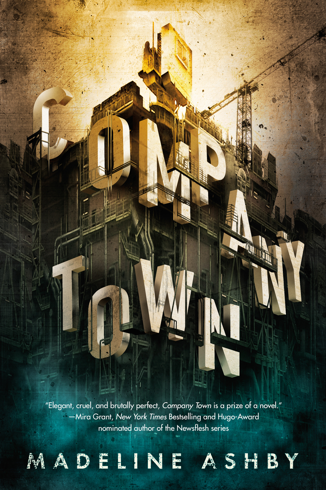
42. Company Town - Madeline Ashby - Gatarix http://images.macmillan.com/folio-assets/macmillan_us_frontbookcovers_1000H/9780765382900.jpg Originality: 5.25 Aesthetic: 5.75 Story: 5 Personal: 5 Average: 5.25 This cover has a nice presentation, but it's more style over substance. It seems like a lot of effort went into coming up with an interesting way to present the title of the book, and it is connected to the theme of construction that's apparent from the crane. But I’m not feeling much story here beneath the gimmick of the letters laid out as parts of the construction project. The Aesthetics score is boosted by that visual concept, and I like the way the letters create some sense of depth. The effect in the sky that looks like an image on an old projector is interesting as well. But I'm reluctant to score that factor higher because I don't think the cover stands out that well, in part due to the limited use of color in most of the image (aside from the blue on the bottom). ... Copied to Clipboard!
|
|
Jesse_Custer 04/22/17 8:24:44 AM #100: |
41. NieR: Automata - Murphiroth
https://m.imgur.com/YtrfDEG?r Originality: 5.25 Aesthetic: 5.75 Story: 5.75 Personal: 4.5 Average: 5.31 The artwork is actually pretty good here, but I found it difficult to tell what's going on without looking closely because of the oppressive amount of black coloring, which caused the characters to blend together. Also, the background is just so grey, making the picture seem dull and lifeless, even though it was likely intended to convey an emotional scene involving a wounded ally (it might also have helped if there was more visible emotion on the face of the character carrying someone). The heavy dark coloring that held the image back on Aesthetics does help the Originality score a bit, but only so much for a mostly conventional scene. And despite the implications of the picture and sense of atmosphere, there's just so much I could award for Story when there's so little sense of emotion or personality to the characters. Overall, it comes across as a cover that could have had a lot more punch with a few stylistic changes. ... Copied to Clipboard!
|
| Topic List |