| Topic List | Page List: 1 |
|---|---|
| Topic | Jesse Ranks User-Nominated Cover Art - The Rankings |
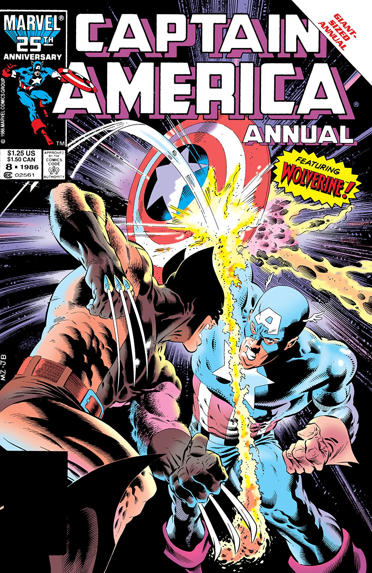
| Jesse_Custer 04/18/17 8:35:02 AM #45: | 60. Captain America Annual Vol 1 #8 - Gundammike http://vignette1.wikia.nocookie.net/marveldatabase/images/7/76/Captain_America_Annual_Vol_1_8.jpg/revision/latest?cb=20080530185419 Originality: 0.5 Aesthetic: 4.75 Story: 5 Personal: 5 Average: 3.81 There are so many comic covers that look exactly like this, depicting a battle between two heroes who are inevitably going to make up and get along after resolving whatever misunderstanding that drove them to try to kill each other for a few panels. It's hardly ever an interesting story and this cover doesn't even try to sell it as some kind of high stakes battle, with only the words “featuring Wolverine!” displayed, as if his appearance in a comic is a rare occurrence. The only thing about this scenario that could create any sense of intrigue is seeing what happens when Wolverine’s adamantium claws try to slice through Cap’s shield, but the cover suggests the answer is nothing. The artwork also does this cover no favors. I've seen plenty of generic battle covers that at least conveyed more of a sense of tension and drama. This looks pretty tame as all-out comic brawls go, and the facial expressions of the character are too simplistic. The shadow effects also could have been done much better, although there are at least some details here to show the rippling muscles of the characters. Basically, this is the kind of cover that gives people who don't know anything about comics the (wrong) idea that it's just a bunch of mindless fighting. ... Copied to Clipboard! |
| Topic List | Page List: 1 |