| Topic List | |
|---|---|
|
Jesse_Custer 04/22/17 10:18:11 AM #101: |
40. Fatal Frame V - metalslug
https://gamefaqs.akamaized.net/box/1/0/9/385109_front.jpg Originality: 4.5 Aesthetic: 6.5 Story: 5.25 Personal: 5 Average: 5.31 Not a bad cover at all, but it's somewhat generic. The most novel aspect is probably the position of one character upside-down in relation to the other, but I've seen that concept plenty of times before, such as on this cover that I like more: http://img.game.co.uk/ml2/2/8/1/1/281198_ps3_b.png This is a nice looking cover, albeit a bit bland with muted coloring. The lighting effect through the water on the characters’ legs is particularly impressive, and really helped boost the Aesthetic score. The Story score benefitted from a sense of atmosphere, but I don't get enough of a feeling of personality from the characters to go any higher. As impressive as that water looks, it just seems like the characters are kind of floating there doing nothing of real significance. ... Copied to Clipboard!
|
|
Drakeryn 04/22/17 10:19:39 AM #102: |
I figured Company Town would be my first nom to fall. I really like the aesthetic and the coloring but it doesn't have a lot besides that.
--- another place and time, without a great divide, and we could be flying deadly high ... Copied to Clipboard!
|
|
scarletspeed7 04/22/17 11:43:20 AM #103: |
Jesse_Custer posted...
http://img.game.co.uk/ml2/2/8/1/1/281198_ps3_b.png See this would be auto-last place for me. --- "Reading would be your friend." ~Dave Meltzer ... Copied to Clipboard!
|
|
Jesse_Custer 04/22/17 11:51:57 AM #104: |
scarletspeed7 posted...
Jesse_Custer posted...http://img.game.co.uk/ml2/2/8/1/1/281198_ps3_b.png But you're the biggest Tidus fan on the board! ... Copied to Clipboard!
|
|
scarletspeed7 04/22/17 11:53:09 AM #105: |
Tidus isn't the problem.
There's an upside-down fat guy on it! --- "Reading would be your friend." ~Dave Meltzer ... Copied to Clipboard!
|
| #106 | Post #106 was unavailable or deleted. |
|
scarletspeed7 04/22/17 12:02:16 PM #107: |
metaIslug posted...
scarletspeed7 posted...There's an upside-down fat guy on it! It's on the left side. --- "Reading would be your friend." ~Dave Meltzer ... Copied to Clipboard!
|
| #108 | Post #108 was unavailable or deleted. |
|
Jesse_Custer 04/22/17 12:41:03 PM #109: |
39. Grimslingers by Greenbriar Games - Simoun
http://bit.ly/2mYZWjB Originality: 5.25 Aesthetic: 6 Story: 5.5 Personal: 4.75 Average: 5.375 I found this to be one of the more difficult covers to figure out. It's not clear to me what the cover is trying to say, and it feels like a series of disconnected story elements thrown together that would only make sense to someone familiar with the game. On their own, each of the images conveys enough of a sense of story to result in a better than average score for that factor, but they don't come together in a meaningful way for me. There's some kind of dinosaur-like monster, a masked gunman with what looks like antlers, a girl who seems out of the old West, and some vaguely futuristic technology with wires hanging out. Some of that stuff doesn't belong in the same era, so is this a story about time travel? Just looking at the cover, I have no idea. As for the artwork, the individual images all look good, although the overall presentation seems somewhat arbitrary. And the uniform coloring doesn't really serve to tie the images together. Lastly, there's not much to say about Originality. It's a somewhat novel presentation, but still not much more than a collection of images, and not enough to warrant a high score in that factor. ... Copied to Clipboard!
|
|
Simoun 04/22/17 2:30:19 PM #110: |
Hey that's pretty high already in my book.
I didn't initially get the theme either but it's apparently post-apocalyptic wild west when I opened the box. What's weird is, you even get to play as a cat if you'd like. The game's real interesting to say the least, and I swear I think it was intentional but one of the robotic companions in this game looks awfully like that pyramid guy from gravity falls --- It's not so cliche anymore when it's happening to you. ... Copied to Clipboard!
|
|
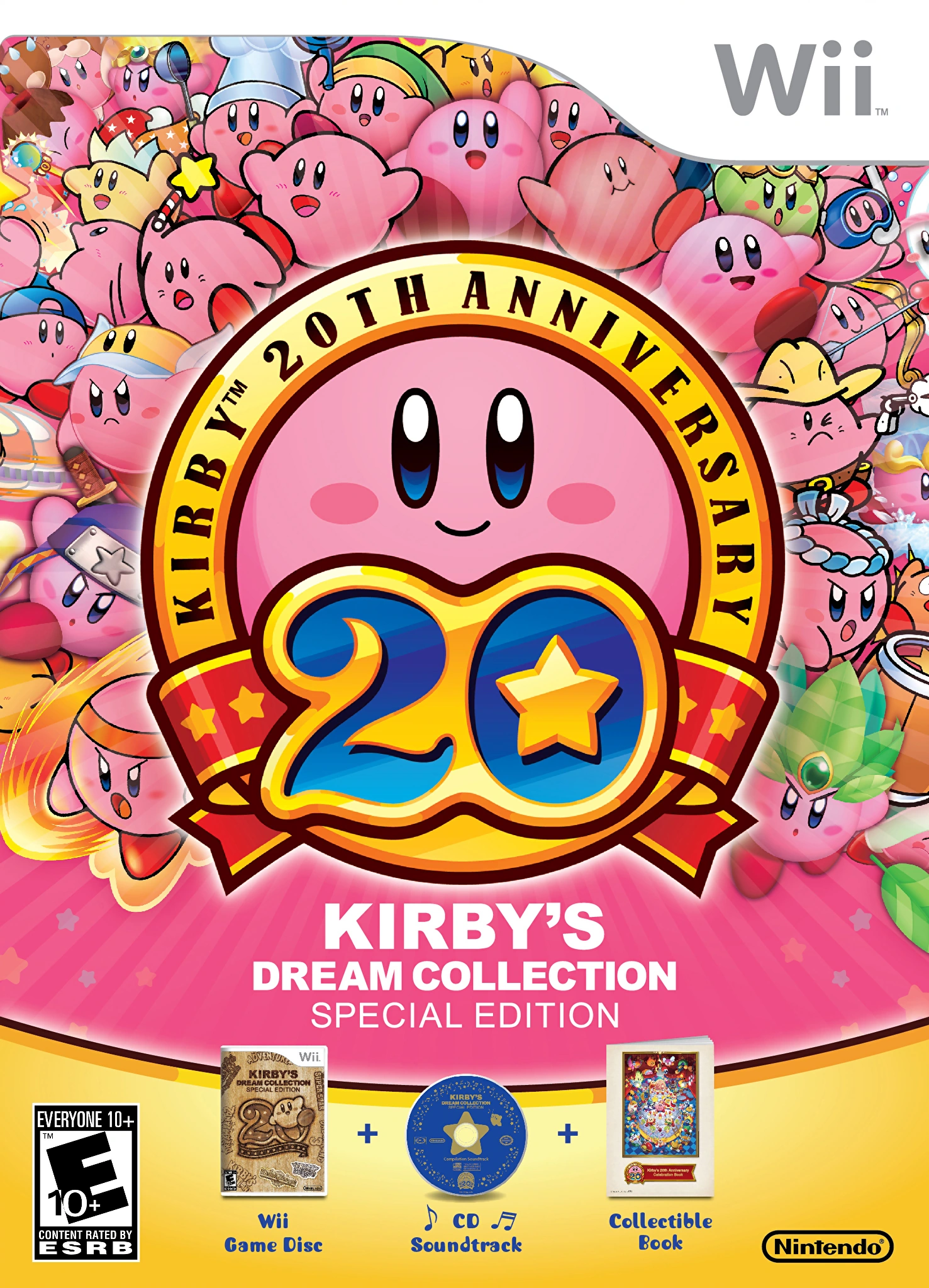
Jesse_Custer 04/22/17 8:42:30 PM #111: |
38. Kirby's Dream Collection - Johnbobb
http://vignette4.wikia.nocookie.net/kirby/images/3/38/KDCol_US_Box_art.png/revision/latest?cb=20120729134957&path-prefix=en Originality: 5.5 Aesthetic: 5.75 Story: 5 Personal: 5.25 Average: 5.375 That's a whole lot of dum pink balls. It's a nice presentation with an interesting way of showing Kirby’s adaptive nature with his many forms. Some of them are basically Kirby with a hat, but there's still a wide range of different Kirbys here that keep the image interesting. It's not something that would personally entice me to play the game, but it is eye-catching and it looks good. The problem for the Story factor is there's just so much you can convey by showing different forms of a character. This is almost like displaying Mario with a bunch of his different power-up forms all at once, which wouldn't tell you much beyond a game mechanic. But Kirby’s personality at least comes through here, simplistic though it may be, and that at least brings this to an average Story score. The artwork is simplistic and child-friendly like the covers for many Nintendo games, but I think it looks good. And there's some variation of color in there so it doesn't just look like someone spilled a bottle of Pepto Bismol as it easily could have. But obviously there's not a lot of complexity to the artwork and it's hardly a work of art to hang on the wall. ... Copied to Clipboard!
|
|
Jesse_Custer 04/22/17 10:14:16 PM #112: |
37. Fullmetal Alchemist volume 13 - TexWolf_1729
http://vignette3.wikia.nocookie.net/fma/images/8/83/FMA_13.jpg/revision/latest?cb=20151008043846 Originality: 5.75 Aesthetic: 5.25 Story: 5.75 Personal: 5 Average: 5.44 I'm a fan of FMA (the original anime series), but this cover doesn't do much for me personally. I prefer badass Edward Elric to kind of mopey Edward Elric with an eye in his chest. The artwork isn't all that impressive, with a literal line for Edward’s mouth. But the overall presentation is good with some novelty, particularly those black arms with hands coming out of his chest and that weird eyeball. There's not that much personality to Edward here, but the Story score is benefitted by those bizarre elements mentioned above, hinting that there's a darkness within Edward, perhaps trying to escape. Also enhancing the story are the chains surrounding Edward as if he's trying to contain this dark power. As it's been awhile since I've watched FMA, I don't remember anything about this eye, but I'm going on just the cover anyway, and that's the story it suggests to me. ... Copied to Clipboard!
|
|
Jesse_Custer 04/22/17 11:39:09 PM #113: |
36 (tie). Formula E by Game Salute - Simoun
https://cf.geekdo-images.com/images/pic1502976.jpg Originality: 5.25 Aesthetic: 5.5 Story: 5.75 Personal: 5.25 Average: 5.44 At first glance, this cover might seem to warrant a higher Originality score, since elephant racing isn't the most typical sight. But my intention with that factor isn't really to award points for unusual scenes that make sense within the context of their reality like this one, but rather images that are stylistically novel. And stylistically speaking, this image isn't all that unique. I'm also not exactly blown away by the artwork, which is fairly cartoonish and simple. Zooming in on the faces of the characters riding the elephants reveals little detail, and that tiger in the upper right looks kind of silly. But the coloring is very nice, and I'm a bit of a sucker for bright colors like this. Story is the best scoring factor here, although not by much. The look of surprise on the face of the woman to the left reveals that this is an unusual occurrence, even in the exotic setting. And the look of joy on the face of the boy riding the elephant gives us a good sense of personality. ... Copied to Clipboard!
|
|
scarletspeed7 04/23/17 12:19:34 AM #114: |
So I have this weird pet peeve. I don't like when characters obscure the title font. It's okay in very rare instances in comics, but generally I dislike that. I feel like it's really poor use of a logo you paid someone to make.
--- "Reading would be your friend." ~Dave Meltzer ... Copied to Clipboard!
|
|
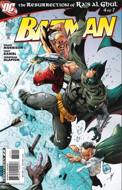
Jesse_Custer 04/23/17 12:25:51 AM #115: |
I never really thought about it, but I see your point. I can only imagine what you thought of this cover:
http://2.bp.blogspot.com/-1hkRKRPOZfg/VZRsGQtEbvI/AAAAAAAAAZ4/Gxhd9BYPNOE/s640/Batman671.jpg ... Copied to Clipboard!
|
|
Simoun 04/23/17 1:10:55 AM #116: |
Stylistically novel. Got it, chief :D
--- It's not so cliche anymore when it's happening to you. ... Copied to Clipboard!
|
|
scarletspeed7 04/23/17 1:26:34 AM #117: |
Jesse_Custer posted...
I never really thought about it, but I see your point. I can only imagine what you thought of this cover: I have other problems with that cover overall, but that's such a big offender. So much open space and you have to clutter everything at the top? Shame! --- "Reading would be your friend." ~Dave Meltzer ... Copied to Clipboard!
|
|
Jesse_Custer 04/23/17 9:22:42 AM #118: |
36 (tie). Tales of the Green Hornet Vol; 2 # 3 - Gundammike
https://d1466nnw0ex81e.cloudfront.net/n_iv/600/897793.jpg Originality: 5.25 Aesthetic: 5.75 Story: 5.5 Personal: 5.25 Average: 5.44 Probably the best thing about this cover is how the visual presentation is used to tell a story, showing the commanding presence of the heroes in the sky, with details of the city visible through them as if to show that they are a part of the city itself, and a more literal picture below of the heroes in action. The artwork is pretty good for the most part. It looks a bit dated, but the faces of the characters are nicely portrayed, along with plenty of cool details to the city behind. Also, the lighting on the street looks really nice. Perhaps if I cared about the Green Hornet, I would like the cover more on a personal level, but it gets the job done. ... Copied to Clipboard!
|
|
scarletspeed7 04/23/17 11:45:09 AM #119: |
Do you like the Green Hornet covers Alex Ross did?
--- "Reading would be your friend." ~Dave Meltzer ... Copied to Clipboard!
|
|
Jesse_Custer 04/23/17 12:14:45 PM #120: |
scarletspeed7 posted...
Do you like the Green Hornet covers Alex Ross did? Some of them look pretty cool. I particularly like his Batman '66 Meets the Green Hornet covers like these: https://s-media-cache-ak0.pinimg.com/564x/37/57/cf/3757cf691f87a1b8b2c3bba5a8d04a23.jpg http://www.nerdist.com/wp-content/uploads/2014/06/BatmanGreenHornet_Ross_4_Cov_rgb.jpg ... Copied to Clipboard!
|
|
Snake5555555555 04/23/17 12:17:38 PM #121: |
I love that you can see Joker's mustache on the 2nd cover.
--- Death or glory becomes just another story http://tinyurl.com/jqx883t - http://tinyurl.com/zqwzc9a - http://tinyurl.com/k89vzw9 ... Copied to Clipboard!
|
|
Jesse_Custer 04/23/17 12:35:48 PM #122: |
Snake5555555555 posted...
I love that you can see Joker's mustache on the 2nd cover. That's my favorite detail of the cover as well. It's almost like looking at an actual picture of Cesar Romero as The Joker. ... Copied to Clipboard!
|
|
Gundammike 04/23/17 2:13:12 PM #123: |
Jesse_Custer posted...
Perhaps if I cared about the Green Hornet, I would like the cover more on a personal level, but it gets the job done. I should personally hunt you down and make you love the Green Hornet, but nah.....we cool. --- You will respect the power of a Newtype Super Saiya-jin Jedi Master!" ... Copied to Clipboard!
|
|
Jesse_Custer 04/23/17 3:23:13 PM #124: |
Gundammike posted...
Jesse_Custer posted...Perhaps if I cared about the Green Hornet, I would like the cover more on a personal level, but it gets the job done. Admittedly, I have little familiarity with the character. Did you watch the old TV series or got into him through the comics? ... Copied to Clipboard!
|
|
Jesse_Custer 04/23/17 3:25:51 PM #125: |
34. Astro City #33 - scarletspeed7
http://vignette3.wikia.nocookie.net/marvel_dc/images/e/e0/Astro_City_Vol_3_33.jpg/revision/latest?cb=20160319051221 Originality: 5.25 Aesthetic: 5.5 Story: 5.75 Personal: 5.5 Average: 5.5 Honestly, I feel Alex Ross is capable of better artwork than this. It's clearly above average art, but I expect a higher standard from him. Ross has the ability to make something as fantastic as superheroes seem completely believable and realistic with his depictions, but I don't get much of that vibe from this cover. This probably sounds more negative than is actually intended, but it's because I have such a high regard for Ross’ work. Also bringing down the Aesthetic score a bit is how much of the cover is just blackness (even if that was an intentional design choice to use the spotlight effect), as I'm not a fan of lack of variation to background coloring. Despite looking a bit less realistic than I feel it could, this cover effectively tells the story of an ordinary guy who happens to have powers, not your typical member of the Justice League. That comes across in his attire that looks like something any number of office workers would have worn in a prior era, as opposed to a superhero costume. Lastly, I don't see anything about this cover that makes it particularly unique. It's certainly not a derivative image, and it's a dynamic scene that captures the essence of the action as much as possible with a single page. But it's not jumping out to me as novel enough in presentation to warrant a higher Originality score. ... Copied to Clipboard!
|
|
Gundammike 04/23/17 3:57:09 PM #126: |
Jesse_Custer posted...
Gundammike posted...Jesse_Custer posted...Perhaps if I cared about the Green Hornet, I would like the cover more on a personal level, but it gets the job done. Started with the old TV series, and then followed that up with the Now Comics run. That comics run(which the cover chosen is from) basically continued on from what happens after the TV series ended, the next generation of Hornet & Kato(the nephew of the TV series' Hornet & younger sister of Kato, until they were forced to put Bruce Lee back as Kato), and even dealt with the old radio serials being the original Hornet. Basically the comics had it go like this: The Lone Ranger(the great grandfather of Britt Ried) Britt Reid 1 & Ikano Kato (the old radio serial & movie serials Hornet & Kato) Britt Reid 2 & Hayashi Kato (Van Williams & Bruce Lee, as the sons of the radio/movie serial Hornet & Kato) Alan Reid & Hayashi Kato (the nephew of the TV series Hornet, dies on his first night out) Paul Reid & Mishi Kato (Alan's younger brother who is reluctant to take up the mantle & Hayashi's younger half-sister) Paul Reid & Hayashi Kato (They had to sober up Kato as he'd taken up drinking after allowing his best friend's son to die, basically the rights holders complained about a female Kato & wanted Bruce Lee back) Mishi Kato became as the vigilante Crimson Wasp Paul Reid & Kono Kato (Grandson of Ikano and nephew of Hayashi and Mishi, so you didn't have a 60-70 year old Kato running around) --- You will respect the power of a Newtype Super Saiya-jin Jedi Master!" ... Copied to Clipboard!
|
|
scarletspeed7 04/23/17 5:09:20 PM #127: |
Hmm, I find that image so striking with the bright yellow streaks highlighted so boldly against the stark black background.
--- "Reading would be your friend." ~Dave Meltzer ... Copied to Clipboard!
|
|
Jesse_Custer 04/23/17 9:17:10 PM #128: |
33. The Imaginarium of Doctor Parnassus - Johnbobb
http://images3.static-bluray.com/movies/covers/10088_front.jpg Originality: 6 Aesthetic: 5.75 Story: 5.5 Personal: 5.75 Average: 5.75 I'm a fan of Terry Gilliam’s work, with Brazil being my second favorite movie of all time, and somehow I didn't even know this movie existed. Thanks to this nomination, I decided to check out the movie (which was not Gilliam’s best work, but was ok). That being said, I'm doubtful this cover alone would intrigue me to watch the movie without seeing the names Terry Gilliam and Heath Ledger. There's definitely some unique aspects to this cover such as the checkered-floor cube the characters appear to be in, and most obviously, the dream-like world depicted in the mirror. And a decent amount of story can be inferred from that mirror world showing things like a guy on enormous stilts and a surreal, brightly colored environment. The problem is there's also plenty of the cover devoted to showing off the cast just standing around doing nothing, which prevents the story score from going higher. And the cover is actually relatively tame for a Gilliam film, providing only a hint of the insanity. But it looks fairly interesting anyway. ... Copied to Clipboard!
|
|
Johnbobb 04/23/17 9:34:40 PM #129: |
Dr. Parnassus gets a pretty mixed reception, but it's honestly my favorite Gilliam movie.
--- Khal Kirby, warlord of the Super Star Khalasar PSN/Steam: CheddarBBQ http://i.imgur.com/sRNNOSP.png ... Copied to Clipboard!
|
|
Jesse_Custer 04/23/17 9:45:28 PM #130: |
Johnbobb posted...
Dr. Parnassus gets a pretty mixed reception, but it's honestly my favorite Gilliam movie. What do you think of Brazil? ... Copied to Clipboard!
|
|
Johnbobb 04/23/17 9:47:25 PM #131: |
Jesse_Custer posted...
Johnbobb posted...Dr. Parnassus gets a pretty mixed reception, but it's honestly my favorite Gilliam movie. I was a big of it Hell, in many ways Brazil is objectively better, I just enjoyed Parnassus more Imaginarium > 12 Monkeys > Brazil > The Zero Theorem > Fear and Loathing --- Khal Kirby, warlord of the Super Star Khalasar PSN/Steam: CheddarBBQ http://i.imgur.com/sRNNOSP.png ... Copied to Clipboard!
|
|
Jesse_Custer 04/23/17 9:50:48 PM #132: |
Oh yeah, 12 Monkeys is also fantastic, even if I am partial to Brazil.
Zero Theorum didn't work for me, which surprised me because I usually really like Christoph Waltz. ... Copied to Clipboard!
|
|
Johnbobb 04/23/17 9:53:26 PM #133: |
Jesse_Custer posted...
Oh yeah, 12 Monkeys is also fantastic, even if I am partial to Brazil. Zero Theorem I have mixed feelings about. Waltz himself was great, but the movie was a little all over the place --- Khal Kirby, warlord of the Super Star Khalasar PSN/Steam: CheddarBBQ http://i.imgur.com/sRNNOSP.png ... Copied to Clipboard!
|
|
Jesse_Custer 04/23/17 11:39:38 PM #134: |
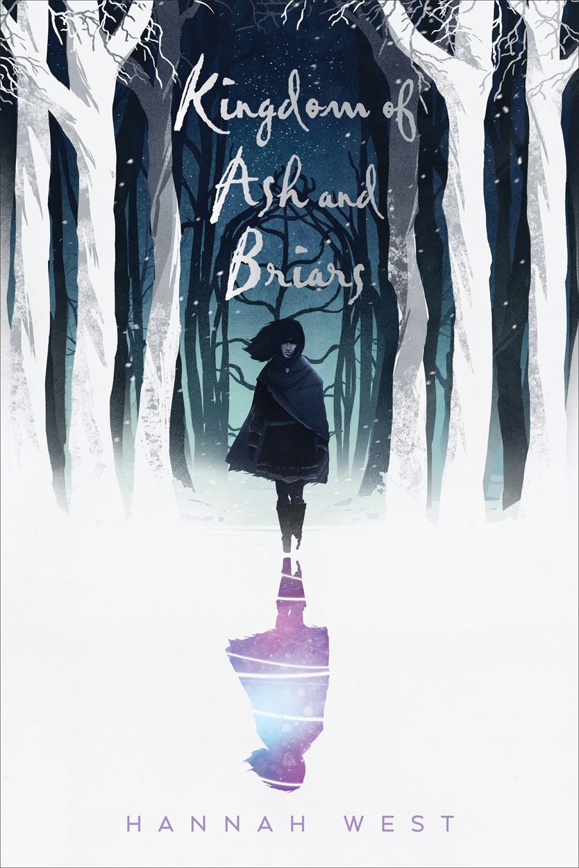
32. Kingdom of Ash and Briars - Hannah West - Gatarix
https://images-na.ssl-images-amazon.com/images/I/71UJwoNTTbL.jpg Originality: 5.75 Aesthetic: 5.75 Story: 6.25 Personal: 5.5 Average: 5.81 I think I get what they were going for here, depicting a discolored and partially obscured shadow of the mysterious character, likely suggesting some dark power the character possesses. While I like the cover, what held it back from scoring even higher is that the character is by far the most interesting aspect. And while it helps makes the shadow stand out visually, there's too much white on the cover, which seems like a missed opportunity to portray the intrigue of what looks like a cool fantasy-based world. Despite all the white and the overly simplistic appearance of the trees, the cover looks pretty nice overall. And I get a surprisingly strong sense of atmosphere to boost that Story score even from the little bit we’'re given. I just can't help but think this cover design feels almost unfinished. ... Copied to Clipboard!
|
|
Jesse_Custer 04/24/17 9:47:19 AM #135: |
31. Kendrick Lamar- To Pimp a Butterfly - Bane_Of_Despair
http://static.highsnobiety.com/wp-content/uploads/2015/03/kendrick-lamar-album-artwork-to-pimp-a-butterfly-000.jpg Originality: 5.75 Aesthetic: 5.25 Story: 6.25 Personal: 6 Average: 5.81 At first glance, this cover might not seem like anything special. And some guys holding a bunch of money seems like it was a cliche in rap music back in the 90s. But even if you know nothing about the album (and for purposes of this topic, only the cover is what matters), there's more going on here that warrants an above average Originality score. For one thing, the use of black and white photography is somewhat unusual, and seems intended here to highlight racial issues in America, particularly given the setting with the White House in the background. Also, that Judge with x’s for eyes lying on the ground is easy to miss at first, but is a striking image. The cover scored the best in Story because there's a lot going on here. The Judge is likely symbolic of racism and corruption in the criminal justice system. There's also an interesting placement of a boy with a pixelated middle finger right over the Parental Advisory label, which conveys obvious messages about censorship. Altogether, it's a bold cover with plenty to say, although there's almost too much going on to get a single clear-cut story across, which prevents the Story factor from going even higher. While it's an interesting cover to look at, I can't really go any higher for the Aesthetic score. The use of black and white is an effective design choice and the presentation is good, but it's still basically a bunch of guys standing around in a Photoshopped image of the White House. Lastly, I might have given a slightly lower Personal score, but a certain user’s topic whining about Lamar and his new album (I'm sure Bane knows who I'm thinking of) just made me appreciate anything associated with the rapper more. So bonus points for this cover. ... Copied to Clipboard!
|
|
Jesse_Custer 04/24/17 4:48:32 PM #136: |
30. Lost Horizon - Awakening the World - FL81
http://www.oncelosthorizon.com/awakeningtheworld/album_1_big.jpg Originality: 6.75 Aesthetic: 5.25 Story: 6.5 Personal: 5 Average: 5.875 This one seems like two entirely different concepts that don't belong together in the same cover. I actually like the bottom half with the bizarre scene of anthropomorphized animals in suits enslaving humans. But then the top half of the picture with the band walking out of a black hole as if to save the day seems so dumb. The mishmash of ideas actually wound up enhancing the uniqueness and sense of story with so much going on here, but it made the cover look worse by combining pictures of the actual band members with a drawing that has such a different tone. The shame of it is if the band could have gotten over their ego enough to not throw themselves into the cover, there was actually an interesting concept here. I would have liked to see more exploration of the bizarre symbolism with the animal businessmen holding the puppet strings of the humans. But it was enough for a good score overall anyway. ... Copied to Clipboard!
|
|
Jesse_Custer 04/24/17 8:27:12 PM #137: |
29. Serj Tankian - Imperfect Harmonies - Murphiroth
https://m.imgur.com/hFqPnjQ?r Originality: 6.25 Aesthetic: 5.75 Story: 6.5 Personal: 5.25 Average: 5.94 I feel like there's some Two-Face joke to be made here, but I'm not coming up with anything good enough. This is a pretty cool concept with a lot of symbolism. Obviously there's a duality going on here, but it's portrayed in a fairly novel way. We have two very different environments, one nature and the other a heavily developed city. And it's cool the way the nature scene uses such vibrant colors, while the city is bleak grey. I think they could have highlighted this distinction even more by going with a brighter blue sky on the left, which looks a bit drab, but they certainly got that theme across with the green grass. There’s also that two-shaded cloth thing in the center, with a few holes torn through on the city side. And of course there's the very unusual outfit being worn by the guy that plays with black against white. All those elements together give a lot to analyze, which is open to some degree of interpretation, and it makes for a good Story score. The only reason I didn't go higher on the Originality score is that I've seen plenty of other covers with a similar concept, although this one has a bit more complexity than they usually do. As for the Aesthetic score, everything is nicely laid out, but the nature scene on the left is kind of simplistic, and looks like it could be the cover for some New Age album, and the right side is almost lost by comparison given its muted coloring. Overall, it's not that visually impressive, but it's a very good presentation nonetheless. ... Copied to Clipboard!
|
|
Jesse_Custer 04/25/17 8:46:13 AM #138: |
28. Fairest #2 - scarletspeed7
http://orig15.deviantart.net/8438/f/2012/030/6/9/fairest_cover_2_by_adamhughes-d4o6eb5.jpg Originality: 5.5 Aesthetic: 6.5 Story: 6.25 Personal: 5.5 Average: 5.94 I don't think I've ever seen a bad Adam Hughes cover, but they rarely give me that wow factor, and this one is a similar thing. It's an attractive cover with some great details that most other artists wouldn't bother with like the veins under the skin in the guy’s arm. The coloring is also very good, with variant shading used to create a sense of lighting on the skin of the characters. There's a decent sense of story here as a demonic cherub interrupts the kiss, much to the surprise of the lovers, and plants a kiss on the woman’s cheek. This works as offbeat comedy, but it could also be interpreted as symbolic of a romance gone wrong. And there's a good deal of personality to the characters, particularly the woman (who is obviously the best drawn because this is an Adam Hughes cover and drawing women is what he does best). There's some degree of originality here by playing with the iconic image of the angelic cherub making people fall in love, and the contrast of that winged creature’s darkness with how bright the rest of the cover is. But the presentation and layout doesn't strike me as all that novel. ... Copied to Clipboard!
|
|
Jesse_Custer 04/25/17 2:04:28 PM #139: |
Sure is quiet in here, going to assume people are still following.
27. The Legend of Zelda: Breath of the Wild - Murphiroth https://m.imgur.com/R86Qdqt?r Originality: 4.5 Aesthetic: 7.75 Story: 5.25 Personal: 6.25 Average: 5.94 On a purely aesthetic level, this is a fantastic cover. The perspective behind Link looking out at the realm was a good choice, the layered use of colors makes for a nicely varied image, and the panorama is really attractive with plenty of details. The only portion of the artwork I feel could use a bit of improvement is the rock and plants beneath Link, which aren't quite up to par with the magnificent clouds and landscape, but the overall image is so well done that you can spend awhile just taking it all in. What held this cover back is there's not much more to say about it other than to comment on the high quality of the artwork. We get some sense of the adventure that lies ahead for Link, but it's not much of a story. And as much as I like the choice of perspective, there's nothing particularly original about it. There are plenty of covers in various medium just like this (albeit not usually as pretty) with a character looking out at the world. I wouldn't go so far as to call it generic, but there's nothing that special about it either other than it looking really nice. ... Copied to Clipboard!
|
|
NBIceman 04/25/17 3:02:24 PM #140: |
... Copied to Clipboard!
|
|
scarletspeed7 04/25/17 3:04:11 PM #141: |
I really don't have a response to "I don't like Adam Hughes." You also get a much higher response rate than my projects, so you shouldn't complain! :P
--- "Reading would be your friend." ~Dave Meltzer ... Copied to Clipboard!
|
|
Jesse_Custer 04/25/17 3:07:42 PM #142: |
scarletspeed7 posted...
I really don't have a response to "I don't like Adam Hughes." Wait, I never said I don't like Hughes. I said I've never actually seen a bad Hughes cover (not sure I can even say that about any other artist), but only a few of them really "wow" me. I know I posted a Hughes cover that was something I really liked in my comics topic, but I don't remember what it was offhand. ... Copied to Clipboard!
|
|
Gatarix 04/25/17 3:08:03 PM #143: |
tbh my favorite part of the BotW cover is that font. The rest is just kind of generic-pretty, but the font is top tier.
--- You put your RESOLVE HAT back on, which conveniently is the same hat as your NORMAL HAT. {Drakeryn} ... Copied to Clipboard!
|
|
scarletspeed7 04/25/17 3:08:56 PM #144: |
Jesse_Custer posted...
scarletspeed7 posted...I really don't have a response to "I don't like Adam Hughes." All I see is a Hughes hating apologist. --- "Reading would be your friend." ~Dave Meltzer ... Copied to Clipboard!
|
|
Jesse_Custer 04/25/17 3:13:57 PM #145: |
Oh that's right, this was the one I highlighted in the comic covers topic:
http://www.justsayah.com/art/20673/Wonder_Woman_#184/ ... Copied to Clipboard!
|
|
scarletspeed7 04/25/17 3:23:55 PM #146: |
There's a great Wonder Woman/Lois Lane cover too.
--- "Reading would be your friend." ~Dave Meltzer ... Copied to Clipboard!
|
|
Jesse_Custer 04/25/17 3:39:34 PM #147: |
scarletspeed7 posted...
There's a great Wonder Woman/Lois Lane cover too. Is this it? https://precinct1313.files.wordpress.com/2015/11/ww-v2-170.jpg ... Copied to Clipboard!
|
|
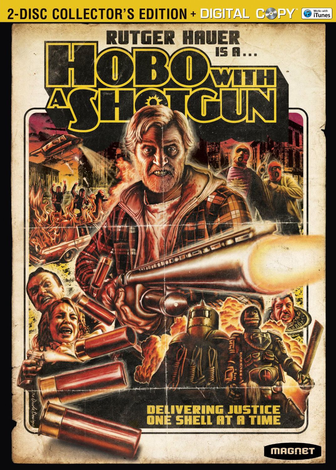
Jesse_Custer 04/25/17 7:07:33 PM #148: |
26. Hobo with a Shotgun - Johnbobb
http://cdn.collider.com/wp-content/uploads/hobo-with-a-shotgun-dvd-cover.jpg Originality: 5.75 Aesthetic: 6 Story: 7.5 Personal: 4.75 Average: 6.0 What makes this cover stand out most is that it looks like it could have been the cover art for a movie released decades ago (in fact, this is a 2011 film). Since its style is something of a tribute to older style film covers, there's just so much I can award for Originality, although the cover certainly has several striking and unusual images that contribute to the score. The Aesthetic score was a challenge here because I don't really find this to be an attractive cover that's easy on the eyes, and the red shading is a bit oppressive. But these were clearly intentional design choices. And there's an astonishing amount of personality and Story that comes through in the artwork from that crazy expression on the hobo’s face to the creepy scene in the lower left with that angry guy holding the woman. And I don't even know where to begin with the oddity of the characters in the lower right. It seems like they took a bunch of key scenes from the movie and recreated them in this distinctive art style, and the layout of images is quite good to create a cohesive picture. So this is a situation where the ability to tell a story visually has really boosted the Aesthetic score. It's not a cover I personally enjoy or that would make me want to check out the movie, but I could easily see the appeal in an objective sense. And it's an effective cover at presenting a movie in a way that has become unconventional today. ... Copied to Clipboard!
|
|
scarletspeed7 04/25/17 7:08:38 PM #149: |
Jesse_Custer posted...
scarletspeed7 posted...There's a great Wonder Woman/Lois Lane cover too. Yeah that's the one. --- "Reading would be your friend." ~Dave Meltzer ... Copied to Clipboard!
|
|
Jesse_Custer 04/25/17 10:24:30 PM #150: |
25. Action Comics #1 - Anagram
https://upload.wikimedia.org/wikipedia/en/5/5a/Action_Comics_1.jpg Originality: 6 Aesthetic: 5.5 Story: 6.5 Personal: 6 Average: 6.0 The cover for the comic that introduced Superman to the world is one of the most famous covers of all time. It did so in a weird way by portraying Superman as less of a hero, and more of an overpowered menace to society. Sure, he's probably smashing that car into pieces to teach some criminal a lesson, but look at the utter terror of the people around him. In particular, that guy in the lower left running away who looks like he's shitting his pants over Superman’s rampage of destruction. That's not how you would expect them to initially present a guy who's trying to help people, and it makes the comic more intriguing to read and find out what kind of hero this is. As for the aesthetic value, obviously the art is extremely dated, but the overall presentation is quite good. The car looks believable, Superman is in a dramatic pose, and the reaction of the guy in the lower left contributes a lot to create an almost movie-like scene. Surprisingly, it's still an interesting image to this day. Overall, I think it's one of the best covers of its era, regardless of its historical importance. ... Copied to Clipboard!
|
| Topic List |