SMRPG nerds unite.
--
[NO BARKLEY NO PEACE]
Board 8 > Zen Talks About the Match Pics Part 2: Spirit of Vengeance
| Topic List | |
|---|---|
|
AxemRedRanger 12/11/11 2:58:00 PM #251: |
... Copied to Clipboard!
|
|
KamikazePotato 12/11/11 3:03:00 PM #252: |
Not a SMRPG nerd, but that pic is pretty swanky.
-- Black Turtle did a pretty good job. ... Copied to Clipboard!
|
|
Oranejo 12/11/11 3:24:00 PM #253: |
From: LeonhartFour | #195 Thanks, I remember getting a good amount of positive feedback for that one. Although I think some people felt that idea should have been saved for the finals. Looking at the CBVIII pictures I had four of mine accepted (Protoman Rd1, Big Daddy TV round, Ehrgeiz Cloud vs Ryu, and the one I quoted), but in this contest I have only submitted one. :/ -- Black Turtle keeps that Guru Jeep ridin'. ... Copied to Clipboard!
|
|
greatone10 12/11/11 8:16:00 PM #254: |
SMRPG is my second favorite game ever, but I do think the sprites should stand out a little bit more. Nonetheless, I would love for that to get picked.
-- "Go get me Jared...from Subway!" -- CM Punk This line reserved for Rivalry Guru winner. ... Copied to Clipboard!
|
|
LeonhartFour 12/11/11 8:17:00 PM #255: |
From: XIII_socks | #249 It's instantly clear to anyone who's played 5 minutes of Mario RPG. Seriously. That scene happens in the first 5 minutes of the game. But yeah, the brightened version is much better, TRE. -- http://www.gifsoup.com/view/593815/frasier-and-niles-dance-o.gif ... Copied to Clipboard!
|
|
GANON1025 12/11/11 10:21:00 PM #256: |
Another go at Mario/Bowser/X/Zero:
 -- You beat yourself up with your past. Don't blame yourself, blame the world. Blame God. Blame me. ... Copied to Clipboard!
|
|
Menji76 12/12/11 12:45:00 AM #257: |
Mega's look a bit saturated imo
But I love the font. -- Menji~ Shotgun, BANG. What's up with that thang? ... Copied to Clipboard!
|
|
Menji76 12/12/11 1:24:00 AM #258: |
Also, are images from soon to be released games, fair game?
-- Menji+ What Will Never Be the Greatest. http://img85.imageshack.us/img85/8184/ffxiii.gif ... Copied to Clipboard!
|
|
greatone10 12/12/11 3:26:00 AM #259: |
From: Menji76 | #258 Yeah. I believe Link got TP art before the game was released, and I know Lightning definitely got art from a game that hadn't been released yet (well duh). -- "Go get me Jared...from Subway!" -- CM Punk This line reserved for Rivalry Guru winner. ... Copied to Clipboard!
|
|
ZenOfThunder 12/12/11 6:40:00 AM #260: |
siiigh this contest is killing me
never before have I see the life so sucked from the very pics we create -- ~Zen ... Copied to Clipboard!
|
|
The Mana Sword 12/12/11 6:48:00 AM #261: |
I actually have a WACKY idea for Mario/MMX, but I don't know if I'll be able to finish it before the match.
-- I wish I could wear skirts and dresses :( -GMUN ... Copied to Clipboard!
|
|
ZenOfThunder 12/12/11 6:55:00 AM #262: |
START NOOOW
-- ~Zen ... Copied to Clipboard!
|
|
The Mana Sword 12/12/11 6:57:00 AM #263: |
Can't, at work!
I mean, I guess I could always just save it for Mario/Trainers, but I don't think Trainer pictures will let itself very well to the theme. -- I wish I could wear skirts and dresses :( -GMUN ... Copied to Clipboard!
|
|
greatone10 12/12/11 5:23:00 PM #264: |
     -- "Go get me Jared...from Subway!" -- CM Punk This line reserved for Rivalry Guru winner. ... Copied to Clipboard!
|
| #265 | Post #265 was unavailable or deleted. |
|
GANON1025 12/12/11 5:38:00 PM #266: |
Oh wow, both of my entries were chosen.
-- You beat yourself up with your past. Don't blame yourself, blame the world. Blame God. Blame me. ... Copied to Clipboard!
|
| #267 | Post #267 was unavailable or deleted. |
|
LeonhartFour 12/12/11 6:36:00 PM #268: |
From: UltimaterializerX | #265 Considering he made it for Mario/Bowser vs. Trainers, it would be very odd if it were picked! -- http://img.imgcake.com/leonpngpe.png http://img.imgcake.com/squalloweenpngem.png ... Copied to Clipboard!
|
| #269 | Post #269 was unavailable or deleted. |
|
GANON1025 12/12/11 7:12:00 PM #270: |
Yes, 4 is also mine. That font is Visitor.
-- You beat yourself up with your past. Don't blame yourself, blame the world. Blame God. Blame me. ... Copied to Clipboard!
|
| #271 | Post #271 was unavailable or deleted. |
|
ZenOfThunder 12/12/11 8:00:00 PM #272: |
I don't make good pictures! Just ones with lots of technical crap going on. I can't be creative for crap.
Will write up the 5(!) pics when I'm done with this OTHER FINAL -- ~Zen ... Copied to Clipboard!
|
|
AlecTrevelyan006 12/12/11 8:05:00 PM #273: |
From: GANON1025 | #270 I like the Mario Strikers art. Or rather I like Mario Strikers. -- http://img.imgcake.com/alecoweenpngam.png http://img.imgcake.com/alecpngym.png ... Copied to Clipboard!
|
|
GANON1025 12/12/11 8:07:00 PM #274: |
I have not played the games, but I do like the art. It is hard to find any really angry-looking Marios.
-- You beat yourself up with your past. Don't blame yourself, blame the world. Blame God. Blame me. ... Copied to Clipboard!
|
|
AsurasKordoth 12/12/11 8:12:00 PM #275: |
From: greatone10 | #259 To be fair it was released in Japan. -- -Merc ... Copied to Clipboard!
|
|
Menji76 12/12/11 8:23:00 PM #276: |
I used it anyway!
-- Menji+ What Will Never Be the Greatest. http://img85.imageshack.us/img85/8184/ffxiii.gif ... Copied to Clipboard!
|
|
AlecTrevelyan006 12/12/11 8:49:00 PM #277: |
 Oh man I forgot that pic I outright laughed when I saw that -- ##Alec ... Copied to Clipboard!
|
|
ZenOfThunder 12/12/11 8:56:00 PM #278: |
I wish I made the background better. I was bad at backgrounds back then. REALLY bad.
-- ~Zen ... Copied to Clipboard!
|
| #279 | Post #279 was unavailable or deleted. |
|
ZenOfThunder 12/12/11 9:40:00 PM #280: |
I think the top destroys the bottom. The attention goes completely to the top. The palette is so much brighter.
-- ~Zen ... Copied to Clipboard!
|
| #281 | Post #281 was unavailable or deleted. |
|
ZenOfThunder 12/12/11 9:59:00 PM #282: |
Blame whoever designs Metroid, for I guess they also do not have access to brightness/contrast and vibrance adjustment layers
 -- ~Zen ... Copied to Clipboard!
|
|
Lopen 12/12/11 10:04:00 PM #283: |
That's probably the darkest area in Metroid.
Granted I guess it's Norfair so it fits but yeah. That area typically looks a lot brighter in game because the foreground is a lot brighter with the lava and stuff. -- No problem! This is a cute and pop genocide of love! ... Copied to Clipboard!
|
|
Dauntless Hunter 12/13/11 12:11:00 AM #284: |
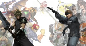
From: UltimaterializerX | #265 Don't you think 8 Marios vs 4 Bowsers on top and 2 Xs vs 2 Zeros on the bottom is a little unbalanced? -- [NO BARKLEY NO PEACE] ... Copied to Clipboard!
|
|
Agent M 12/13/11 1:56:00 AM #285: |
Heh, looks like the text in my picture was edited out before being used. I've tried the non-text route and it always feels like it's missing something. But I think it looks good without text too.
... Copied to Clipboard!
|
|
greatone10 12/13/11 3:10:00 AM #286: |
Allen seems dead set on only accepting pics with the games completely separated.
It's a shame because I'd rather do pics that pit the heroes and villains against each other in combat. It makes them stand out from the early round pics better. -- "Go get me Jared...from Subway!" -- CM Punk This line reserved for Rivalry Guru winner. ... Copied to Clipboard!
|
|
Agent M 12/13/11 3:52:00 AM #287: |
Can anyone tell me if this art is official? I've never played Pokemon, so I kind of have a hard time knowing what art I can use.

... Copied to Clipboard!
|
|
Orochimaru_Fan 12/13/11 4:09:00 AM #288: |
That... looks like manga art tbqh. That should be official enough, I suppose
Edit: Yup, it is. http://bulbapedia.bulbagarden.net/wiki/Blue_(Adventures) ... Copied to Clipboard!
|
|
greatone10 12/13/11 4:49:00 AM #289: |
I'd be sure to let Allen know where it came from in the little text box, so he doesn't think it's fan art.
-- "Go get me Jared...from Subway!" -- CM Punk This line reserved for Rivalry Guru winner. ... Copied to Clipboard!
|
|
Agent M 12/13/11 5:34:00 AM #290: |
Ok, thanks a lot for helping me out there. I added the link just in case.
Here's the picture anyways.... http://imageshack.us/photo/my-images/707/trainersmetroid.png/ No confusing "VS" this time. Ridley is kind of awkward when it comes to mug shots. ... Copied to Clipboard!
|
|
ZenOfThunder 12/13/11 7:03:00 AM #291: |
Not sure about that text. I'd use something harder.
ANYWAY 57: Mario/Bowser vs X/Zero Pic 1 Why did Zero get pukish yellow-green for his color? Also another thing I don't get is the VS being mirrored as A2. It's a reflection, right? So shouldn't like X and Zero be upside-down or something. I dunno, it bugs me, it was the first thing I noticed. But I really like the gridish feel, I like the texturing here, I like that it seems almost kinda washed out and blurry, but I don't really like the Bowser picture. It came out too dark, I think. I also like the thin line of separation, which is just another good example of how to split your pics without a bevel! Overall: 8/10, excuse my whining Pic 2 Goddamn this pic is a mess. "Imma cram as much as I can into the top pic, but keep the bottom pic relatively simple!" 8 Marios vs 4 Bowsers, huh? Couldn't at least make it 4 on 4? Mario just has so much good art, huh? All that good art that we've seen before. There's no demand to see these pics again. Now the top is a goddamn mess and the bottom is something we could've seen in round 1 but without names and two sprites in an incredibly awkward pose at the bottom. LET US GINGERLY TOUCH OUR TIPS comes to mind. Also, Sigma. ...Because Sigma. And ugly Zero as drawn by the awkward kid in high school. Goddamn. Overall: 2.5/10 Pic 3 Bowser looks fine but the other three look kinda blurry. What happened there? Anyway, this is a pretty cool pic. I like the heavy shadows, it makes it pretty stylized; you usually don't see much drop shadow on sprites. I like the multicolored boxes behind the portraits (ALSO BOWER'S PORTRAIT BORDER LOOKS DIFFERENT AND IT BOTHERS ME) and the layout is nice and the pics in the center are dynamic. It looks like there's a spot for names but it was abandoned, which is fine. Also using a white color overlay to fade the middle backgrounds is pretty classic; KP and I used to do that all the time. Good times, man. Overall: 8/10 -- ~Zen ... Copied to Clipboard!
|
|
ZenOfThunder 12/13/11 7:03:00 AM #292: |
Pic 4
I originally thought the glow around X was anti-aliasing, but then I noticed Zero doesn't have it so I'm wondering if it was done on purpose? Anyway, it's consistent and a bit thicker than regular anti-aliasing and I think it looks kinda nice. It might just be a 1 point stroke that was made transparent, idk, but it kinda works with the pic. I think X nabs the eye because he's more solid blue, while Zero is a mishmash of white, red and some green. There's also a bit more breathing room in the bottom. The top looks so cool but it's like a giant chaotic blurb. The Strikers series has this heavy ink style and the characters are always in super dynamic poses that makes them hard to place (we've all tried making Strikers pics back in the day, I know). As much as I love Strikers I think the art should be used only when the other half also has something dynamic and heavy to use. I'm not sure if this pic got that, but at least X and Zero were in dynamic poses. I think they just needed a filter (GASP) like that sumi-e or whatever to make them appear a bit heavier. Also, cool font choice. Pink vs? Nice. Overall: 7.5/10 Pic 5 I don't know why but I didn't realize that the names were on those bars until I stared for a while. At first I thought they were floating, then I thought they were floating with a little colored rectangle behind them, and then I realized the rectangle went all the way past the name and to the bottom. I'm not sure if this is a bad thing. BACK-TO-BACK is so goddamn cool, and it's a shame that BACK-TO-BACK X/Zero has been used a bit already this contest. It's also a shame that X/Zero have like NO GOOD ART and I want Capcom to do something about that because it's a goddamn shame. Yeah, I think the Capcom guys dominate the eye because they're a lot crisper than some washed out old plumber and turtle. Also I like how the name here is MEGAMAN because I'm sick of just seeing an "X" floating around the picture. MEGAMAN has so much more substance and it seems like it has more purpose than just the dumb ol' "X." White background is also a good choice. I would have torn this apart if there was some weird background that was like half Mario 64 level and half Mega Man X level. Sometimes simple is good, people! This is probably my favorite of the 5, just because it's kinda different kinda. They're all "different" but this one is just like kickin' back and not giving a f***. Overall: 8.5/10 -- ~Zen ... Copied to Clipboard!
|
|
GANON1025 12/13/11 8:45:00 AM #293: |
yeah well WHAT DO YOU KNOW
-- You beat yourself up with your past. Don't blame yourself, blame the world. Blame God. Blame me. ... Copied to Clipboard!
|
|
Surskit 12/13/11 12:41:00 PM #294: |
Pic 4 is the best of the batch by far, imo. So awesome. Using Strikers art is very welcome too.
4 > 5 > 3 > 1 > 2 to me. -- Surskit .-#Elements of Water#-. ... Copied to Clipboard!
|
|
CrimsonOcean 12/13/11 1:18:00 PM #295: |
Hey Zen (or anyone), is there a way in Photoshop to kind of gradually make an image sort of piecey. Or streaky? Sort of like the Speedway logo?
Only with an image, not a letter. -- http://img.imgcake.com/crimjpgpe.jpg Mo' buildings mo' problems ocean kinda grew on me like a flesh eating ...fungus. -BIGPUN9999 ... Copied to Clipboard!
|
|
GANON1025 12/13/11 1:36:00 PM #296: |
Also, the white around the X was not intentional. I had the tolerance way down the magic eraser tool, so when I erased the background around X it left that. At first I thought it was an outer glow around the image, but later I figured it out and took it off for the other picture.
-- You beat yourself up with your past. Don't blame yourself, blame the world. Blame God. Blame me. ... Copied to Clipboard!
|
|
GANON1025 12/13/11 2:35:00 PM #297: |
Future generations will view this match pic and weep at its beauty:
 -- You beat yourself up with your past. Don't blame yourself, blame the world. Blame God. Blame me. ... Copied to Clipboard!
|
|
ZenOfThunder 12/13/11 3:41:00 PM #298: |
From: CrimsonOcean | #295 This would have to be a manual thing that you'd do with the lasso and stuff. It'd take a while :( -- ~Zen ... Copied to Clipboard!
|
|
LeonhartFour 12/13/11 5:38:00 PM #299: |
      -- "The great GF...Bahamut." "...GF? I...? Using my powers...It is you humans...I fear..." ... Copied to Clipboard!
|
|
ZenOfThunder 12/13/11 6:04:00 PM #300: |
...eh
-- ~Zen ... Copied to Clipboard!
|
| Topic List |