ZenOfThunder posted... From: CrimsonOcean | #295 Hey Zen (or anyone), is there a way in Photoshop to kind of gradually make an image sort of piecey. Or streaky? Sort of like the Speedway logo?
Only with an image, not a letter. This would have to be a manual thing that you'd do with the lasso and stuff. It'd take a while :(
Augh, I was afraid of that.
--
http://img.imgcake.com/crimjpgpe.jpg Mo' buildings mo' problems ocean kinda grew on me like a flesh eating ...fungus. -BIGPUN9999
Bowser looks fine but the other three look kinda blurry. What happened there? Anyway, this is a pretty cool pic. I like the heavy shadows, it makes it pretty stylized; you usually don't see much drop shadow on sprites. I like the multicolored boxes behind the portraits (ALSO BOWER'S PORTRAIT BORDER LOOKS DIFFERENT AND IT BOTHERS ME) and the layout is nice and the pics in the center are dynamic. It looks like there's a spot for names but it was abandoned, which is fine. Also using a white color overlay to fade the middle backgrounds is pretty classic; KP and I used to do that all the time. Good times, man.
Overall: 8/10
I was planning to get some better artwork but then I didn't have time.... meh..
I don't know what happened to Bowser's border but it wouldn't go away, it was really odd.
I abuse transparent backgrounds almost as much as outer glow, but it usually helps to contrast with the main artwork.
I thought Mario's background was biased because it's instantly recognizable, whereas the other background is a center square image on the level select in Mega Man X :/
I'll take an 8 though, I basically improvise everything with no technical skill whatsoever!
Alucard seems to have quite a bit of art from games other than SotN. Is any of this fair game? For some reason he has black hair in these, I don't know the storyline so yeah....
I think most of us would rather keep to SotN art just because we know people will recognize it. That, and speaking for myself, I don't have that much knowledge about the rest of the series and that may be the case with some of the other picsmiths.
But this is the match to experiment with anyway, because the Vampires are getting demolished regardless of the match pic.
-- "Go get me Jared...from Subway!" -- CM Punk This line reserved for Rivalry Guru winner.
I try to use pictures that haven't been used before. Hence me trying to use Pyramid Head Ridley. But that picture there is technically a spoiler for those games, I don't know how that will factor in.
--
You beat yourself up with your past. Don't blame yourself, blame the world. Blame God. Blame me.
That's a cool concept, but in some my eyes are drawn to the background and some they're drawn to the bubbles. I think you need some more consistency but I do like the ideas.
Look at that anti-aliasing! The font is bad, the pictures don't really match up top, Ganondorf is looking creepy, and the most generic Castlevania art possible. Overall: 4/10
What is with this image quality? Google images > filter bigger than 2MP. Overall: 3/10
Good approach here! I like seeing something different. I think that it needs to be more consistent on what you focus on; the bubble or the background. Good choice of pics, good execution. Overall: 8.5/10
uh you should understand what's wrong with this one by now. Overall: 2/10
yeeeeah ALUCADRACULA. Someone finally did it. EXCELLENT choice of pics for the vampires. Vincent Price Dracula LIKE A BOSS. (he needs some level adjustments, though). Good backgrounds, too. I don't really like Skyward Sword Link paired with anything because he's got such an odd artstyle but I think that's the best Ganondorf pic you could choose to pair him with. Cool borders, too. Overall: 9/10
You can't get too mad at 1, it looks like someone's first/early attempt at make a match pic so even if it's technically the worst looking one it's not that bad. 3 and 5 are definitely the best ones there.
Seifer art sucks ya know
--
You beat yourself up with your past. Don't blame yourself, blame the world. Blame God. Blame me.
Good approach here! I like seeing something different. I think that it needs to be more consistent on what you focus on; the bubble or the background. Good choice of pics, good execution. Overall: 8.5/10
It sounds silly, but I think the picture looked weird when I covered up the background faces with the bubbles. I wanted both visible, but I know what you mean about the bubbles being too off centre.
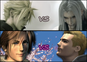
Anyways, this next picture took more work than the others so far. Cloud and Seifer look kind of crappy but I needed those poses to get the right effect here.
I like it. It's good seeing someone use some good old FFVII to represent Cloud/Seph, rather than the AC and KH stuff that gets thrown around so much.
--
I think someone is being way, way too sensitive. Do we have to stop saying "You got owned" in order to not offend black people due to slavery? - wg64Z
I like it too. The characters in the middle aren't of the greatest-looking quality there, but for this I think it works. It makes everyone look even instead of Cloud/Seifer looking just plain bad in comparison.
--
You beat yourself up with your past. Don't blame yourself, blame the world. Blame God. Blame me.
Ganon, where did you get that Sephiroth picture? I spent a while looking for a happy/goofy Seph face but couldn't find a thing. I could really use that.
-- Yoblazer: http://oi52.tinypic.com/ad21i1.jpg Watch and you'll see... someday I'll be... part of your world!
I searched "Sephiroth Crisis Core". I figured the best way find an uncommonly used pictures for him would be through that game. There's actually a couple pictures like that, it's very strange seeing Sephiroth showing anything resembling happy.
--
You beat yourself up with your past. Don't blame yourself, blame the world. Blame God. Blame me.


