Board 8 > Snake Ranks User-Nominated Covers *THE RANKINGS*
| Topic List | |
|---|---|
|
Snake5555555555 02/27/18 11:39:32 AM #130: |
57. Phoenix
Nominated by: Shonen_Bat (4/6 remaining) http://www.mobygames.com/images/covers/l/20071-phoenix-atari-2600-front-cover.jpg Though the artwork is small on this Atari 2600 game, it packs a powerful punch. There's a lot of elements here that invoke the dread of deep space, with the huge robotic phoenix rising above being the centerpiece of this feeling. The coloring on the smoke and the surrounding outer space scene looks insanely detailed, and sure these planets are little too close to each other, but this is pulp space so I can forgive it. There's also something about the Atari 2600 negative cover space that gives this an undeniable charm too. --- To seal this town to the abyss, the mark of Samael. http://tinyurl.com/zqwzc9a - https://i.imgur.com/ecJSilM.png - https://i.imgur.com/WrowyEj.gif ... Copied to Clipboard!
|
|
Snake5555555555 02/27/18 11:48:33 AM #131: |
56. Doll$boxx - High $pec
Nominated by: Murphiroth (1/5 remaining)  It's a little tough to discern what's going on in this cover but that's not to say I don't enjoy the heavily stylized nature of it. Sometimes it's good to be a little abstract. The character designs are dark and edgy to the max, wearing what appears to be knight and cleric inspired outfits. The use of black paint splotches and heavy black outlines helps punctuate that edgy feeling. --- To seal this town to the abyss, the mark of Samael. http://tinyurl.com/zqwzc9a - https://i.imgur.com/ecJSilM.png - https://i.imgur.com/WrowyEj.gif ... Copied to Clipboard!
|
|
Snake5555555555 02/28/18 5:50:00 PM #132: |
55. Nemo's War
Nominated by: Simoun (3/6 remaining) https://cf.geekdo-images.com/images/pic2741051.png This artwork is strikingly similar to Victoriana to me, and that's a good thing. Many elements from the classic story 20,000 Leagues under the Sea are represented here, Nemo, the Nautilus, even a hint of a kraken through transparent tentacles taking a hold of the submarine. Very cool choice to have water droplets on the compass that serves as the game's logo. Overall, this cover feels adventurous, treacherous, and all-around rip-roaring good time. --- To seal this town to the abyss, the mark of Samael. http://tinyurl.com/zqwzc9a - https://i.imgur.com/ecJSilM.png - https://i.imgur.com/WrowyEj.gif ... Copied to Clipboard!
|
|
Snake5555555555 02/28/18 5:53:45 PM #133: |
54. Inkheart
Nominated by: Shonen_Bat (3/6 remaining) http://jennifermelzer.com/wp-content/uploads/2015/03/inkheart-cover.jpg First off, I love the fourth wall break here. The hand creeping into our real world is an incredibly cool concept, as if we're being surrounded by the world's fiction rather than us going to the world of Inkheart. We can already see a lizard and a fairy have escaped the confines of fantasy. This window into the alternate world gives us a few glimpses as to why some would want to leave. A burning city, looming mountains of doom, eerie mist rolling off the lake, perhaps a hostile animal? The scattered items and overall trim of the cover is reminiscent of a girl's diary. It's cool stuff. --- To seal this town to the abyss, the mark of Samael. http://tinyurl.com/zqwzc9a - https://i.imgur.com/ecJSilM.png - https://i.imgur.com/WrowyEj.gif ... Copied to Clipboard!
|
|
Shonen_Bat 02/28/18 6:01:55 PM #134: |
Eh, I thought those three would go out first. I was hoping the Inkheart cover would go higher though because I think it's really neat.
--- Glaze on the layers of the atmosphere, white stardust sprinkles on a fine parfait. I'll take your hand and you can take me here, up to the Satellite Cafe. ... Copied to Clipboard!
|
|
Snake5555555555 02/28/18 9:24:48 PM #135: |
53. Abzu
Nominated by: Johnbobb (4/6 remaining)  Visually clean and simple, but powerful nonetheless. I get a sense of confusion and that there's something wrong with this flipped scene. However, there's also a sense of joyous adventure and rediscovering one's identity here, a returning of things to their normal state, depending on your point of view. It's interesting that the water is positioned as such to be either the top or bottom of the surface. There's plenty of subtext in this cover and it really takes a simplistic concept and expands it to be eye-candy that's beautiful and meaningful. --- To seal this town to the abyss, the mark of Samael. http://tinyurl.com/zqwzc9a - https://i.imgur.com/ecJSilM.png - https://i.imgur.com/WrowyEj.gif ... Copied to Clipboard!
|
|
Murphiroth 03/01/18 11:30:56 PM #136: |
I would've nominated the regular version of Oathbringer if wraparounds weren't allowed just because I love the cover either way.
I dig High $pec cause I like the sentai/superhero team w/musical instruments vibe. --- ... Copied to Clipboard!
|
|
Snake5555555555 03/02/18 11:42:55 AM #137: |
52. The Legend of Zelda: Breath of the Wild
Nominated by: Shonen_Bat (2/6 remaining) https://cdn.releases.com/img/image/32e779d7-b277-43d9-868f-f12bc221520e.jpg/300 There's a quote from Preacher that describes this cover perfectly. "I looked out that first night an' all I could see was America, stretchin' away in every direction. I got this mad idea - if I jumped off the Empire State Buildin' I could land anywhere in America I wanted... an' the great adventure could begin." That's exactly what I see here portrayed in the Breath of the Wild. The world of Hyrule spread out before Link, a world of endless possibilities, a world of endless danger but also a world of exciting journey. It invites you to take that leap along with Link, so you can have a great adventure that's all your own. --- To seal this town to the abyss, the mark of Samael. http://tinyurl.com/zqwzc9a - https://i.imgur.com/ecJSilM.png - https://i.imgur.com/WrowyEj.gif ... Copied to Clipboard!
|
|
Snake5555555555 03/02/18 11:54:57 AM #138: |
51. Pink Floyd - Dark Side of the Moon
Nominated by: BlueCrystalTear (4/6 remaining) https://lastfm-img2.akamaized.net/i/u/770x0/fb824927b6a04e978553007ef6a7b9b8.jpg This simple design has become the icon for a whole generation of music. You can pretty much analyze this cover in anyway you want to, as the white light passing through the prism to become a spectrum of colors can mean something different to any and everyone. The "official" meaning put out by the band is that it represents their stage lighting, their lyrics, and a simple and bold design. I'm definitely in the camp of a more simple and straightforward meaning. I'm sure you could write whole essays about this cover, but at the end of the day it's a mere prism, and designed with a purpose that it fulfills with aplomb. --- To seal this town to the abyss, the mark of Samael. http://tinyurl.com/zqwzc9a - https://i.imgur.com/ecJSilM.png - https://i.imgur.com/WrowyEj.gif ... Copied to Clipboard!
|
|
Gatarix 03/02/18 11:57:30 AM #139: |
Breath of the Wild way too low
I love the lighting and the use of color. it's not that deep but it's great eyecandy. also that logo is sweet --- You put your RESOLVE HAT back on, which conveniently is the same hat as your NORMAL HAT. {Drakeryn} ... Copied to Clipboard!
|
|
scarletspeed7 03/02/18 12:15:20 PM #140: |
Preacher quotes describing Zelda. That's a weird dichotomy! It works though.
--- "Reading would be your friend." ~Dave Meltzer ... Copied to Clipboard!
|
|
Tokoyami 03/02/18 12:33:29 PM #141: |
Eh Breath of the Wild's is fine but nothing that special imo
Also woooo all 6 of mine in the top half --- What a mad banquet of darkness... Bane ... Copied to Clipboard!
|
|
NBIceman 03/02/18 2:34:39 PM #142: |
I'm always hesitant to celebrate in ranking topics because it usually triggers a massacre of my noms but I'm happy to see all six have survived so far too.
--- http://i.imgur.com/UYamul2.gif Spurs - Yankees - Eagles - Golden Knights ... Copied to Clipboard!
|
|
Snake5555555555 03/03/18 10:58:26 PM #143: |
50. Uncharted 2: Among Thieves
Nominated by: Dragon66116 (1/5 remaining) https://vignette.wikia.nocookie.net/uncharted/images/7/7b/Uncharted_2_box_artwork.jpg/revision/latest?cb=20150626173257 Naughty Dog pretty much knocked it out of the park with this cover. Whereas the rest of the series instead relishes in generic covers that do little to relay the adventure the player is about to embark, Uncharted 2 has several elements to it that better clue in the player about what they're about to experience. Drake here is comparatively much more in danger, hanging precariously from a derailed train as cargo and another train car rain down below. Rushing snow and water creates an atmosphere that's cold and unpleasant. The ancient totem and parchment go a long way to making this feel like a true historical, archaeological adventure. With all the elements here, it's really hard to deny this being a great cover to describe the game perfectly. --- To seal this town to the abyss, the mark of Samael. http://tinyurl.com/zqwzc9a - https://i.imgur.com/ecJSilM.png - https://i.imgur.com/WrowyEj.gif ... Copied to Clipboard!
|
|
Snake5555555555 03/03/18 11:06:40 PM #144: |
49. Catch-22
Nominated by: Mega Mana (2/5 remaining) http://static.tvtropes.org/pmwiki/pub/images/catch_22.jpg It's a bit hard for me to explain why exactly I like this cover so much. I just do. It doesn't do anything fancy, it's few elements of design are sparse, yet it's so striking and appealing in its simplicity. I really think the huge eye catching logo and author's name go a long way to making this work as well as it does too. It just makes you want to pick it up and check it out! --- To seal this town to the abyss, the mark of Samael. http://tinyurl.com/zqwzc9a - https://i.imgur.com/ecJSilM.png - https://i.imgur.com/WrowyEj.gif ... Copied to Clipboard!
|
|
NFUN 03/03/18 11:14:56 PM #145: |
Good book. Gotta finish it.
--- Thus is our treaty written, thus is our agreement made. Thought is the arrow of time; memory never fades. What was asked is given; the price is paid. ARF ... Copied to Clipboard!
|
|
Simoun 03/05/18 6:52:37 AM #146: |
bump
--- It's not so cliche anymore when it's happening to you. ... Copied to Clipboard!
|
|
Snake5555555555 03/05/18 11:27:45 AM #147: |
48. A Gathering of Shadows
Nominated by: Gatarix (2/6 remaining)  First thing I love is the bold use of the color red. I think it's funny Gatarix nominated 2 covers that have arms rising up; I like how it's used here especially, with the use of many arms reminding me of the hallway scene in Repulsion. It feels grabby, almost a little claustrophobic, overwhelming. I absolutely adore how the arms have white lines on them representing city streets, illustrating that these arms have control over the area through a larger conspiracy. I like the assassin lady's design, minimalistic and another great use of color, almost using the red of the arms in defiance. Overall, the composition is excellent and centered well, and this cover would attract anyone to this book. --- To seal this town to the abyss, the mark of Samael. http://tinyurl.com/zqwzc9a - https://i.imgur.com/ecJSilM.png - https://i.imgur.com/WrowyEj.gif ... Copied to Clipboard!
|
|
Snake5555555555 03/05/18 11:39:19 AM #148: |
47. Ys Origin (PS4)
Nominated by: NBIceman (5/6 remaining) http://www.mobygames.com/images/covers/l/433155-ys-origin-playstation-4-front-cover.jpg I think I really enjoy huge towers looming in the background. They are overwhelming with their presence, demanding attention, serving as a constant reminder for difficulty and dread. Usually a scene like this would be cast in darkness, but Ys Origin keeps hope alive with blue skies and green tides as two characters boldly look on towards challenges ahead. Despite this monolithic spire being ever-present in view, this cover is one that gives me optimism and the strength to carry on. --- To seal this town to the abyss, the mark of Samael. http://tinyurl.com/zqwzc9a - https://i.imgur.com/ecJSilM.png - https://i.imgur.com/WrowyEj.gif ... Copied to Clipboard!
|
|
Snake5555555555 03/07/18 11:40:08 AM #149: |
bump
--- To seal this town to the abyss, the mark of Samael. http://tinyurl.com/zqwzc9a - https://i.imgur.com/ecJSilM.png - https://i.imgur.com/WrowyEj.gif ... Copied to Clipboard!
|
|
Snake5555555555 03/07/18 1:51:49 PM #150: |
46. Generation X (Vol. 2) #5
Nominated by: Mega Mana (1/5 remaining) https://tinyurl.com/ycc45kw2 This cover is pretty straight-forward but still I enjoy the concept of this cover quite a bit. It really portrays the visceral horror and shock of suddenly having a bunch of eyes grow all your body quite well,as Eye-Boy aka Trevor Hawkins screams out in panic and has disheveled look. Anyone with ommetaphobia will instantly be triggered by this, and if you don't, it's sure enough to develop ommetaphobia for you! One thing I find strange is that Eye-Boy looks really feminine on this cover, I don't remember him looking this woman-like in the actual pages of the comic. Some other minor points I like is the way the X in the title separates the cover and how they squeeze the other members of Gen-X into the little space to the right. --- To seal this town to the abyss, the mark of Samael. http://tinyurl.com/zqwzc9a - https://i.imgur.com/ecJSilM.png - https://i.imgur.com/WrowyEj.gif ... Copied to Clipboard!
|
|
scarletspeed7 03/07/18 1:56:22 PM #151: |
It's just Eyeful Ethel!
https://static.comicvine.com/uploads/original/8/80419/1896498-eyefulethel.jpg --- "Reading would be your friend." ~Dave Meltzer ... Copied to Clipboard!
|
|
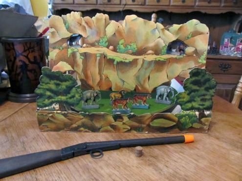
Snake5555555555 03/08/18 12:55:18 PM #152: |
45. Jungle Shooting
Nominated by: Zyxyz0 (3/6 remaining) https://cf.geekdo-images.com/images/pic1184807.jpg Bloody hell this cover is some brutal shit. It's "definitely" the type of cover I envision when I see the title "Jungle Shooting". The detail in this scene is really impressive, especially the tiger, with each aspect of its fur coming to life with realistic coloring and the way it lays, falls and sits. The way the goat(?, honestly not sure what animal this is) is held in the air by the tiger's mighty jaws feels grounded and wickedly savage in a way unbecoming of a simple board game. That's honestly my favorite thing about this cover. You're not just going to sit down and play some Jungle Shooting. No, you're going to go to that jungle yourself, you're going to encounter that tiger, and you're going to be its next meal! --- To seal this town to the abyss, the mark of Samael. http://tinyurl.com/zqwzc9a - https://i.imgur.com/ecJSilM.png - https://i.imgur.com/WrowyEj.gif ... Copied to Clipboard!
|
|
Tokoyami 03/08/18 1:01:40 PM #153: |
Jesus that's a board game?
--- What a mad banquet of darkness... Bane ... Copied to Clipboard!
|
|
Snake5555555555 03/08/18 1:05:20 PM #154: |
44. Miami Connection
Nominated by: Mega Mana (0/5 remaining) http://drafthousefilms.com/_uploads/films/29251/miamiconnection_poster-final__large.jpg If I learned anything from watching RedLetterMedia over the years, its that movie covers and posters more often than not are complete liars. Low-budget schlock titles and rip-off B-movies want your eyeballs and they want your dollars, so they're not above putting awesome shit on their covers to get said eyeballs and dollars. Sitting down to actually watch the flick is another story, as the films either fail to live up to the cover or lack what's on the cover completely. Miami Connection is a different beast however. For once, what you see IS what you get! What a novel concept. So yeah, you're in for motorcycle ninjas, cheesy rock and roll, and yes, you asked for it, someone even gets to open up a letter they got in the mail! And every part of it is beautiful. The artwork here is just shoddy enough to be charming and just good enough to accurately show what's going to be happening. Sure, everyone has potatoes for faces and there's plently of awkward kung-fu and gun-holding but that warm Miami sunset will make sure everything is all right in the end. --- To seal this town to the abyss, the mark of Samael. http://tinyurl.com/zqwzc9a - https://i.imgur.com/ecJSilM.png - https://i.imgur.com/WrowyEj.gif ... Copied to Clipboard!
|
|
Snake5555555555 03/08/18 1:06:36 PM #155: |
Tokoyami posted...
Jesus that's a board game? I looked it up, it's your own personal shooting gallery. https://cf.geekdo-images.com/original/img/5XAQSWbu4tb4-Del4KKdkVmXzFA=/0x0/pic1103925.jpg --- To seal this town to the abyss, the mark of Samael. http://tinyurl.com/zqwzc9a - https://i.imgur.com/ecJSilM.png - https://i.imgur.com/WrowyEj.gif ... Copied to Clipboard!
|
|
Mega Mana 03/08/18 1:52:19 PM #156: |
Snake5555555555 posted...
44. Miami Connection I love this poster, I want this poster, and everytime I see neon blue and neon pink on a poster, I think of this movie. The only thing on the poster we DON'T get... is Miami. --- "In my headcanon, some staffer saw Trump pull out his phone and start typing so they just Terry Tate Office Linebacker'd him out of his shoes." - FFD ... Copied to Clipboard!
|
|
Anagram 03/08/18 11:50:48 PM #157: |
Mega Mana posted...
Doesn't it take place in Miami? --- Not changing this sig until I decide to change this sig. Started: July 6, 2005 ... Copied to Clipboard!
|
|
Snake5555555555 03/09/18 1:16:11 AM #158: |
It actually takes place in Orlando but Miami still makes an appearance so it's still not a lie!
--- To seal this town to the abyss, the mark of Samael. http://tinyurl.com/zqwzc9a - https://i.imgur.com/ecJSilM.png - https://i.imgur.com/WrowyEj.gif ... Copied to Clipboard!
|
|
Snake5555555555 03/10/18 12:20:46 PM #159: |
43. Astro City: The Dark Age Book Four #2
Nominated by: scarletspeed7 (4/6 remaining) https://static.comicvine.com/uploads/scale_large/5/50638/1148996-cover.jpg God damn you can never go wrong with Alex Ross covers. His work across the board on Astro City are some of the most top notch covers you'll ever see. This one has a little bit of a different feel from the rest, with bright colors overpowering the cover, crafting a sense of speed and adrenaline with trailing neon-tubing and harsh right-angles, as if we just caught Mirage in freeze-frame on the way to the next fight, careening through city skies at the speed of light. In the background is Las Vegas' infamous cowboy, Vegas Vic, which carries a strange presence here as its not fully in frame, but helps establish location and Mirage's origins from the area. With striking colors and a stand-out character design, this Astro City cover is yet another essential cover in the Alex Ross canon. --- To seal this town to the abyss, the mark of Samael. http://tinyurl.com/zqwzc9a - https://i.imgur.com/ecJSilM.png - https://i.imgur.com/WrowyEj.gif ... Copied to Clipboard!
|
|
scarletspeed7 03/10/18 1:06:01 PM #160: |
Actually thought this would land lower than the Superman cover.
--- "Reading would be your friend." ~Dave Meltzer ... Copied to Clipboard!
|
|
Snake5555555555 03/10/18 6:21:01 PM #161: |
42. Crooked Kingdom
Nominated by: Gatarix (1/6 remaining)  This cover is totally awesome. I love the aesthetic of ravens, and the deep coloring of the black here is sweet. I can see and notice near ever detail in the ebony bird's feathers. It's also cool how the spires and towers pierce into the raven creating the breaks in his plumage, while the crown shaped building creates the tail feathers. My absolute favorite thing about this cover though is how the white splotches on the bird creates a starry night sky, which looks beautiful. Another thing I didn't notice until today is some blood splotches near the bottom, another neat touch in line with the cover's theming. --- To seal this town to the abyss, the mark of Samael. http://tinyurl.com/zqwzc9a - https://i.imgur.com/ecJSilM.png - https://i.imgur.com/WrowyEj.gif ... Copied to Clipboard!
|
|
Snake5555555555 03/10/18 7:07:38 PM #162: |
41. Fire in the Sky: The Great Pacific War 1941-1945
Nominated by: Zyxyz0 (2/6 remaining) https://cf.geekdo-images.com/images/pic58333.jpg This cover is pretty simplistic upon first glance, with not much in the way of detail or exciting scenery to ogle at. The more I looked at it though the more I admired its minimalistic design. it's one you use your imagination for. A simple plume of black smoke as a lone plane crashes down speaks volumes more than if you just showed it outright in a scene of chaotic destruction. The way the smoke forms what looks like a quill pen is an interesting touch and one I didn't notice until at least a few examinations of this cover. I like how there's not even any water despite showing a submarine or ship, instead letting the color of the cover represent it instead. Some may disagree, but I really like this cover quite a bit. --- To seal this town to the abyss, the mark of Samael. http://tinyurl.com/zqwzc9a - https://i.imgur.com/ecJSilM.png - https://i.imgur.com/WrowyEj.gif ... Copied to Clipboard!
|
|
Johnbobb 03/10/18 8:05:08 PM #163: |
Man contest is getting tough if Crooked Kingdom is already dropping
--- Khal Kirby, warlord of the Super Star Khalasar PSN/Steam: CheddarBBQ https://goo.gl/Diw2hs ... Copied to Clipboard!
|
|
scarletspeed7 03/12/18 11:12:39 AM #164: |
There were a lot of really good nominations this time around.
--- "Reading would be your friend." ~Dave Meltzer ... Copied to Clipboard!
|
|
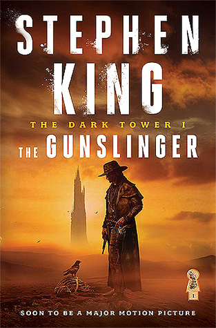
Snake5555555555 03/12/18 1:13:44 PM #165: |
40. Stephen King - The Gunslinger
Nominated by: NBIceman (4/6 remaining) http://sheilaliming.com/428DH/wp-content/uploads/2016/08/gunslinger-2016.jpg This cover contrasts nicely with NBIceman's other nomination, Ys Origin. Both feature towers looming ever-present in the background, but the Gunslinger portrays it in that dark light I had previously discussed. The orange haze accents the atmosphere of oppression, famine and death, and our central character for this cover, the Gunslinger, invokes western-imagery to portray a new frontier, a hostile environment, and isolation as the lone ranger faces this new world in solitude. I like how the Gunslinger is level with the tower, actually giving the viewer that glimmer of hope you need in a world like this. They're of equal stature, and the hero will not let himself be intimidated by this symbol of power. It's a distant obstacle, but perhaps one that's not as intimidating as it initially appears. --- To seal this town to the abyss, the mark of Samael. http://tinyurl.com/zqwzc9a - https://i.imgur.com/ecJSilM.png - https://i.imgur.com/WrowyEj.gif ... Copied to Clipboard!
|
|
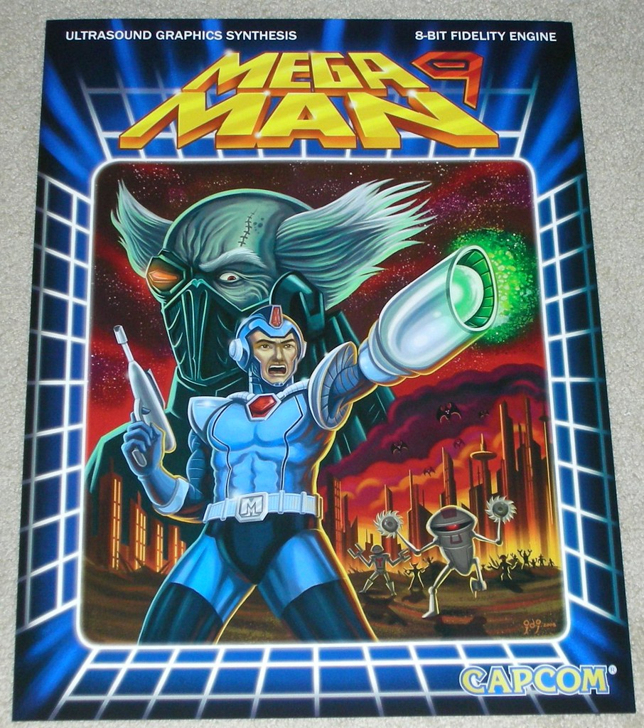
Snake5555555555 03/12/18 1:29:30 PM #166: |
39. Mega Man 9
Nominated by: Anagram (3/6 remaining) https://c2.staticflickr.com/4/3218/2813209098_8a839decd9_b.jpg Gorgeous pulp 80s sci-fi cheese, which manages to call back and update the original Mega Man box art without being hokey or too "in your face" about it. You gotta love the Tron-style cubic grid borders and the little retro touches of the phrases "ULTRASOUND GRAPHICS SYNTHESIS" and "8-BIT FIDELITY ENGINE" which you just know don't actually mean anything. The looming Darth Vader-esque villain has a pretty cool and intimidating design and fits into this post-apocalypse world of '50s robots and desolate landscapes. This cover wouldn't win any awards by any stretch, but it manages to be endearing to a long-running legacy of bad box art whilst still making an attempt for quality and that's really admirable in my eyes. --- To seal this town to the abyss, the mark of Samael. http://tinyurl.com/zqwzc9a - https://i.imgur.com/ecJSilM.png - https://i.imgur.com/WrowyEj.gif ... Copied to Clipboard!
|
|
Johnbobb 03/12/18 1:35:46 PM #167: |
Snake5555555555 posted...
The looming Darth Vader-esque villain my first thought was a cyber Heihachi Mishima --- Khal Kirby, warlord of the Super Star Khalasar PSN/Steam: CheddarBBQ https://goo.gl/Diw2hs ... Copied to Clipboard!
|
|
Snake5555555555 03/12/18 1:42:27 PM #168: |
That definitely works too.
--- To seal this town to the abyss, the mark of Samael. http://tinyurl.com/zqwzc9a - https://i.imgur.com/ecJSilM.png - https://i.imgur.com/WrowyEj.gif ... Copied to Clipboard!
|
|
Anagram 03/12/18 1:57:13 PM #169: |
He looks sort of like Immortan Joe to me.
--- Not changing this sig until I decide to change this sig. Started: July 6, 2005 ... Copied to Clipboard!
|
|
Simoun 03/12/18 11:25:56 PM #170: |
For a minute I was wondering why does megaman 9 look nothing like megaman 9 and then I remembered I was thinking of megaman and bass
--- It's not so cliche anymore when it's happening to you. ... Copied to Clipboard!
|
|
NBIceman 03/12/18 11:41:50 PM #171: |
Apparently I really like towers looming in the distance. Wasn't intentional during the nomination process but I guess I have a type!
It is cool how two covers with a very similar concept can communicate such drastically different tones. --- http://i.imgur.com/UYamul2.gif Spurs - Yankees - Eagles - Golden Knights ... Copied to Clipboard!
|
|
Bane_Of_Despair 03/14/18 12:20:28 AM #172: |
bump
--- Lord have mercy on my soul, I've had a good run but I can't run anymore. Just put me down BKSheikah got me good in Guru ... Copied to Clipboard!
|
|
Snake5555555555 03/14/18 12:20:37 PM #173: |
38. Attack of the 50 ft. Woman
Nominated by: Anagram (2/6 remaining) https://cdn.empireonline.com/jpg/70/0/0/1280/960/aspectfit/0/0/0/0/0/0/c/features/59e8d795405a5c6805947751/23%20Attack%20of%20the%2050ft%20Woman.jpg I like B-movie posters like this one quite a bit. The colors are rich and vibrant, and the way it's painted in that retro-look still stands out to this day. Films and especially b-movies back then always had an obsession with colossal figures and putting impressive numbers in their titles. The Phantom from 10,000 Leagues! The Beast from 20,000 Fathoms! 20 Million Miles to Earth! It was like a contest to see who could be the most outlandish. This poster lives up to its namesake as you would expect, showcasing a scene of pure chaos with overturned cars and people fleeing the scene, as other cars zoom desperately past to escape the carnage. It almost looking like a toyset for their giant oppressor. Also common for the era are the ladies being scantily-clad, with no exception here, but it also draws its roots from the The Amazing Colossal Man a year earlier with that titular character's design. I think the outfit here gives the 50 foot woman an air of class and humanity more than the Colossal Man though, which is an interesting contrast to the scene below. All in all, a great addition to a history of similarly great B-movie posters. --- To seal this town to the abyss, the mark of Samael. http://tinyurl.com/zqwzc9a - https://i.imgur.com/ecJSilM.png - https://i.imgur.com/WrowyEj.gif ... Copied to Clipboard!
|
|
Anagram 03/14/18 3:02:17 PM #174: |
One aspect of the poster I enjoy is that she's clearly way bigger than 50 feet (or the people are like five inches tall) and the car she's holding is much larger than the cars on the freeway.
--- Not changing this sig until I decide to change this sig. Started: July 6, 2005 ... Copied to Clipboard!
|
|
Johnbobb 03/14/18 8:49:26 PM #175: |
oh no the b-movie style posters are falling
--- Khal Kirby, warlord of the Super Star Khalasar PSN/Steam: CheddarBBQ https://goo.gl/Diw2hs ... Copied to Clipboard!
|
|
Simoun 03/15/18 9:39:00 AM #176: |
I would watch this movie
--- It's not so cliche anymore when it's happening to you. ... Copied to Clipboard!
|
|
Snake5555555555 03/15/18 12:23:07 PM #177: |
37. Oktoberfest
Nominated by: Simoun (2/6 remaining) https://cf.geekdo-images.com/images/pic2602498.jpg The amount of detail packed into this cover is incredible. Each member of the crowd is meticulous and individually drawn with unique outfits, body shapes, and facial features. You can just imagine in your mind the crowd commotion, kids laughing, drunken revelry, and an atmosphere of good cheer. The main eye-draw of this picture though are obviously the towering stouts, cast gorgeously in gold-tint as foam drips over the side. The front Pilsener stout even has a detailed reflection of the crowd below! That's amazing. Lastly, I'd like to call out the fact that the people on the lowest Ferris wheel car are breaking the fourth wall by waving at us, the audience. That's pretty a neat touch to cap off this well-painted and well-detailed cover. --- To seal this town to the abyss, the mark of Samael. http://tinyurl.com/zqwzc9a - https://i.imgur.com/ecJSilM.png - https://i.imgur.com/WrowyEj.gif ... Copied to Clipboard!
|
|
Johnbobb 03/15/18 5:16:52 PM #178: |
... Copied to Clipboard!
|
|
Snake5555555555 03/15/18 7:01:31 PM #179: |
36. Thursday - A City By The Light Divided
Nominated by: Bane_of_Despair (5/6 remaining) https://www.fuse.tv/image/572776c80fc94c6538000030/816/545/thursday-a-city-by-the-light-divided-album-cover-full-size.jpg This album cover is instantaneously mood-setting. I love the graffiti/street art style which almost looks like a political statement. You get that feeling of freedom, trouble, and city life through the various scenes and vignettes portrayed throughout the cover. At first it feels disorienting and unwelcoming, but it invites you to look closer and see its scenes of speeding highways, a bright cityscape, people emerging from the dark of a tunnel, whilst power lines, rotary phones, and even a person of business carry along a sense of hustle and bustle. It's a cover of conflicting emotions but at the same time it carries a coherent message across that's part of that explainable feeling of finding yourself and growing up. --- To seal this town to the abyss, the mark of Samael. http://tinyurl.com/zqwzc9a - https://i.imgur.com/ecJSilM.png - https://i.imgur.com/WrowyEj.gif ... Copied to Clipboard!
|
| Topic List |
