Do you think this has any chance of getting accepted?
--
...
| Topic List |
Page List:
1 |
|---|---|
|
spooky96 12/10/11 12:18:00 AM #1: |
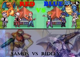
So I made this Red vs Blue X Samus vs Ridley contest image, here's the link....
Do you think this has any chance of getting accepted? -- ... ... Copied to Clipboard!
|
|
Team Rocket Elite 12/10/11 12:20:00 AM #2: |
The top half looks pretty good although the text could be better. The bottom half is kind of a mess where it's hard to make things out. It might get accepted anyways but I think you should try something else for the Samus half.
-- Pokemon VGC2011 US Nationals - 54th place Pokemon VGC2012 NW Regional - 16th place ... Copied to Clipboard!
|
|
Anagram 12/10/11 12:22:00 AM #3: |
Blue's name is kind of hard to read.
-- Not changing this sig until I decide to change this sig. Started: July 6, 2005 ... Copied to Clipboard!
|
|
Azp2k32 12/10/11 12:39:00 AM #4: |
For the top, both the names are kind of hard to read and the art styles clash in an odd way. It just looks weird and nothing stands out in particular. The oddly bright RED and BLUE sort of do then Charizard and Blastoise sort of do then Red and Blue themselves sort of do and in the end it's really just trying to draw my eyes in every direction at once, with the background even competing for attention, particularly against the less colorful RBY sprites. It's a good idea but frankly I would scrap this version and take a different approach. Perhaps try it again in reverse with a RBY Pallet Town instead of Fr/Lg so characters can stand out. The text also needs work though, beyond blending in (seriously, why green for the vs. when the only thing it's on top of is grass T_T). Font choice is not ideal, nor are the colors chosen. Use some some more complimentary versions of the colors for the picture. Also consider making it clearer that it's Pokémon Trainer Red and Pokémon Trainer Blue.
For the bottom, I like the idea but I don't think it really works to create a clear contest picture. The names are sort of there; not a problem but not the best part, but the rest of it is sort of a mess in terms of it seeming to be made up of ghosts of varying levels of transparency. I can barely make out the existence of a 2D representation of Ridley in there, but the rest is all needless chaos that detracts from the character. As a whole, it's not an incredibly effective gimmick. Especially without a background, likely stemming from the fact that it's already abstract enough and a background would just completely kill any chance of clarity and clutter the picture up far too much-a consideration you should definitely have in mind when making these. If it's too cluttered without a background... it probably needs to be cleaned up in a way that makes it presentable with a background since those add a lot to the picture. Additionally, I'm of the personal opinion that if any form of Samus is being made the focus, it should be Varia suit Samus-the most widely recognized form, rather than the less powerful and weaker presence of the default Power Suit. As for your actual question, honestly it probably can get accepted. I just like to give extensive constructive criticism on match pic submissions, especially since you definitely can make this better. -- http://www.nbc.com/parks-and-recreation/exclusives/ron-dancing-animated.gif ... Copied to Clipboard!
|
|
greatone10 12/10/11 12:47:00 AM #5: |
I really like the top half for the most part. I would wash out the colors of the background a little bit so that the sprites stand out a little bit more, but I don't know what image editor your using.
The bottom half is a mess as the only thing I really see is Samus, and Ridley sort of looks like he has two heads or something. The text also needs a border or something so you can actually see it. -- "Go get me Jared...from Subway!" -- CM Punk This line reserved for Rivalry Guru winner. ... Copied to Clipboard!
|
|
GuessMyUserName 12/10/11 12:48:00 AM #6: |
oh man, I hope you do the touch-ups you need, because that Red/Blue pic is awesome
-- http://26.media.tumblr.com/tumblr_lvgdyvJ7fa1qcc7n9o1_250.gif ... Copied to Clipboard!
|
|
spooky96 12/10/11 5:35:00 AM #7: |
@ Azp2k32
Really, thanks a lot, you are the first person whom I've seen who's criticism made sense and I didn't feel offended. Those were some really great suggestion. Though I can't do much now since I've already submitted the image before making this topic, I'm such an idiot -_- -- ... ... Copied to Clipboard!
|
|
spooky96 12/10/11 7:10:00 AM #8: |
bump
-- ... ... Copied to Clipboard!
|
|
Safer Sephiroth 777 12/10/11 7:12:00 AM #9: |
I like it.Plus no matter what pic you enter,the trainers will win anyway.
-- GameFaqs is NOT the place to go for relationship advice.Nobody here gets any action unless it is their right or left hand.Including me.~Dawn and Dusk~ ... Copied to Clipboard!
|
|
spooky96 12/10/11 9:06:00 AM #10: |
Last bump >_>
-- ... ... Copied to Clipboard!
|
| #11 | Post #11 was unavailable or deleted. |
| #12 | Post #12 was unavailable or deleted. |
|
SuperAngelo128 12/10/11 9:18:00 AM #13: |
if he hasn't put up the match pics yet, that means you still have time to upload an edited one with no worries, he'll more likely choose the edited one if it's better
-- http://img.imgcake.com/superangelo128/Higurashipicjpgaz.jpg ... Copied to Clipboard!
|
|
GenesisSaga 12/10/11 9:19:00 AM #14: |
It's not exactly balanced. The Samus half needs touching up.
-- Cupcakes! Cupcakes, cupcakes, CUPCAKES!!! ... Copied to Clipboard!
|
|
tyder21 12/10/11 9:20:00 AM #15: |
One thing I would also fix with the top is making all the Reds look toward the Blues and vice versa. Right now they are looking in all random directions and it's a little bizarre. Also, flip Charizard.
-- One less bracket. http://myanimelist.net/profile/tyder21 ... Copied to Clipboard!
|
| Topic List |
Page List:
1 |