Poll of the Day > This graph on savings rate and spending in the US is fantastic.
| Topic List |
Page List:
1 |
|---|---|
|
blu 04/10/21 5:08:23 PM #1: |
Savings rate at different income percentiles. Could use a title. Take it all with a grain of salt. Some uncertainty in these things and methodology and what withdrawal rate counts as retirement but for an approximate graph its dope.
 Edit: including second graph Same graph, but years needed to work until retirement replacing percentile numbers. 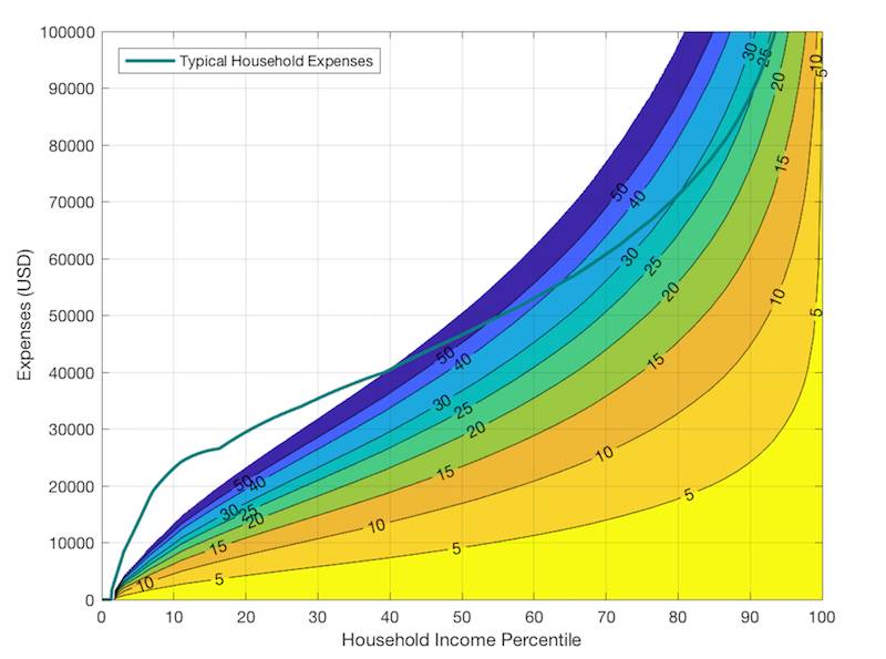 ... Copied to Clipboard!
|
|
EclairReturns 04/10/21 5:21:40 PM #2: |
How interesting. Would you be able to determine the points at which each respective curve on the graphs becomes concave-up?
--- Number XII: Larxene. The Organization's Savage Nymph. ... Copied to Clipboard!
|
|
PunishedOni 04/10/21 7:18:00 PM #3: |
i like how the legend only descirbe one of the 10 lines on the graph
--- i love to post about elves and wizards ... Copied to Clipboard!
|
|
Lokarin 04/10/21 7:21:35 PM #4: |
if I'm reading the chart correctly the 40th percentile is the breaking point where people should be getting government assistance
--- "Salt cures Everything!" My YouTube: https://www.youtube.com/user/Nirakolov/videos ... Copied to Clipboard!
|
|
Mead 04/10/21 7:25:44 PM #5: |
I like the way the blue and the green together
--- YOU control the numbers of leches. -Sal Vulcano ... Copied to Clipboard!
|
|
Clench281 04/10/21 7:53:10 PM #7: |
Misread initially. Thought it was showing distributions of spending (across all us households for example) at various income percentiles, which I would find more interesting
This is essentially a 2D transformation of income by plotting the percentiles vs absolute dollar amount (top of purple curve), then just multiplying the y value by 0.9, 0.8 ... 0.1 --- Take me for what I am -- who I was meant to be. And if you give a damn, take me baby, or leave me. ... Copied to Clipboard!
|
|
blu 04/10/21 8:33:56 PM #8: |
Clench281 posted...
Misread initially. Thought it was showing distributions of spending (across all us households for example) at various income percentiles, which I would find more interesting @Clench281 I'm going to try to see if I can make anything interesting out of data from consumer expense surveys since they provide the data. There's some trends I want to see like the one you mentioned. But, you might enjoy some of their pre-made tables such as the following, which does have a breakdown on things like how much money spent on different types meat by income. It would be nice to have percentiles also...sounds like this has blog potential. https://www.bls.gov/cex/tables/calendar-year/mean-item-share-average-standard-error/cu-income-deciles-before-taxes-2019.pdf ... Copied to Clipboard!
|
| Topic List |
Page List:
1 |