I had a blast with that system color thread, and it was very easy to keep the updates coming. And since I've got time to kill before my trip to Florida in a couple days... I thought, "Why not tackle boxarts next?"
So here we are. I'm counting down my 30 favorite boxarts: the badass, the artful, the bats*** insane. All of 'em are gonna be here.
--
Hey, you ever coming back?
You kidding? I am Queens Boulevard.
Board 8 > Bosco's Top 30 Game Boxarts
| Topic List |
Page List:
1, 2 |
|---|---|
|
TheCodeisBosco 06/25/12 8:27:00 PM #1: |
... Copied to Clipboard!
|
|
Sugisaki_Ken 06/25/12 8:35:00 PM #2: |
Pushing it with the good boscopinions eh.
-- Aww, I lost to SuperNiceDog, Winner of the Rivalry Rumble Guru Contest ... Copied to Clipboard!
|
|
Jeff Zero 06/25/12 8:36:00 PM #3: |
Looking forward to the action.
-- K | H | A | Q | Q | A | H | K "we're about 50 years behind the rest of western society." -icon on B8 ... Copied to Clipboard!
|
|
TheCodeisBosco 06/25/12 8:36:00 PM #4: |
HONORABLE MENTIONS
Dead Rising  -Pictured: the second most badass Mr. West out there. Sorry Frank, but nobody tops Kanye... but you do top Adam, which is an impressive feat. BurgerTime Deluxe JPN  -This boxart is very EarthBound-esque. It's brightly colored, it's a neat Japanese take on American culture, and much like the girls working at Eagleland's various burger joints, the young woman here seems to be a real sweetheart. Doesn't get much more endearing than this. (Also, the game itself is one of the system's best, and it's on the 3DS Virtual Console! Buy it ASAP.) Dune II  -This here is a very classy, cinematic design that's received a lot of praise. To be honest, I don't know very much about the game itself, but I'd consider impulse buying it because of this. -- Hey, you ever coming back? You kidding? I am Queens Boulevard. ... Copied to Clipboard!
|
|
TheCodeisBosco 06/25/12 8:39:00 PM #5: |
#30: GoldenEye 007
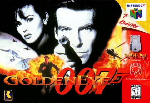 -Say what you will about how dated GoldenEye 007 is, but nobody can deny that this design still kicks ass, even in 2012. Puts the Wii version's box to shame, frankly. -- Hey, you ever coming back? You kidding? I am Queens Boulevard. ... Copied to Clipboard!
|
|
TheCodeisBosco 06/25/12 8:41:00 PM #6: |
#29: Out of This World
 -Out of This World is a favorite among arthouse gamers, and its boxart has received a good deal of acclaim as well. It's epic and very distinctive; if I was walking past it in a store, it'd catch my eye, that's for sure. -- Hey, you ever coming back? You kidding? I am Queens Boulevard. ... Copied to Clipboard!
|
|
Emporer_Kazbar 06/25/12 8:42:00 PM #7: |
From: TheCodeisBosco | #004
-Pictured: the second most badass Mr. West out there. *topic list* -- Will not remove this line of my signature until the Seahawks, Jazz or Rockies win a title (Started 5-16-09) SuperNiceDog: Guru winner ... Copied to Clipboard!
|
|
TheCodeisBosco 06/25/12 8:43:00 PM #8: |
#28: Grim Fandango
 -The boxart for Grim Fandango does a wonderful job evoking memories of the film noirs it was based on. The game's character designs are brilliant as well, so it'd be hard to make a box for this game that DIDN'T look appealing. -- Hey, you ever coming back? You kidding? I am Queens Boulevard. ... Copied to Clipboard!
|
|
Jeff Zero 06/25/12 8:44:00 PM #9: |
Dune 2's is f***ing beautiful. That one is in my top thirty. Out of this World's is sweet in a somewhat similar way.
-- K | H | A | Q | Q | A | H | K "we're about 50 years behind the rest of western society." -icon on B8 ... Copied to Clipboard!
|
|
Kenri 06/25/12 8:47:00 PM #10: |
-Say what you will about how dated GoldenEye 007 is, but nobody can deny that this design still kicks ass, even in 2012. Puts the Wii version's box to shame, frankly.
Until you start seeing Bond's hand as a continuation of his mouth. Then it becomes the worst. Tag. Hoping to see ICO's JPN/EU boxart on here! -- "The courtroom is the garden of holy judgment. Those with lechery in their hearts should leave this sanctuary at once!" ~Franziska von Karma ... Copied to Clipboard!
|
|
TheCodeisBosco 06/25/12 8:50:00 PM #11: |
#27: Uoozu
  -Have you ever played Feeding Frenzy, by PopCap? It was a very popular Xbox Arcade game for a while, and this is essentially a much earlier version of it. There are two differences, though: 1) it's much harder, and 2) for my money, it's actually more fun. It's known here in the States as "Fish Dude," and unfortunately, we got the short end of the stick as far as boxart goes:  The boxart for the original Uoozu, though? Maybe it's just me, but I really dig it. Japanese Game Boy boxarts can be downright strange at times, and this one is borderline avant-garde; while still being appealing, and representing the game well. I'd definitely consider buying that complete copy above, that's for sure! -- Hey, you ever coming back? You kidding? I am Queens Boulevard. ... Copied to Clipboard!
|
|
Jeff Zero 06/25/12 8:52:00 PM #12: |
Lmao, I don't know, Bosco, that octopus dude on the Western box art is pretty amazing.
-- K | H | A | Q | Q | A | H | K "we're about 50 years behind the rest of western society." -icon on B8 ... Copied to Clipboard!
|
|
TheCodeisBosco 06/25/12 8:54:00 PM #13: |
#26: Hatris JPN
 -Speaking of avant-garde, here's another weird-yet-brilliant Game Boy boxart, straight from the Land of the Rising Sun. Hatris is actually a great puzzler, and easily one of my favorite Tetris offshoots; and while its US boxart was bland, it got the cover it deserved in Japan. It also reminds me of one of my favorite movie posters: the Polish Short Circuit 2 one. 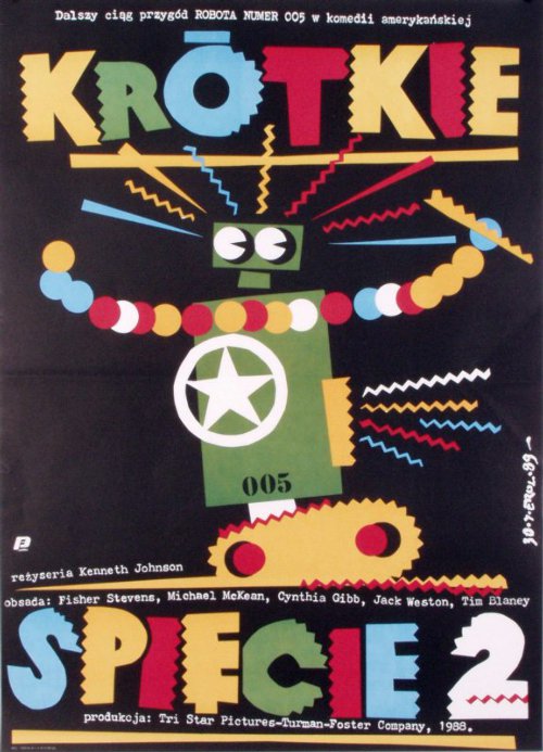 -- Hey, you ever coming back? You kidding? I am Queens Boulevard. ... Copied to Clipboard!
|
|
Jeff Zero 06/25/12 8:55:00 PM #14: |
It also reminds me of one of my favorite movie posters: the Polish Short Circuit 2 one.
xfd that thing rocks -- K | H | A | Q | Q | A | H | K "we're about 50 years behind the rest of western society." -icon on B8 ... Copied to Clipboard!
|
|
TheCodeisBosco 06/25/12 8:58:00 PM #15: |
Might post a couple more later, but for now, a late-night workout is sounding pretty good.
Sugisaki_Ken posted... Pushing it with the good boscopinions eh. I'm telling ya, I've been killin' it lately! Kenri posted... -Say what you will about how dated GoldenEye 007 is, but nobody can deny that this design still kicks ass, even in 2012. Puts the Wii version's box to shame, frankly. I don't see what you're talking about! Which, I suppose, I should be grateful for. >_> As for Ico? I have a feeling you're gonna be pretty happy about that. Jeff Zero posted... Lmao, I don't know, Bosco, that octopus dude on the Western box art is pretty amazing. Him and the fish are rockin' those hats, man! I think the Team Fortress 2 cast would be proud. -- Hey, you ever coming back? You kidding? I am Queens Boulevard. ... Copied to Clipboard!
|
|
WaIker 06/25/12 8:59:00 PM #16: |
burnout paradise better be on this!
-- Boomshine ~Justin_Crossing ... Copied to Clipboard!
|
|
TheCodeisBosco 06/25/12 9:00:00 PM #17: |
WaIker posted...
burnout paradise better be on this! I swear this is the last spoiler I'm gonna give, but... you're gonna be happy too, bro! -- Hey, you ever coming back? You kidding? I am Queens Boulevard. ... Copied to Clipboard!
|
|
WaIker 06/25/12 9:04:00 PM #18: |
aw jeah
-- Boomshine ~Justin_Crossing ... Copied to Clipboard!
|
|
MarvelousGerbil 06/25/12 9:05:00 PM #19: |
From: TheCodeisBosco | #005
#30: GoldenEye 007 -Say what you will about how dated GoldenEye 007 is, but nobody can deny that this design still kicks ass, even in 2012. Puts the Wii version's box to shame, frankly.  -- http://pixel.nymag.com/imgs/daily/vulture/2012/06/22/22_abed.o.jpeg/a_560x0.jpg ... Copied to Clipboard!
|
|
TheCodeisBosco 06/25/12 9:52:00 PM #20: |
#25: Donkey Kong '94
 -I know this is pretty much the quintessential Boscopinion, but... I don't care for DK '94 at all. The gameplay, to me, is awfully dated. But ever since I was a kid, I always liked its boxart a lot, and some things never change! The classic Mario art style is on full display here, and the picture is full of personality: Mario's hammering away at the barrels, DK Jr.'s taunting him, and DK himself seems almost happily unaware of it all. Even Pauline makes a rare appearance! -- Hey, you ever coming back? You kidding? I am Queens Boulevard. ... Copied to Clipboard!
|
|
TheCodeisBosco 06/25/12 9:56:00 PM #21: |
#24: Conker: Live and Reloaded
 -From the moment you see this box, it's clear that the game promises a great, raunchy time. The logo, in particular, is brilliant; the three fonts contrast in a really cool way. -- Hey, you ever coming back? You kidding? I am Queens Boulevard. ... Copied to Clipboard!
|
|
Natwaf_akidna 06/25/12 9:57:00 PM #22: |
*le gasp*
-- My Little Phineas and Ferb: Summer is Magic! Aww, I lost to SuperNiceDog, Winner of the Rivalry Rumble Guru Contest ... Copied to Clipboard!
|
|
TheCodeisBosco 06/25/12 9:59:00 PM #23: |
#23: ToeJam & Earl
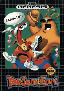 -This is possibly the most utterly 90s thing in existence. JAMMIN'! -- Hey, you ever coming back? You kidding? I am Queens Boulevard. ... Copied to Clipboard!
|
|
KommunistKoala 06/25/12 10:02:00 PM #24: |
Should do top 20 or so Kanye songs next tbqh
Out of this World is a pretty kickass boxart holy crap -- http://img.imgcake.com/KommunistKoala/koalajpgehsa.jpg http://img.imgcake.com/KKpngat.png ... Copied to Clipboard!
|
|
Jeff Zero 06/25/12 10:04:00 PM #25: |
Not really feelin' the love on anything you've posted since the beginning, but this is such a subjective thing that that doesn't surprise me.
-- K | H | A | Q | Q | A | H | K "we're about 50 years behind the rest of western society." -icon on B8 ... Copied to Clipboard!
|
|
TheCodeisBosco 06/25/12 10:05:00 PM #26: |
#22: Revenge of the 'Gator JPN
 -Revenge of the 'Gator was actually a pretty notable game back in the day. Along with The Castlevania Adventure, it was one of the first third-party GB titles to leave a real impression, and it was definitely one of the most visually impressive GB titles up to that point. Even today, it's a fun pinball title that's well worth seeking out. The US boxart was perfectly fine, but this is definitely another case of Japanese Game Boy covers kicking ass. The charm level is through the roof here, and there's a very impressive amount of detail. Just look at all them 'gators! Sterling Archer would have a heart attack if he saw this. -- Hey, you ever coming back? You kidding? I am Queens Boulevard. ... Copied to Clipboard!
|
|
WazzupGenius00 06/25/12 10:07:00 PM #27: |
honestly that Conker boxart is terrible
... Copied to Clipboard!
|
|
TheCodeisBosco 06/25/12 10:08:00 PM #28: |
#21: Psychonauts
 -Holy crap, Raz looks like a stone-cold badass here. This boxart is an excellent concept, brilliantly executed on every level. How in the bloody hell did this flop, I swear... -- Hey, you ever coming back? You kidding? I am Queens Boulevard. ... Copied to Clipboard!
|
|
TheCodeisBosco 06/25/12 10:13:00 PM #29: |
MarvelousGerbil posted...
From: TheCodeisBosco | #005 LMAO, that's awesome! Right in the childhood, I swear. I still like it just as much as before, though. Natwaf_akidna posted... *le gasp* What shocked you? :P Jeff Zero posted... Not really feelin' the love on anything you've posted since the beginning, but this is such a subjective thing that that doesn't surprise me. I got most of the weird stuff out of the way first! You won't be seeing too many Hatris-type boxes from here on out. KommunistKoala posted... Should do top 20 or so Kanye songs next tbqh I might actually do that. It'd be pretty tough to limit it to just 20, though! -- Hey, you ever coming back? You kidding? I am Queens Boulevard. ... Copied to Clipboard!
|
|
KommunistKoala 06/25/12 10:13:00 PM #30: |
Hell you can go as high as you want, I was just throwing out a random number. Rank them all if you want!
-- http://img.imgcake.com/KommunistKoala/koalajpgehsa.jpg http://img.imgcake.com/KKpngat.png ... Copied to Clipboard!
|
|
TheCodeisBosco 06/25/12 10:29:00 PM #31: |
KommunistKoala posted...
Hell you can go as high as you want, I was just throwing out a random number. Rank them all if you want! Once I get back from Florida... definitely expect to see a thread like this. It sounds like a great time. I'll have #20-#16 up soon too, but first, I'm gonna get the penultimate round of my TV Episode contest up and running. -- Hey, you ever coming back? You kidding? I am Queens Boulevard. ... Copied to Clipboard!
|
|
Jeff Zero 06/25/12 10:30:00 PM #32: |
Oh yeah, you're down here right now. Cool.
-- K | H | A | Q | Q | A | H | K "we're about 50 years behind the rest of western society." -icon on B8 ... Copied to Clipboard!
|
|
TheCodeisBosco 06/25/12 10:33:00 PM #33: |
Jeff Zero posted...
Oh yeah, you're down here right now. Cool. Not quite yet, actually! I'll be leaving Friday night, IIRC. As much as I love y'all... if I was in Florida, I wouldn't be posting so much here right now. :P -- Hey, you ever coming back? You kidding? I am Queens Boulevard. ... Copied to Clipboard!
|
|
Natwaf_akidna 06/25/12 10:43:00 PM #34: |
Donkey Kong '94 hate.
-- My Little Phineas and Ferb: Summer is Magic! Aww, I lost to SuperNiceDog, Winner of the Rivalry Rumble Guru Contest ... Copied to Clipboard!
|
|
TheCodeisBosco 06/25/12 10:43:00 PM #35: |
#20: Super Metroid
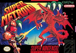 -Metroid has never looked so kickass. Don't get me wrong, the series generally has solid boxarts; I'm also quite fond of Metroid 2's, and even Metroid Prime Pinball's. But this is just... man, it's almost the pinnacle, as far as SNES covers go! Kraid's "cameo" is a great touch that I didn't notice for years. -- Hey, you ever coming back? You kidding? I am Queens Boulevard. ... Copied to Clipboard!
|
|
Jeff Zero 06/25/12 10:47:00 PM #36: |
Ah, alrighty-o, Bosco.
Super Metroid cover is pretty great. -- K | H | A | Q | Q | A | H | K "we're about 50 years behind the rest of western society." -icon on B8 ... Copied to Clipboard!
|
|
TheCodeisBosco 06/25/12 10:51:00 PM #37: |
#19: Boomer's Adventure in Asmik World JPN
 -I swear, this is the last time I'll be posting one of Japan's gonzo Game Boy covers. As you can see, though, I saved the best for last. It's hilarious, bizarre and utterly Japanese; and I've always been a sucker for claymation art. Boomer's Adventure was a success in Japan, but its success in the States was limited... gee, I wonder why? 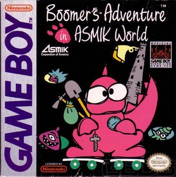 -- Hey, you ever coming back? You kidding? I am Queens Boulevard. ... Copied to Clipboard!
|
|
TheCodeisBosco 06/25/12 10:55:00 PM #38: |
#18: Dark Souls JPN (PS3 version)
 -About a year ago, I had a thread where I ranked boxarts that users nominated. This exquisite Dark Souls box was one of 'em, and the cover image has stuck with me ever since. It's very artful, and if I had a PS3 or 360, I'd definitely purchase it; this cover really piqued my interest. -- Hey, you ever coming back? You kidding? I am Queens Boulevard. ... Copied to Clipboard!
|
|
Jeff Zero 06/25/12 10:55:00 PM #39: |
Dark Souls cover is beautiful.
-- K | H | A | Q | Q | A | H | K "we're about 50 years behind the rest of western society." -icon on B8 ... Copied to Clipboard!
|
|
TheCodeisBosco 06/25/12 11:05:00 PM #40: |
#17: Mike Tyson's Punch-Out!!
 -This was one of the earliest first-party NES titles to break away from the Black Box design. While Punch-Out!!'s excellent sprites would have looked great on a Black Box cover, I'm glad they went this route instead. This sleek, mature boxart surely must have stuck out from the competition back then - just imagine seeing it on a store shelf next to:    -- Hey, you ever coming back? You kidding? I am Queens Boulevard. ... Copied to Clipboard!
|
|
TheCodeisBosco 06/25/12 11:13:00 PM #41: |
#16: Katamari Forever JPN
 -Namco really achieved a brilliant effect with their Katamari boxarts. Much like the Katamaris themselves, they've gotten bigger and more extravagant over time. This Katamari seems to consist of an entire city, and the art style and attention to detail are both top-notch. -- Hey, you ever coming back? You kidding? I am Queens Boulevard. ... Copied to Clipboard!
|
|
TheCodeisBosco 06/25/12 11:14:00 PM #42: |
Well, that's half the list! We're getting into the really great stuff now, so I'm looking forward to posting some more tomorrow.
-- Hey, you ever coming back? You kidding? I am Queens Boulevard. ... Copied to Clipboard!
|
|
Jeff Zero 06/25/12 11:15:00 PM #43: |
Katamari's is stellar.
-- K | H | A | Q | Q | A | H | K "we're about 50 years behind the rest of western society." -icon on B8 ... Copied to Clipboard!
|
|
WazzupGenius00 06/25/12 11:15:00 PM #44: |
Gauntlet actually looks decent, I think.
I wonder if the real-life picture for MTPO was an attempt to trick kids into thinking the graphics would look like that. ... Copied to Clipboard!
|
|
shadosneko 06/25/12 11:18:00 PM #45: |
From: TheCodeisBosco | #035
#20: Super Metroid -Metroid has never looked so kickass. Don't get me wrong, the series generally has solid boxarts; I'm also quite fond of Metroid 2's, and even Metroid Prime Pinball's. But this is just... man, it's almost the pinnacle, as far as SNES covers go! Kraid's "cameo" is a great touch that I didn't notice for years. One thing in particular that I just love about this one is how it's not even confined by the black bars of the box. It's just that badass. -- http://backloggery.com/shados http://last.fm/user/ShadosNeko VISUALSHOCK! SPEEDSHOCK! SOUNDSHOCK! NOW IS TIME TO THE 68000 HEART ON FIRE! ... Copied to Clipboard!
|
|
TheCodeisBosco 06/26/12 10:53:00 AM #46: |
WazzupGenius00 posted...
Gauntlet actually looks decent, I think. I actually think Gauntlet's is okay too, but Tyson's is clearly on a whole 'nother level. shadosneko posted... From: TheCodeisBosco | #035 I love it when boxarts do that. You can just tell the designers had a blast making 'em, y'know? -- Hey, you ever coming back? You kidding? I am Queens Boulevard. ... Copied to Clipboard!
|
|
TheCodeisBosco 06/26/12 10:59:00 AM #47: |
#15: Chrono Trigger
 -This is perhaps one of gaming's most iconic boxarts, and to me, it deserves all the praise it gets. The artwork is terrific, the snow-filled landscape gives it a very unique vibe, and I love the teamwork on display. That sword is blazin'! -- Hey, you ever coming back? You kidding? I am Queens Boulevard. ... Copied to Clipboard!
|
|
Mershaaay 06/26/12 11:03:00 AM #48: |
FFVII better be number 1!
-- SephirothG, channeling awesomeness from Mershiness. The Resurrection ... Copied to Clipboard!
|
|
TheCodeisBosco 06/26/12 11:03:00 AM #49: |
#14: Chulip JPN
 -This looks like something the Criterion Collection would come up with. It's one of gaming's most wistful, serene covers; talk about one hell of a sunset, huh? -- Hey, you ever coming back? You kidding? I am Queens Boulevard. ... Copied to Clipboard!
|
|
Jeff Zero 06/26/12 11:05:00 AM #50: |
That's rad. I dig these atmospheric overlook kinds of covers a lot.
-- K | H | A | Q | Q | A | H | K "we're about 50 years behind the rest of western society." -icon on B8 ... Copied to Clipboard!
|
| Topic List |
Page List:
1, 2 |