
-Jesus Christ, this is a powerful image. Somber, gritty, and flat-out badass. You know what's crazy, though? It's not even the best boxart in the series.
--
Hey, you ever coming back?
You kidding? I am Queens Boulevard.
| Topic List |
Page List:
1, 2 |
|---|---|
|
TheCodeisBosco 06/26/12 11:07:00 AM #51: |
#13: Metal Gear Solid 4
-Jesus Christ, this is a powerful image. Somber, gritty, and flat-out badass. You know what's crazy, though? It's not even the best boxart in the series. -- Hey, you ever coming back? You kidding? I am Queens Boulevard. ... Copied to Clipboard!
|
|
Jeff Zero 06/26/12 11:09:00 AM #52: |
MGS4's box art so good.
-- K | H | A | Q | Q | A | H | K "we're about 50 years behind the rest of western society." -icon on B8 ... Copied to Clipboard!
|
|
TheCodeisBosco 06/26/12 11:11:00 AM #53: |
#12: Mario & Luigi: Partners in Time
 -Compared to the other two M&L titles - and most Mario titles in general - Partners in Time was a much more serious story, told on a surprisingly epic scale. This boxart does a wonderful job capturing the scope of it. The artwork is packed with characters and details, and yet it doesn't seem messy in the slightest; the result is, for my money, the best cover in the entire Mario franchise. -- Hey, you ever coming back? You kidding? I am Queens Boulevard. ... Copied to Clipboard!
|
|
swordz9 06/26/12 11:15:00 AM #54: |
So many great mustaches.
-- http://myanimelist.net/animelist/swordz9 ... Copied to Clipboard!
|
|
TheCodeisBosco 06/26/12 11:17:00 AM #55: |
#11: The Last Story
 -A truly ravishing cover that looks even more Criterion-esque than Chulip did. Nintendo and Xseed made the very wise choice to keep the boxart the same in each territory; so whether you live in the States, Japan, Europe or Australia, you can have this terrific cover in your collection, without having to resort to importing. (Though we still have to wait about a month for the American release...) -- Hey, you ever coming back? You kidding? I am Queens Boulevard. ... Copied to Clipboard!
|
|
TheCodeisBosco 06/26/12 11:22:00 AM #56: |
Mershaaay posted...
FFVII better be number 1! FFVII's cover? Really, man? :P Jeff Zero posted... That's rad. I dig these atmospheric overlook kinds of covers a lot. Agreed! I really wish they were more common; or at least, came over stateside more often. In particular, that Japanese Dark Souls cover is light years ahead of the one we got. swordz9 posted... So many great mustaches. For real! Toadsworth is such a boss. -- Hey, you ever coming back? You kidding? I am Queens Boulevard. ... Copied to Clipboard!
|
|
Jeff Zero 06/26/12 11:23:00 AM #57: |
The Last Story's is great. I love how it mentions it as a Hironobu Sakaguchi game with music by Nobuo Uematsu. I feel like those two really earned that level of prestige.
FFVII's cover? Really, man? :P FFVII's cover is awesome, man. -- K | H | A | Q | Q | A | H | K "we're about 50 years behind the rest of western society." -icon on B8 ... Copied to Clipboard!
|
|
TheCodeisBosco 06/26/12 11:25:00 AM #58: |
Jeff Zero posted...
The Last Story's is great. I love how it mentions it as a Hironobu Sakaguchi game with music by Nobuo Uematsu. I feel like those two really earned that level of prestige. I do like FFVII's cover, and it's certainly iconic. But I don't know, it's just not particularly inspiring to me, y'know? I think my favorite FF cover would be the one for FFX. -- Hey, you ever coming back? You kidding? I am Queens Boulevard. ... Copied to Clipboard!
|
|
Jeff Zero 06/26/12 11:26:00 AM #59: |
That is a great choice. I think it's my favorite cover in the series, although VII's is my second favorite.
-- K | H | A | Q | Q | A | H | K "we're about 50 years behind the rest of western society." -icon on B8 ... Copied to Clipboard!
|
|
Mershaaay 06/26/12 11:29:00 AM #60: |
FFVII's cover is PERFECT
One man (and a giant sword) up against what seems like a colossal monster, but is actually a powerful corporation. Simply beautiful. -- SephirothG, channeling awesomeness from Mershiness. The Resurrection ... Copied to Clipboard!
|
|
Jeff Zero 06/26/12 11:30:00 AM #61: |
Hah, yeah, quite so.
-- K | H | A | Q | Q | A | H | K "we're about 50 years behind the rest of western society." -icon on B8 ... Copied to Clipboard!
|
|
TheCodeisBosco 06/26/12 11:34:00 AM #62: |
Time for the top ten! Aww yeah!
#10: Red Alarm JPN  -My jaw hit the floor when I saw this for the first time. Who knew that a Star Fox-esque rail shooter could inspire such a badass (yet surprisingly artistic) cover? Granted, us Americans certainly didn't get dicked over or anything:  But still, I don't know how the NoA guys could look at the original cover and think, "we need to make a new one." It's a perfect representation of the game, and stylish as all get out. -- Hey, you ever coming back? You kidding? I am Queens Boulevard. ... Copied to Clipboard!
|
|
TheCodeisBosco 06/26/12 11:39:00 AM #63: |
#9: Platoon
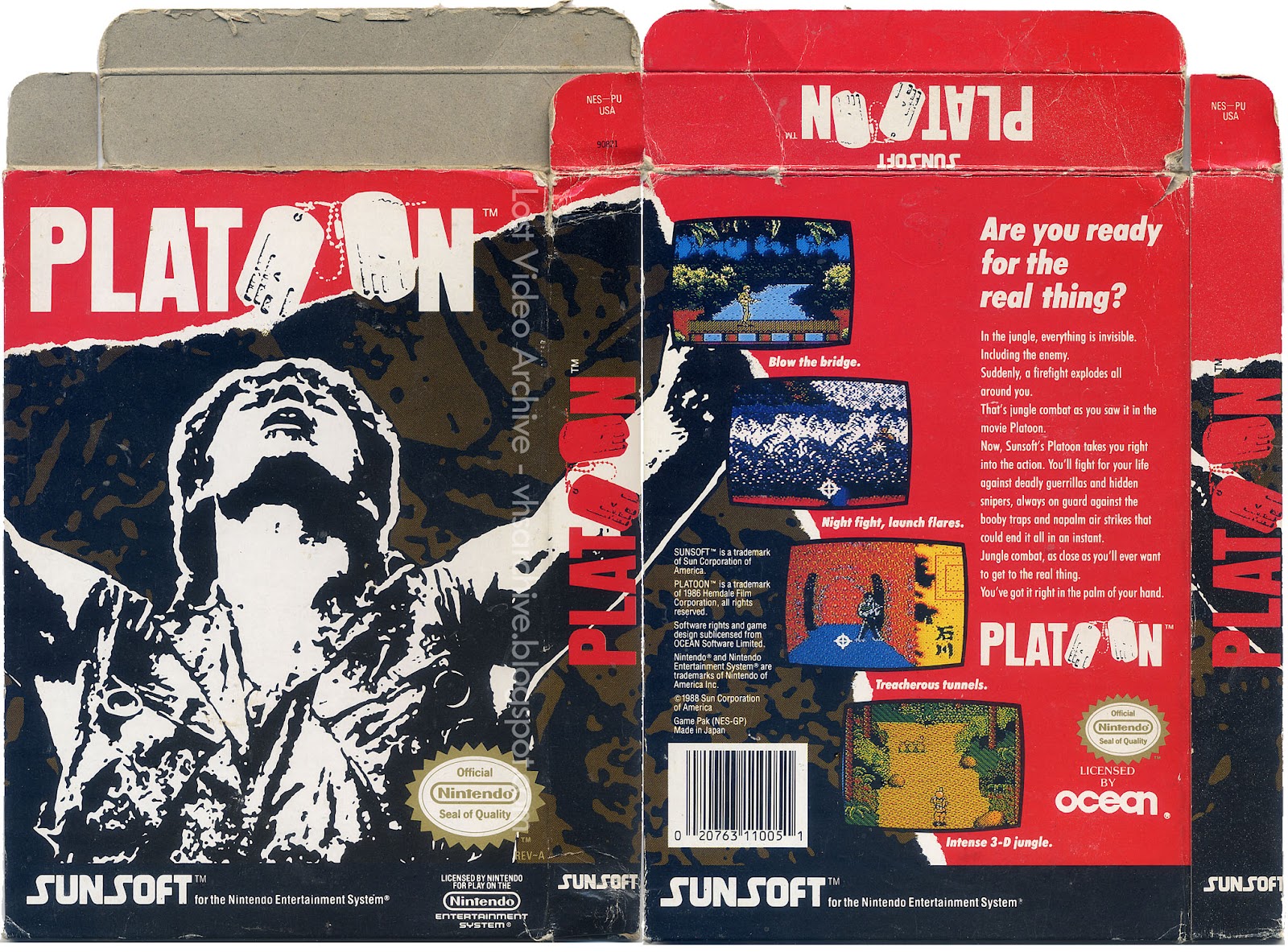 -Sunsoft took a huge risk with this. It didn't look like anything in the NES library - NES boxarts typically tried to look as inviting as possible. This, though, is the kind of box that'll put hair on your chest. The awesomeness of this cover couldn't even be merely contained on the front of the box; you have to see the entire thing - front and back - to fully appreciate it. -- Hey, you ever coming back? You kidding? I am Queens Boulevard. ... Copied to Clipboard!
|
|
TheCodeisBosco 06/26/12 11:43:00 AM #64: |
#8: Sonic the Hedgehog 2
 -Without question, this is one of my favorite "mainstream blockbuster" boxarts. It's pretty much perfect on every level, if you ask me: Sonic looks ready for action, Tails is right at the forefront, and the checkered background is a nice, understated detail. It's a distinctly "Sonic" take on the old Genesis Black Box design. But of course, the selling point is Robotnik clutching that massive "2." He looks like a f***ing beast! -- Hey, you ever coming back? You kidding? I am Queens Boulevard. ... Copied to Clipboard!
|
|
TheCodeisBosco 06/26/12 11:45:00 AM #65: |
#7: Pepsiman
 -DRINK! That is all. -- Hey, you ever coming back? You kidding? I am Queens Boulevard. ... Copied to Clipboard!
|
|
TheCodeisBosco 06/26/12 11:49:00 AM #66: |
#6: Borderlands
 -Possibly the most darkly comedic boxart to ever hit American shelves, Borderlands no doubt got a ton of impulse buys just from the cover alone. It couldn't possibly do a better job capturing the style and atmosphere of the game - and while Gearbox may never top it, they definitely followed it up in respectable fashion with the sequel.  -- Hey, you ever coming back? You kidding? I am Queens Boulevard. ... Copied to Clipboard!
|
|
TheCodeisBosco 06/26/12 11:51:00 AM #67: |
The top 5 will be coming up either later today, or early tomorrow! We're getting down to the wire!
Mershaaay posted... FFVII's cover is PERFECT I will agree that it's one of the best in the series, for sure. Probably one of the best for the PlayStation itself, as well. -- Hey, you ever coming back? You kidding? I am Queens Boulevard. ... Copied to Clipboard!
|
|
Mershaaay 06/26/12 11:57:00 AM #68: |
TheCodeisBosco posted...
#7: Pepsiman oh my god -- SephirothG, channeling awesomeness from Mershiness. The Resurrection ... Copied to Clipboard!
|
|
swordz9 06/26/12 12:06:00 PM #69: |
FFX definitely has the best box art. VIII, XIII and XIII-2 are all pretty close though and even FFV's is pretty great.
-- http://myanimelist.net/animelist/swordz9 ... Copied to Clipboard!
|
|
TheCodeisBosco 06/26/12 12:35:00 PM #70: |
Mershaaay posted...
TheCodeisBosco posted...#7: Pepsiman It's amazing, right? I'm craving Pepsi all of a sudden... -- Hey, you ever coming back? You kidding? I am Queens Boulevard. ... Copied to Clipboard!
|
|
TheCodeisBosco 06/26/12 7:00:00 PM #71: |
#5: Burnout Paradise
 -You just knew this was gonna be in the top five. Your typical racing game has a very generic, dull boxart; one that gets the job done, but just barely. With the Burnout Paradise cover, though, EA wouldn't settle for anything less than pure dopeness. It's sleek, relevant, and my pick for Boxart of the Generation™. -- Hey, you ever coming back? You kidding? I am Queens Boulevard. ... Copied to Clipboard!
|
|
TheCodeisBosco 06/26/12 7:17:00 PM #72: |
#4: Perfect Dark JPN
 -If the Rareware and N64 logos weren't so incongruent with the rest of the artwork, this box would be absolutely perfect. As it stands, it's still... really damn close to perfect. It has many traits that, frankly, you wouldn't normally expect from a Nintendo-published title: it's sophisticated, dark, and even a bit sultry. It's also proof that the good ol' Virtual Boy red/black combo can be very stylish if executed properly. -- Hey, you ever coming back? You kidding? I am Queens Boulevard. ... Copied to Clipboard!
|
|
TheCodeisBosco 06/26/12 7:24:00 PM #73: |
#3: Metal Gear Solid 2: Sons of Liberty
 -Badass as all get out, plain and simple. I've always liked the "melty" MGS artwork better than most, though, so your mileage may vary. -- Hey, you ever coming back? You kidding? I am Queens Boulevard. ... Copied to Clipboard!
|
|
TheCodeisBosco 06/26/12 7:32:00 PM #74: |
#2: Pikmin 2
 -When the first Pikmin title came out, the boxart and ad campaign placed heavy emphasis on the in-game visual style, which was considered quite advanced at the time. For whatever reason, though, Nintendo decided to go a wildly different route with Pikmin 2: it was nothing but claymation! Each region had its own brilliant claymation boxart; but for my money, the States had the best one. It's a truly inspiring scene, one that captures the essence of the Pikmin world in perfect fashion. Highlights include the lobster, who's clearly in quite a panic; the yellow Pikmin making its way back to land; and Louie, whose hilarious incompetence was also one of the brightest spots of the game itself. -- Hey, you ever coming back? You kidding? I am Queens Boulevard. ... Copied to Clipboard!
|
|
TheCodeisBosco 06/26/12 7:43:00 PM #75: |
You must be wondering, "How can a boxart top that Pikmin one?" Well, you're about to find out.
#1: ICO JPN/EU  -This isn't just one of the best boxarts in gaming history - it might also be one of the great 21st century works of art. It's exquisite, and completely captures my attention every time I see it; it evokes an incredible sense of wonder and isolation. In one of gaming's most dunderheaded moments, Sony felt that it wouldn't appeal to US customers, and switched the cover to this:  What a f***ing embarrassment. -- Hey, you ever coming back? You kidding? I am Queens Boulevard. ... Copied to Clipboard!
|
|
TheCodeisBosco 06/26/12 7:45:00 PM #76: |
Well, I guess that's it! Hopefully y'all enjoyed seeing these boxarts, and got a kick out of the stranger ones. As with the last thread, though, I'm curious: what did you think were the biggest snubs?
-- Hey, you ever coming back? You kidding? I am Queens Boulevard. ... Copied to Clipboard!
|
|
swordz9 06/26/12 7:45:00 PM #77: |
Some pretty great box arts. Lacking a couple of my personal favorites, but there were some great ones I never saw before like Pepsiman.
-- http://myanimelist.net/animelist/swordz9 ... Copied to Clipboard!
|
|
whatisurnameplz 06/26/12 8:02:00 PM #78: |
From: TheCodeisBosco | #075
In one of gaming's most dunderheaded moments, Sony felt that it wouldn't appeal to US customers, and switched the cover to this: What a f***ing embarrassment. Maybe they thought people would think that you played as stick figures walking around in a desert. -- The Hunger Games>Mockingjay>Catching Fire Majora's Mask won GotD. Deal with it. ... Copied to Clipboard!
|
|
TheCodeisBosco 06/26/12 8:26:00 PM #79: |
swordz9 posted...
Some pretty great box arts. Lacking a couple of my personal favorites, but there were some great ones I never saw before like Pepsiman. I always love introducing people to that Pepsiman boxart. It's just brilliant on every level. -- Hey, you ever coming back? You kidding? I am Queens Boulevard. ... Copied to Clipboard!
|
|
Kenri 06/26/12 8:33:00 PM #80: |
Wow, that Burnout Paradise boxart is pretty striking. Good choice.
ICO's my pick for best boxart ever as well, and its US boxart is definitely one of my picks for worst ever. Such trash. -- "The courtroom is the garden of holy judgment. Those with lechery in their hearts should leave this sanctuary at once!" ~Franziska von Karma ... Copied to Clipboard!
|
|
TheCodeisBosco 06/26/12 8:40:00 PM #81: |
Kenri posted...
Wow, that Burnout Paradise boxart is pretty striking. Good choice. The US one is probably in the bottom five ever. Hell, maybe the bottom three. It's just so awful, and horribly outdated to boot. -- Hey, you ever coming back? You kidding? I am Queens Boulevard. ... Copied to Clipboard!
|
|
RappinHobo9292 06/26/12 8:40:00 PM #82: |
Needs more Spider
 -- Will not change sig unless the Sens win the Stanley Cup. Started 2/19/07 http://paranatural.net/chapter-one/ - Read Paranatural ... Copied to Clipboard!
|
|
TheCodeisBosco 06/26/12 8:47:00 PM #83: |
RappinHobo9292 posted...
Needs more Spider Haha! That's so kitschy, and yet kind of badass. I dig it. -- Hey, you ever coming back? You kidding? I am Queens Boulevard. ... Copied to Clipboard!
|
|
Jeff Zero 06/26/12 8:52:00 PM #84: |
oh my gobrino
Ico's is so terrible for us -- K | H | A | Q | Q | A | H | K "we're about 50 years behind the rest of western society." -icon on B8 ... Copied to Clipboard!
|
|
TheCodeisBosco 06/26/12 9:40:00 PM #85: |
Jeff Zero posted...
oh my gobrino It combines everything bad about early 00s boxart, for real. You'd almost think it was supposed to be a parody. -- Hey, you ever coming back? You kidding? I am Queens Boulevard. ... Copied to Clipboard!
|
|
Natwaf_akidna 06/26/12 10:39:00 PM #86: |
Aww yeah Pepsiman cover love.
Eww Ico cover (US) -- My Little Phineas and Ferb: Summer is Magic! Aww, I lost to SuperNiceDog, Winner of the Rivalry Rumble Guru Contest ... Copied to Clipboard!
|
|
shadosneko 06/27/12 12:46:00 AM #87: |
no phalanx
-- http://backloggery.com/shados http://last.fm/user/ShadosNeko VISUALSHOCK! SPEEDSHOCK! SOUNDSHOCK! NOW IS TIME TO THE 68000 HEART ON FIRE! ... Copied to Clipboard!
|
|
LinkMarioSamus 06/27/12 2:45:00 AM #88: |
TheCodeisBosco posted...
Kenri posted...Wow, that Burnout Paradise boxart is pretty striking. Good choice. Just to ask, why do people hate the US cover art for Ico so much? I mean, it's definitely trash compared to the Japan/PAL cover for the game (which does a WAY better job conveying what the game is all about), but...did I just answer my own question? I beat Ico for the first time recently and am close to wrapping up SOTC for the first time. Both 10/10 games, no question. I didn't even have much of a problem with the major complaints that both games often receive (e.g. SOTC's horse controls didn't take any getting used to at all for me). ... Copied to Clipboard!
|
|
TheCodeisBosco 06/27/12 8:35:00 AM #89: |
shadosneko posted...
no phalanx Phalanx was actually on the short list (which had about 40-45 boxes on it). -- Hey, you ever coming back? You kidding? I am Queens Boulevard. ... Copied to Clipboard!
|
|
GenesisTwilight 06/27/12 1:08:00 PM #90: |
From: shadosneko | #087
no phalanx -- http://backloggery.com/genesistwilight/sig.gif http://mlkshk.com/r/3JLF.gif ... Copied to Clipboard!
|
| Topic List |
Page List:
1, 2 |