| Topic List | Page List: 1 |
|---|---|
| Topic | Jesse Ranks User-Nominated Cover Art - The Rankings |
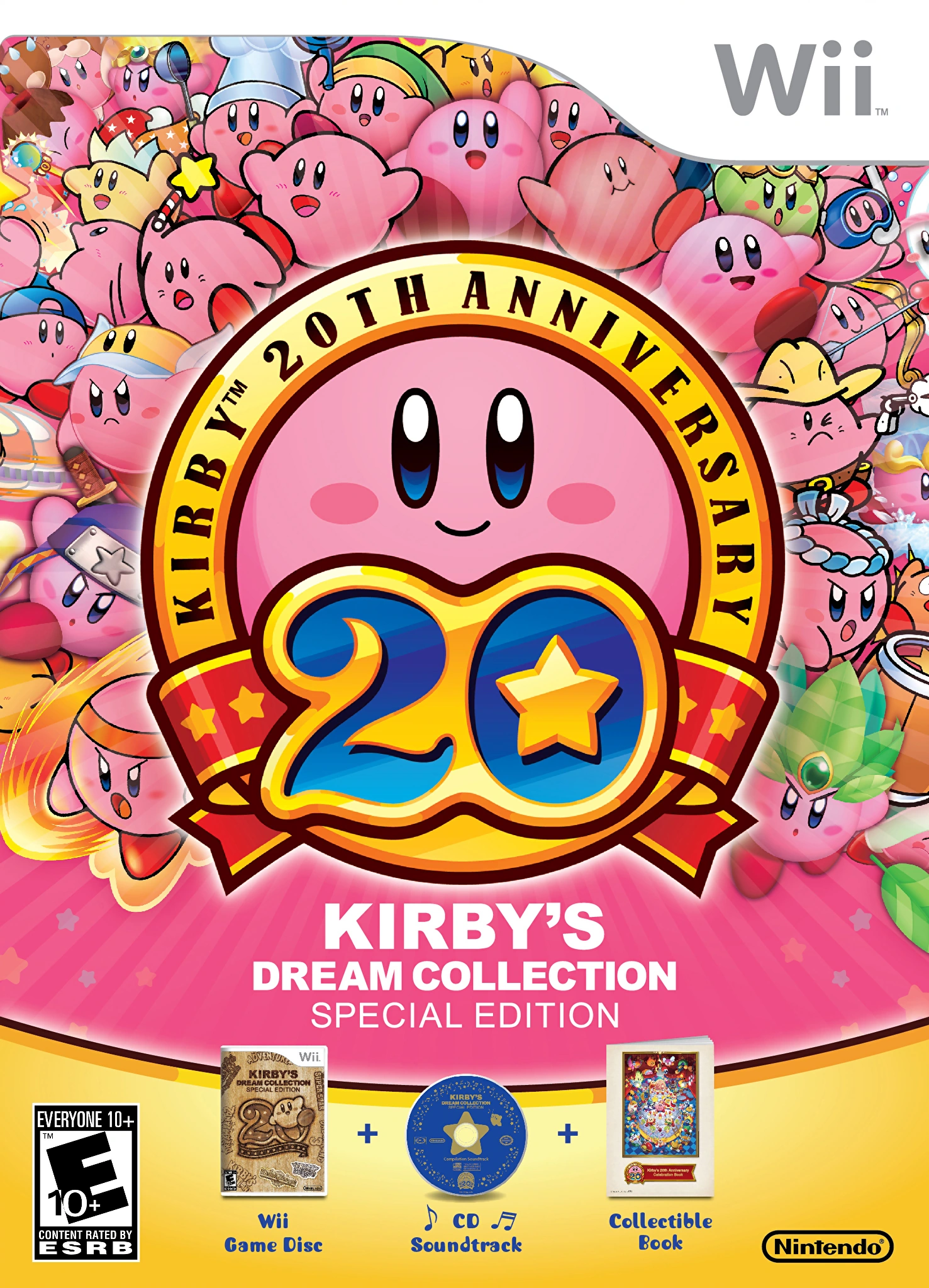
| Jesse_Custer 04/22/17 8:42:30 PM #111: | 38. Kirby's Dream Collection - Johnbobb http://vignette4.wikia.nocookie.net/kirby/images/3/38/KDCol_US_Box_art.png/revision/latest?cb=20120729134957&path-prefix=en Originality: 5.5 Aesthetic: 5.75 Story: 5 Personal: 5.25 Average: 5.375 That's a whole lot of dum pink balls. It's a nice presentation with an interesting way of showing Kirby’s adaptive nature with his many forms. Some of them are basically Kirby with a hat, but there's still a wide range of different Kirbys here that keep the image interesting. It's not something that would personally entice me to play the game, but it is eye-catching and it looks good. The problem for the Story factor is there's just so much you can convey by showing different forms of a character. This is almost like displaying Mario with a bunch of his different power-up forms all at once, which wouldn't tell you much beyond a game mechanic. But Kirby’s personality at least comes through here, simplistic though it may be, and that at least brings this to an average Story score. The artwork is simplistic and child-friendly like the covers for many Nintendo games, but I think it looks good. And there's some variation of color in there so it doesn't just look like someone spilled a bottle of Pepto Bismol as it easily could have. But obviously there's not a lot of complexity to the artwork and it's hardly a work of art to hang on the wall. ... Copied to Clipboard! |
| Topic List | Page List: 1 |