Current Events > What the fuck just happened to the game boards
| Topic List | |
|---|---|
|
parisdolphin 06/03/21 12:54:31 PM #51: |
TheGoldenEel posted...
SeriouslyMe neither ... Copied to Clipboard!
|
|
SothaSil 06/03/21 12:55:12 PM #52: |
Oh god what the hell!? Guess im never leaving CE again...thats fucking horrendous, unintuitive, and unorganized
--- Rebel ... Copied to Clipboard!
|
|
Strider102 06/03/21 12:56:16 PM #53: |
That feeling when you purposefully try to kill a site.
--- Last Cloudia ID: 188850453 ... Copied to Clipboard!
|
|
MachineJaipur 06/03/21 12:56:31 PM #54: |
Like I understand the logic behind the new topic list style but at least incorporate an alternating color scheme to make individual topics on the list stand out
LIke: 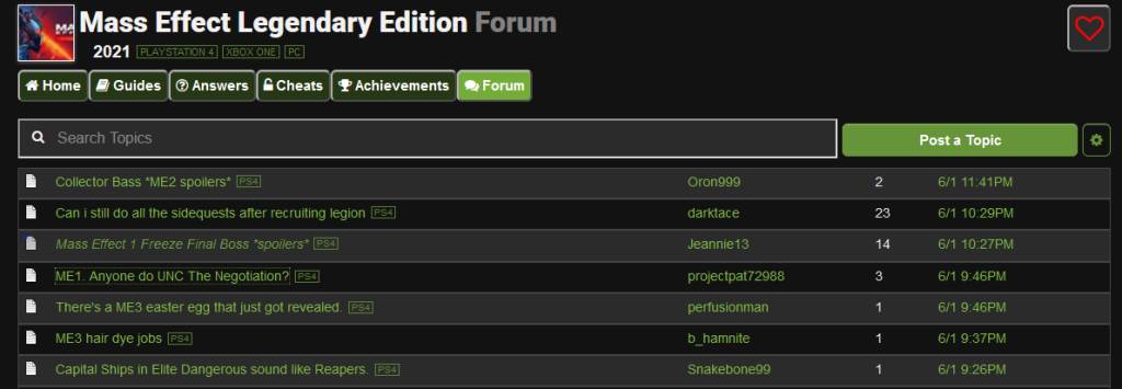 looks so much better than 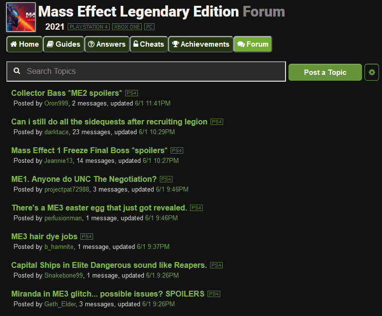 Because the second one is a vomit speal of green text with no differentiation ... Copied to Clipboard!
|
|
GodofLegend 06/03/21 12:57:16 PM #55: |
So... who's bright idea was this? Game boards are a full on mess right now.
--- The dream is dead..... ... Copied to Clipboard!
|
|
Redwarz 06/03/21 12:57:29 PM #56: |
they also buried the upcoming games list behind another menu.
--- Currently Playing: Nights of Azure, World of Warcraft, Senran Kagura Estival Versus ... Copied to Clipboard!
|
|
Purple_Cheetah 06/03/21 12:58:25 PM #57: |
I think the only thing I like about this change is you can now show all platforms on the topic list and filter.
That's the only thing I like. ... Copied to Clipboard!
|
|
LightHawKnight 06/03/21 12:58:29 PM #58: |
Classic still looks like ass. Whoever they hired to redesign this garbage should never be allowed to touch a website again.
--- The Official Odin of the Shin Megami Tensei IV board. "You know how confusing the whole good-evil concept is for me." ... Copied to Clipboard!
|
|
Sir Will 06/03/21 12:58:33 PM #59: |
So you can't choose what page to go to. And you have to scroll to the top to go back to a topic list track it, or even go to the last page. WTF?
--- River Song: Well, I was off to this gay gypsy bar mitzvah for the disabled when I thought 'Gosh, the Third Reich's a bit rubbish, I think i'll kill the Fuhrer' ... Copied to Clipboard!
|
|
orcus_snake 06/03/21 12:59:22 PM #60: |
its like they thought "hmm, everyhting looks perfectly fine...HOW ABOTU WE FUCK IT UP TO HELL AND BACK"
--- "Warwick are you jungling" "No I'm standing by the wolves because I miss my family" ... Copied to Clipboard!
|
|
dotsdfe 06/03/21 1:01:45 PM #61: |
It's horrible, jeez.
"Here's a new style with fewer options that just looks like an uglier version of the old one. Have fun!" --- Winner of the Third Hacked User Contest. World's #1 Phoenix Wright fan. ... Copied to Clipboard!
|
|
MachineJaipur 06/03/21 1:02:47 PM #62: |
LightHawKnight posted...
Classic still looks like ass. Whoever they hired to redesign this garbage should never be allowed to touch a website again.Pretty sure this was all Devin ... Copied to Clipboard!
|
|
MachineJaipur 06/03/21 1:03:51 PM #63: |
Sir Will posted...
So you can't choose what page to go to. And you have to scroll to the top to go back to a topic list track it, or even go to the last page. WTF?User friendly design? NOT SLEEK ENOUGH. MUST. MODERNIZE. https://www.youtube.com/watch?v=1acWg-c5Buo ... Copied to Clipboard!
|
|
Alpha218 06/03/21 1:05:47 PM #64: |
With classic style, I really just hate that you cant navigate back to the board from the bottom of the thread, and user highlighting is broken
--- I'm Commander Shepard, and this is my favorite user on the Citadel. https://discord.gg/Wgtz2y9 - Come join us for Among Us ||| https://bit.ly/39z7PHA - YouTube ... Copied to Clipboard!
|
|
apocalyptic_4 06/03/21 1:06:54 PM #65: |
Yea what the fuck was that I got lost trying to navigate back to CE.
--- XBL: Mrpicardbottoms PSN: Bosh369 ... Copied to Clipboard!
|
|
Garlands_Soul 06/03/21 1:07:12 PM #66: |
Christ I hope they change it back. This is how you kill the site for good
--- "I, Garland, will knock you all down!" ... Copied to Clipboard!
|
| #67 | Post #67 was unavailable or deleted. |
|
spikethedevil 06/03/21 1:07:59 PM #68: |
... Copied to Clipboard!
|
|
Hornezz 06/03/21 1:08:49 PM #69: |
Alpha218 posted...
With classic style, I really just hate that you cant navigate back to the board from the bottom of the thread, and user highlighting is brokenThere is a back button but it only shows up if the topic has more than 1 page. lol --- In dentibus anticis frustum magnum spinaciae habes. ... Copied to Clipboard!
|
|
Purple_Cheetah 06/03/21 1:09:11 PM #70: |
Where's that damn CJayC quote about never ripping the soul out of GameFAQs when you need it?
... Copied to Clipboard!
|
|
MachineJaipur 06/03/21 1:10:26 PM #71: |
Purple_Cheetah posted...
Where's that damn CJayC quote about never ripping the soul out of GameFAQs when you need it?  ... Copied to Clipboard!
|
|
CyricZ 06/03/21 1:11:12 PM #72: |
It feels like two separate board systems now lol.
Oh well. I've suffered every change up until now, what's one more? :-P --- CyricZ He/him ... Copied to Clipboard!
|
|
Lairen 06/03/21 1:11:20 PM #73: |
Can i mark the new layout as offensive?
--- When it rains, it pours. ... Copied to Clipboard!
|
|
Purple_Cheetah 06/03/21 1:13:01 PM #74: |
MachineJaipur posted...
Thank you. ... Copied to Clipboard!
|
|
Questionmarktarius 06/03/21 1:14:28 PM #75: |
Medussa posted...
display style classic helps a bitNo "names on left" tho. ... Copied to Clipboard!
|
|
BloodMoon7 06/03/21 1:14:36 PM #76: |
Everything looks fine here
--- My maid will hear about this. ... Copied to Clipboard!
|
|
deeewooh 06/03/21 1:14:55 PM #77: |
... Copied to Clipboard!
|
|
LightHawKnight 06/03/21 1:15:17 PM #78: |
MachineJaipur posted...
Pretty sure this was all Devin Well he should never ever be allowed to touch a website ever again. --- The Official Odin of the Shin Megami Tensei IV board. "You know how confusing the whole good-evil concept is for me." ... Copied to Clipboard!
|
|
Jagr_68 06/03/21 1:15:25 PM #79: |
Can we sticky this topic please?
FUCK this is horrendous --- New York Rangers [2004-2008] https://media.giphy.com/media/WvQHBYW0q4TuxdAg61/giphy.gif https://psnprofiles.com/Jaromiroquai68 ... Copied to Clipboard!
|
|
uwnim 06/03/21 1:17:46 PM #80: |
modern is absolute garbage and everything looks like the shitty comments sections shit like news sites and whatnot have.
--- I want a pet Lavos Spawn. [Order of the Cetaceans: Phocoena dioptrica] ... Copied to Clipboard!
|
|
Solid Sonic 06/03/21 1:19:02 PM #81: |
I guess the new interface is much worse on phones than it is computers. The logo says "Beta" but I don't really notice any difference on my GPD Win 3.
On my phone it was drastically different, though. --- It is more important to use your anonymity to upset other people than it is to do anything productive. ... Copied to Clipboard!
|
|
RyuForce 06/03/21 1:19:30 PM #82: |
This feels like a don't fix what's broke kind of thing. Seriously why is the default set up for desktop look like it's meant for phone? Hell Gamefaqs was fine on mobile so there was no need to make it more Mobile friendly. Least I can fix it to look more like this board but it's just so unnecessary and ineffective to have Column two on by default versus Column One. Hell I have a wide screen computer and understood the original design doesn't take up the entire page due to old computer monitors of the past. This new version taking less space by default is ridiculous.
Modern looks hideous and way to plain and boring. And those little boxes for tags and what console each topic is on needs a different design for both. Even having some shaded background to make them stick out more could fix that. The old highlighted look was great and catches the eye which is why I tag people in the first place to know what they generally do before I consider posting or to realize if I'm reading a troll post or not. Now that's going to be easy to overlook. Thanks, I guess? The only nice thing is the merge of the consoles with a way to see what version the person is talking about of the game. It's also looks alright when on Classic mode to navigate the topics but taking away page numbers to jump straight to was stupid as I like to see if a topic I once posted on gets lot more attention or not. Like if they just simply rearranged the buttons for the topics list it would been a decent change but it's all the small removals that really discourages viewing unless I'm already tracking the topic. Why do new site updates always seem designed to take features away rather then add onto what worked? --- "Well, doesn't this just beat all?" ~ Rei, Breath of Fire III PSN: GojiraRising ... Copied to Clipboard!
|
|
Rowdy54 06/03/21 1:19:52 PM #83: |
It broke Gameraven damn it
--- This is my signature. ... Copied to Clipboard!
|
|
Hornezz 06/03/21 1:20:33 PM #84: |
1 column/ classic style makes it more acceptable, but I'd still say it's a step back.
Breadcrumb navigation is so much better than large buttons with rounded borders. Those were modern maybe a decade ago. --- In dentibus anticis frustum magnum spinaciae habes. ... Copied to Clipboard!
|
| #85 | Post #85 was unavailable or deleted. |
|
spikethedevil 06/03/21 1:21:14 PM #86: |
Is this a monkeys paw for everyone wanting all the game boards to be one board for all systems?
--- A garbage pod!? It's a smegging garbage pod! ... Copied to Clipboard!
|
|
Squall28 06/03/21 1:21:25 PM #87: |
Looks horrible.
--- You can't go back and change the beginning, but you can start where you are and change the ending. -Misattributed to CS Lewis ... Copied to Clipboard!
|
|
Lairen 06/03/21 1:21:34 PM #88: |
Its vomit on my phone.
--- When it rains, it pours. ... Copied to Clipboard!
|
|
MachineJaipur 06/03/21 1:21:52 PM #89: |
RyuForce posted...
The Console Tag should be themed IE Blue for PS4/5, Green for Xbox, Red for Switch, Grey(?) for PC. Or even make it changeable via options ... Copied to Clipboard!
|
|
Questionmarktarius 06/03/21 1:21:53 PM #90: |
spikethedevil posted...
Is this a monkeys paw for everyone wanting all the game boards to be one board for all systems?yes ... Copied to Clipboard!
|
|
Solar_Crimson 06/03/21 1:21:56 PM #91: |
Garlands_Soul posted...
Christ I hope they change it back. This is how you kill the site for goodNope, it's more than likely permanent. And it will be coming to the rest of the site eventually as well. --- I often wonder if we are growing as a people... or in fact, regressing. ... Copied to Clipboard!
|
|
TwoDoorPC 06/03/21 1:22:22 PM #92: |
it'd be nice if there was just one site redesign that wasn't awful.
--- This post is brought to you by ExpressVPN ... Copied to Clipboard!
|
|
UnholyMudcrab 06/03/21 1:22:24 PM #93: |
Hey! Admin!
Leave them boards alone --- ... Copied to Clipboard!
|
|
FL81 06/03/21 1:23:21 PM #94: |
on the one hand at least we have embedded avatars now
on the other hand --- ... Copied to Clipboard!
|
|
Purple_Cheetah 06/03/21 1:24:33 PM #95: |
RyuForce posted...
Why do new site updates always seem designed to take features away rather then add onto what worked?As AOL put it when forcing everyone onto AIM 8.0 with less than 1/10th of the features of 7.5. "It's a lightweight high performance race car" I don't think I need to explain what happened in less than a year. Though that was probably coming regardless. ... Copied to Clipboard!
|
|
RyuForce 06/03/21 1:25:04 PM #96: |
MachineJaipur posted...
The Console Tag should be themed That would work a lot and be kinda cool. Alas it looks like that's not happening. Another thing to complain about. Why make the quote, edit, report, etc buttons on the bottom so hard to see and faded? --- "Well, doesn't this just beat all?" ~ Rei, Breath of Fire III PSN: GojiraRising ... Copied to Clipboard!
|
|
MacadamianNut3 06/03/21 1:25:06 PM #97: |
Why can't CS and related majors just leave shit that works the way it is
--- Roll Tide & Go Irish ... Copied to Clipboard!
|
|
spikethedevil 06/03/21 1:26:12 PM #98: |
... Copied to Clipboard!
|
|
ktownslayer16 06/03/21 1:26:18 PM #99: |
Medussa posted...
display style classic helps a bit as well as switching from two column to one. --- Fire Pierre Dorion ... Copied to Clipboard!
|
|
RyuForce 06/03/21 1:26:30 PM #100: |
Purple_Cheetah posted...
As AOL put it when forcing everyone onto AIM 8.0 with less than 1/10th of the features of 7.5. Hard to say. The problem is most other times they do this garbage, there's so little other options that jumping ship and making it clear the redesign is garbage rarely happens. --- "Well, doesn't this just beat all?" ~ Rei, Breath of Fire III PSN: GojiraRising ... Copied to Clipboard!
|
| Topic List |