From: Menji76 | #064
none of those captures should ever be used in a match pic.

Best of Rounds 5-6
The nominees:
Really not sure about any of these. This is my favorite, so it gets the award:
Could have been better, though! I feel like we really burnt out by the end. Nobody really cared about this contest by this point!
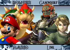
Runner up:
Worst of Rounds 5-6
The nominees:
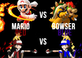
We cared so little that not many were even bad! The winner is, without a doubt in my mind:
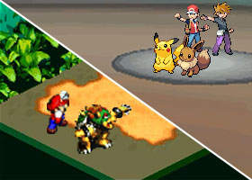
It REALLY pissed me off. Here's my writeup!
I, uh... I applaud the originality, I guess, but I also SPIT at the person who thinks they can get away with using that as Blue art. Couldn't be bothered to replace Pikachu with Eevee, huh? "A selective color layer will do!" I HATE this pic, not only for the audacity to use some Red art that wasn't that good in the first place TWICE, but to think that a character that has been portrayed as GARY OAK in every other match (AND in the game itself, god damn) could get a pic like THAT and consider it acceptable.
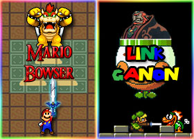
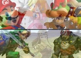
It's not artsy. It's not a good idea. It doesn't look that cool. AND the names are dull and blendy. How about you use a brighter color? Mario/Bowser is alright but they look pre-rendered. I'm thinking this person didn't even know how to use a goddamn render. You know what happens when you drag a PNG layer with transparency right into Photoshop without saving it? It gets a black background. This black background screams to me "look I didn't know what I was doing! I got two cool renders off of PlanetRenders but they had black backgrounds lol LET'S MAKE IT ALL BLACK." Also they're not even facing each other and Bowser is holding some weird white blob for some reason.
Overall: -5/10, I really hate this one. It hits all my sore spots and I hope not to see anything like it again.
Best New Picsmith: Surskit
Is he even new? Whatever! He gets the award. I like him.
Runner up: tyder21
--
~Zen