Board 8 > Snake Ranks User-Nominated Covers *THE RANKINGS*
| Topic List | |
|---|---|
|
Snake5555555555 02/21/18 12:17:31 PM #80: |
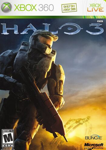
72. Halo 3
Nominated by: Dragon66116 (2/5 remaining) https://vignette.wikia.nocookie.net/halo/images/e/e5/Halo3coverart.JPG/revision/latest/scale-to-width-down/350?cb=20131024014002 I still have pretty fond memories of this classic cover. I've always enjoyed the beautiful shining orange color of the bottom half and the way it ever so slightly shines off the Master Chief's armor. The space of the cover is used well, placing Master Chief to the left as he marches on to the next objective to the clear area of the right. This sort of "solo military guy" cover is cliche, but I think Halo 3 nails a different feeling from the rest of the pack. --- To seal this town to the abyss, the mark of Samael. http://tinyurl.com/zqwzc9a - https://i.imgur.com/ecJSilM.png - https://i.imgur.com/WrowyEj.gif ... Copied to Clipboard!
|
|
Snake5555555555 02/21/18 12:29:43 PM #81: |
71. The Three Body Problem
Nominated by: Nfun (0/3 remaining)  This cover feels like it's trying way too hard to be interesting and unique and has way too much going on in the background. I have no clue what that thing in the background is supposed to be but it looks generically alien and futuristic. The same sort of bland alien pyramid sits comfortably below. However, despite these less than stellar objects, I actually think it's composed really nicely, with the tip of the pyramid perfectly aligning with the center of the circular object above. The use of concentric circles too is very eye appealing. Too bad it was squandered with objects that don't really have the same sort of eye catching draw. --- To seal this town to the abyss, the mark of Samael. http://tinyurl.com/zqwzc9a - https://i.imgur.com/ecJSilM.png - https://i.imgur.com/WrowyEj.gif ... Copied to Clipboard!
|
|
Snake5555555555 02/21/18 5:49:58 PM #82: |
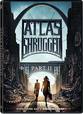
70. Atlas Shrugged 2
Nominated by: Behindthecurve (0/5 remaining) https://images-na.ssl-images-amazon.com/images/I/91MzYQQt7IL._SY445_.jpg Of all the Atlas Shrugged posters and covers, this is the one that would intrigue me the most. The gears on either side of the main characters appear to be melting off the sides of buildings which is an interesting visual to me personally, and suggest a world on the brink of falling apart as the gears running everything crumble. The way the title of Atlas Shrugged is hung up on bridge wires is also pretty neat. Once again though, the characters on this poster are rather unremarkable. --- To seal this town to the abyss, the mark of Samael. http://tinyurl.com/zqwzc9a - https://i.imgur.com/ecJSilM.png - https://i.imgur.com/WrowyEj.gif ... Copied to Clipboard!
|
|
Snake5555555555 02/21/18 5:56:09 PM #83: |
69. Arm of the Sphinx
Nominated by: Gatarix (4/6 remaining)  This is a very striking and immediately noticeable cover, with a stark blue mechanical arm rising out of the sands below, suggesting deep rooted mystery and a threat ages in the making. Even the way the buildings are stack suggest a reality that feels more dystopian than our own, whilst maintaining identifiable elements like castle ramparts. It's very cool and eye-catching. --- To seal this town to the abyss, the mark of Samael. http://tinyurl.com/zqwzc9a - https://i.imgur.com/ecJSilM.png - https://i.imgur.com/WrowyEj.gif ... Copied to Clipboard!
|
|
Anagram 02/21/18 6:04:29 PM #84: |
I like how the author's name increases in size as you read left to right.
--- Not changing this sig until I decide to change this sig. Started: July 6, 2005 ... Copied to Clipboard!
|
|
Simoun 02/22/18 1:18:05 AM #85: |
Whoa didn't notice that. Pretty cool
--- It's not so cliche anymore when it's happening to you. ... Copied to Clipboard!
|
|
Mega Mana 02/22/18 2:59:21 AM #86: |
Anagram posted...
I like how the author's name increases in size as you read left to right. The title does the opposite as well so there's an interesting balance to both. --- "In my headcanon, some staffer saw Trump pull out his phone and start typing so they just Terry Tate Office Linebacker'd him out of his shoes." - FFD ... Copied to Clipboard!
|
|
Snake5555555555 02/22/18 12:38:01 PM #87: |
68. Rayguns and Rocketships
Nominated by: Simoun (5/6 remaining) https://cf.geekdo-images.com/images/pic2232689.jpg Rayguns and Rocketships is a cover that revels in classic, pulp B-movie sci-fi imagery from the golden age of the 50s. It's a menagerie of pop culture that draws from many sources, The Rocketeer, Forbidden Planet, Star Trek, Buck Rogers, probably even more. I really like the old, tattered look of the cover to give it even more of that retro feel. The action is high and chaotic, and looks like a really fun time which is a plus. Despite all the sources it draws from, it comes together cohesively in a really well-executed way. --- To seal this town to the abyss, the mark of Samael. http://tinyurl.com/zqwzc9a - https://i.imgur.com/ecJSilM.png - https://i.imgur.com/WrowyEj.gif ... Copied to Clipboard!
|
|
Snake5555555555 02/22/18 12:47:28 PM #88: |
67. Victoriana
Nominated by: Simoun (4/6 remaining) https://cf.geekdo-images.com/images/pic2597432.jpg This artwork is very interesting and weird to look at at first, it feels very stiff, and doesn't attempt to stand out with bright colors. It stands on its own with great character design that invokes era appropriate clothing with a slight fantastical bend. The addition of the Invisible Man really swerves it towards the fantasy though, and nearly feels out of place here, but it's the Invisible Man so it's still cool. Elsewhere, I enjoy the sort of looking-glass frame the characters are placed in as well as the gears that populate the outer ring of the cover, which feels like it invokes steampunk. --- To seal this town to the abyss, the mark of Samael. http://tinyurl.com/zqwzc9a - https://i.imgur.com/ecJSilM.png - https://i.imgur.com/WrowyEj.gif ... Copied to Clipboard!
|
|
Johnbobb 02/22/18 12:56:52 PM #89: |
Isn't that woman Mina from Dracula? Invisible Man fit right in for me because these all look like classic literature characters
I could be wrong though because I've never heard of that game before --- Khal Kirby, warlord of the Super Star Khalasar PSN/Steam: CheddarBBQ https://goo.gl/Diw2hs ... Copied to Clipboard!
|
|
Snake5555555555 02/22/18 1:10:32 PM #90: |
Oh I think you're right actually, I feel dumb for not making connections to more literary characters now. The guy in front is Sherlock Holmes I think too.
--- To seal this town to the abyss, the mark of Samael. http://tinyurl.com/zqwzc9a - https://i.imgur.com/ecJSilM.png - https://i.imgur.com/WrowyEj.gif ... Copied to Clipboard!
|
|
Anagram 02/22/18 1:37:16 PM #91: |
Who's the guy in back, then?
--- Not changing this sig until I decide to change this sig. Started: July 6, 2005 ... Copied to Clipboard!
|
|
Simoun 02/23/18 12:54:53 AM #92: |
Oof, 2 out right away.
Yeah I hav no idea who that guy is either Probably what sells Rayguns and Rocketships for me is that laser cutlass. Its just so out of place that it tips the balance between plausible scifi to errolflynn scifi --- It's not so cliche anymore when it's happening to you. ... Copied to Clipboard!
|
|
Snake5555555555 02/23/18 1:01:00 PM #93: |
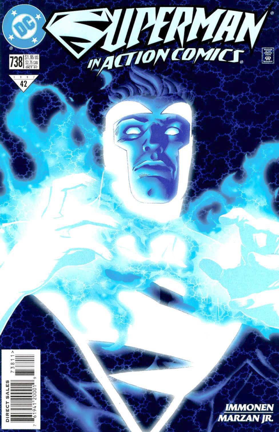
66. Action Comics #738
Nominated by: scarletspeed7 (5/6 remaining) https://vignette.wikia.nocookie.net/marvel_dc/images/6/66/Action_Comics_Vol_1_738.jpg/revision/latest?cb=20140111201550 From the infamous Superman Red/Superman Blue era, Action Comics #738 is a striking cover with bold colors and an intriguing concept. I really like how the outline of Superman's body is transposed over the bolts of lightning, it's a really neat look, and makes the brightness of Superman's new powers look even more incredible. The expression on Superman's face, a mixture of bold bravery and confidence really puts the appropriate cap on the whole portrait. --- To seal this town to the abyss, the mark of Samael. http://tinyurl.com/zqwzc9a - https://i.imgur.com/ecJSilM.png - https://i.imgur.com/WrowyEj.gif ... Copied to Clipboard!
|
|
scarletspeed7 02/23/18 1:09:35 PM #94: |
I always thought the design of Superman Blue (in the right hands) was just very striking.
--- "Reading would be your friend." ~Dave Meltzer ... Copied to Clipboard!
|
|
Snake5555555555 02/23/18 2:02:57 PM #95: |
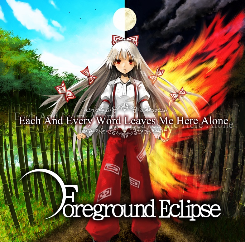
65. Foreground Eclipse - Each And Every Word Leaves Me Here Alone
Nominated by: Shonen_Bat (5/6 remaining) http://www.fg-eclipse.net/image/material/each_jacket.jpg I enjoy covers that show a dichotomy or inner conflict in a character. This one is pretty obvious and on the nose but is still an enjoyable concept. Left shows peace and beauty, right shows chaos and destruction, pretty cut and dry. The artstyle is also very different, there's a sharp realism to the bamboo stalks especially. I think it would've been interesting to have angel wings on the left to contrast with the fire wings on the right for improved symmetry, but then again, one-winged angel is a real concept. I will also say the character design isn't particularly outstanding. --- To seal this town to the abyss, the mark of Samael. http://tinyurl.com/zqwzc9a - https://i.imgur.com/ecJSilM.png - https://i.imgur.com/WrowyEj.gif ... Copied to Clipboard!
|
|
Johnbobb 02/23/18 3:32:06 PM #96: |
I really dig that one
I mean yeah the light/dark balance isn't really new or shocking but the whole thing feels really crisp somehow --- Khal Kirby, warlord of the Super Star Khalasar PSN/Steam: CheddarBBQ https://goo.gl/Diw2hs ... Copied to Clipboard!
|
|
Snake5555555555 02/23/18 10:09:24 PM #97: |
64. Pizza Connection 2
Nominated by: JONALEON1 (0/6 remaining) https://pbs.twimg.com/media/CdorFAMUAAAcwSo.jpg Look at this rich glutton, a perfect encapsulation of greed and excess, literally eating money right in front of everyone, in between puffs of his Cuban cigar, barely paying us a glance as he can't take his eyes of this magnificently loaded pizza slice. This is the kind of guy who listens to Huey Lewis and the News whilst donning a raincoat. In all seriousness, this cover is a little dumb, but in the best way possible. The concept of this absolutely cracks me up and it's admittedly kind of fun to read into this more than what is probably saying. --- To seal this town to the abyss, the mark of Samael. http://tinyurl.com/zqwzc9a - https://i.imgur.com/ecJSilM.png - https://i.imgur.com/WrowyEj.gif ... Copied to Clipboard!
|
|
NFUN 02/23/18 10:15:50 PM #98: |
Snake5555555555 posted...
64. Pizza Connection 2 Thank you for this, JONA --- Thus is our treaty written, thus is our agreement made. Thought is the arrow of time; memory never fades. What was asked is given; the price is paid. ARF ... Copied to Clipboard!
|
|
Drakeryn 02/24/18 1:41:36 AM #99: |
NFUN posted...
Snake5555555555 posted...64. Pizza Connection 2 --- another place and time, without a great divide, and we could be flying deadly high ... Copied to Clipboard!
|
|
trdl23 02/24/18 1:51:54 AM #100: |
NFUN posted...
Snake5555555555 posted...64. Pizza Connection 2 --- E come vivo? Vivo! ... Copied to Clipboard!
|
|
Snake5555555555 02/24/18 12:07:25 PM #101: |
63. Pac-Man Game
Nominated by: Raetsal_Lupin (1/4 remaining)  I really love this cover because of how it portrays Pac-Man in completely different light than the games where he originates from, with one key different especially. These ghosts aren't blue. Pac-Man is straight up giving no fucks, downing these ghosts like he's at a Nathan's Hot Dog Eating Contest. Those puny pellets are no longer enough to satiate this huge yellow monster and Pac is tired of waiting for Power Pellets to be able to eat those see-through chumps. I find myself rooting for those poor, scared ghosts hiding behind the Pac-Man logo, watching in horror as their friends become Pac-Man's next meal. Be afraid. Be very afraid. --- To seal this town to the abyss, the mark of Samael. http://tinyurl.com/zqwzc9a - https://i.imgur.com/ecJSilM.png - https://i.imgur.com/WrowyEj.gif ... Copied to Clipboard!
|
|
Anagram 02/24/18 12:09:25 PM #102: |
I notice there are eight ghosts on this cover instead of four.
Also, some of the ghosts are hiding behind the logo, which only raises further questions. --- Not changing this sig until I decide to change this sig. Started: July 6, 2005 ... Copied to Clipboard!
|
|
Snake5555555555 02/24/18 12:13:25 PM #103: |
I've got no problem with that, according to the very deep Pac-Man lore there's at least 7 members of the Ghost Gang plus a lot of other ghosts that pop up in the series.
--- To seal this town to the abyss, the mark of Samael. http://tinyurl.com/zqwzc9a - https://i.imgur.com/ecJSilM.png - https://i.imgur.com/WrowyEj.gif ... Copied to Clipboard!
|
|
Snake5555555555 02/24/18 12:30:42 PM #104: |
62. Oathbringer
Nominated by: Murphiroth (2/5 remaining)  The artwork on this cover is great, I especially enjoy the melty goo that appears to be emanating from the lady's hand. The character designs are definitely high-fantasy inspired, and the towering Goliath looming over the scene carries a Lovecraftian presence in its look. The lady couldn't look less concerned though, as she skips deftly down the floating glass stairs. Oathbringer has a cover that more accurately captivates the imagination, feeling like an aftermath or in-media-res version of events that have already transpired and it feels very unique in that regard. --- To seal this town to the abyss, the mark of Samael. http://tinyurl.com/zqwzc9a - https://i.imgur.com/ecJSilM.png - https://i.imgur.com/WrowyEj.gif ... Copied to Clipboard!
|
|
scarletspeed7 02/24/18 12:36:21 PM #105: |
I'm curious what that cover looks like with the wording.
--- "Reading would be your friend." ~Dave Meltzer ... Copied to Clipboard!
|
|
Snake5555555555 02/24/18 1:16:48 PM #106: |
I just looked it up, this is actually the true cover and the full picture is a wrap-around.
https://i2.wp.com/www.tor.com/wp-content/uploads/2017/03/oathbringer_cover-final.jpg?fit=640%2C973&type=vertical&ssl=1 --- To seal this town to the abyss, the mark of Samael. http://tinyurl.com/zqwzc9a - https://i.imgur.com/ecJSilM.png - https://i.imgur.com/WrowyEj.gif ... Copied to Clipboard!
|
|
Anagram 02/24/18 1:18:24 PM #107: |
Do you feel betrayed now?
--- Not changing this sig until I decide to change this sig. Started: July 6, 2005 ... Copied to Clipboard!
|
|
Snake5555555555 02/24/18 1:26:53 PM #108: |
That cover alone would've ranked lower but I said wrap arounds were fine so it's cool.
--- To seal this town to the abyss, the mark of Samael. http://tinyurl.com/zqwzc9a - https://i.imgur.com/ecJSilM.png - https://i.imgur.com/WrowyEj.gif ... Copied to Clipboard!
|
|
Anagram 02/24/18 2:47:01 PM #109: |
Well okay then.
--- Not changing this sig until I decide to change this sig. Started: July 6, 2005 ... Copied to Clipboard!
|
|
scarletspeed7 02/24/18 2:47:20 PM #110: |
Snake5555555555 posted...
That cover alone would've ranked lower but I said wrap arounds were fine so it's cool. I wanted a feud. --- "Reading would be your friend." ~Dave Meltzer ... Copied to Clipboard!
|
|
Snake5555555555 02/25/18 12:05:40 PM #111: |
61. Persona 4
Nominated by: Pirateking2000 (2/6 remaining) https://imgur.com/a/afxMN The artwork on this cover is super-strong and it helps carry it a lot for me. The neat three-panel effect showcasing different scenes gives the cover a distinct comic book feel and the character designs are all very eye-appealing, with strongly inspired anime designs that are taken from pre-existing inspirations but also stand on their own two legs. The harsh, striking yellow line helps separate the panels into having stronger feelings attached to them, with the blue panels representing trust and loyalty whilst yellow depicts deceit and underhandedness. --- To seal this town to the abyss, the mark of Samael. http://tinyurl.com/zqwzc9a - https://i.imgur.com/ecJSilM.png - https://i.imgur.com/WrowyEj.gif ... Copied to Clipboard!
|
|
Snake5555555555 02/25/18 12:10:30 PM #112: |
60. Persona 5 Steelbook Edition
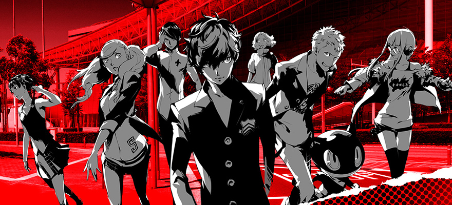
Nominated by: greengravy294 (0/1 remaining) http://segabits.com/wp-content/uploads/2016/10/persona-5-cover-def.jpg Persona 5 keeps the comic book feel from P4 alive and well, but uses it in a different manner here. Instead of panels, it's a splash page, showcasing a superhero-like team shot with incredible use of blood red and monochrome to make its characters stand-out. I think the character designs of P5 are all together stronger than P4 as well, with varied style choices giving each character more distinct personality. Lastly, I love the little rip effect at the bottom right hand corner, suggesting a sort of "to-be-continued" aspect. --- To seal this town to the abyss, the mark of Samael. http://tinyurl.com/zqwzc9a - https://i.imgur.com/ecJSilM.png - https://i.imgur.com/WrowyEj.gif ... Copied to Clipboard!
|
|
Snake5555555555 02/26/18 11:47:55 AM #113: |
59. Whitechapel Gods
Gatarix (3/6 remaining)  As a cover that primarily focuses on one character design, Whitechapel Gods succeeds in given the viewer many interesting things to look at and examine. Key background elements clearly indicate setting, whilst the flames burning up behind the ribcage in conjuction with the gears suggest an industrial revolution steampunk theme with a supernatural bend. The man looks sinister, a devilish figure, with a spider companion on the shoulder suggesting power and entrapment. The whole picture combines photo-realism with the fantastical and I think it all comes together extremely well. --- To seal this town to the abyss, the mark of Samael. http://tinyurl.com/zqwzc9a - https://i.imgur.com/ecJSilM.png - https://i.imgur.com/WrowyEj.gif ... Copied to Clipboard!
|
|
Snake5555555555 02/26/18 12:04:30 PM #114: |
58. Katamari Damacy
Nominated by: Zyxyz0 (4/6 remaining) https://wallscover.com/images/katamari-damacy-wallpaper-5.jpg This is such a joyfully weird cover, but Katamari Damacy is such a joyfully weird game. I like the mismatched and varied items that are rolled up into the ball, ranging from a cruise liner to an octopus to a baseball stadium. It's kinda fun to make out what you can see in there. The additions of a rainbow, scenic Mr. Fuji, and grazing cows only serve to make this look like a game that only cares about good times and being as out there as possible. --- To seal this town to the abyss, the mark of Samael. http://tinyurl.com/zqwzc9a - https://i.imgur.com/ecJSilM.png - https://i.imgur.com/WrowyEj.gif ... Copied to Clipboard!
|
|
scarletspeed7 02/26/18 12:06:40 PM #115: |
Snake5555555555 posted...
scenic Mr. Fuji, Yeah, the beautiful vistas of that classic 80s wrestling villain! But I agree, the Katamari cover is great. Perfectly encapsulates the game. --- "Reading would be your friend." ~Dave Meltzer ... Copied to Clipboard!
|
|
Snake5555555555 02/26/18 12:08:11 PM #116: |
Oh my god, that typo is hilarious XD
I'm just gonna leave that in. --- To seal this town to the abyss, the mark of Samael. http://tinyurl.com/zqwzc9a - https://i.imgur.com/ecJSilM.png - https://i.imgur.com/WrowyEj.gif ... Copied to Clipboard!
|
|
Johnbobb 02/26/18 1:13:36 PM #117: |
I almost nominated Katamari Damacy too
--- Khal Kirby, warlord of the Super Star Khalasar PSN/Steam: CheddarBBQ https://goo.gl/Diw2hs ... Copied to Clipboard!
|
|
scarletspeed7 02/26/18 1:28:03 PM #118: |
Johnbobb posted...
I almost nominated Katamari Damacy too Damn, a little organization and we could have nominated another Katamari game for a comparison. --- "Reading would be your friend." ~Dave Meltzer ... Copied to Clipboard!
|
|
Gatarix 02/26/18 2:10:28 PM #119: |
aww, Whitechapel Gods didn't make the top half
that one was my favorite and also my guess for your favorite --- You put your RESOLVE HAT back on, which conveniently is the same hat as your NORMAL HAT. {Drakeryn} ... Copied to Clipboard!
|
|
Simoun 02/26/18 2:55:19 PM #120: |
Final Destination (the first one)
--- It's not so cliche anymore when it's happening to you. ... Copied to Clipboard!
|
|
Snake5555555555 02/26/18 2:55:54 PM #121: |
Scarlet's topic is that way! ----->https://gamefaqs.gamespot.com/boards/8-gamefaqs-contests/76334713
--- To seal this town to the abyss, the mark of Samael. http://tinyurl.com/zqwzc9a - https://i.imgur.com/ecJSilM.png - https://i.imgur.com/WrowyEj.gif ... Copied to Clipboard!
|
|
scarletspeed7 02/26/18 2:58:42 PM #122: |
Lol.
You should just rate it for him anyways. --- "Reading would be your friend." ~Dave Meltzer ... Copied to Clipboard!
|
|
Snake5555555555 02/26/18 3:29:06 PM #123: |
Simoun posted...
Final Destination (the first one) Alright I'll do this one on the house https://tinyurl.com/yb8cxwj5 A bunch of derpy teenagers stare wistfully at nothing while a Party City skull decoration looms scarily in the back. The little bolt of lightning is cute, like, it's just a little thing to let you know he's there. --- To seal this town to the abyss, the mark of Samael. http://tinyurl.com/zqwzc9a - https://i.imgur.com/ecJSilM.png - https://i.imgur.com/WrowyEj.gif ... Copied to Clipboard!
|
|
scarletspeed7 02/26/18 3:31:20 PM #124: |
I feel like I've never seen that poster before but holy shit, that is the most unappealing face on the central character.
--- "Reading would be your friend." ~Dave Meltzer ... Copied to Clipboard!
|
|
Anagram 02/26/18 3:31:37 PM #125: |
That kid has the most early 2000s hair I've ever seen.
--- Not changing this sig until I decide to change this sig. Started: July 6, 2005 ... Copied to Clipboard!
|
|
Gatarix 02/26/18 3:33:28 PM #126: |
why are all the guys wearing bright red lipstick
also what scarlet said --- You put your RESOLVE HAT back on, which conveniently is the same hat as your NORMAL HAT. {Drakeryn} ... Copied to Clipboard!
|
|
Bane_Of_Despair 02/26/18 3:37:46 PM #127: |
honestly he's giving the fuck me face
--- Lord have mercy on my soul, I've had a good run but I can't run anymore. Just put me down BKSheikah got me good in Guru ... Copied to Clipboard!
|
|
Ringworm 02/26/18 4:19:41 PM #128: |
Anagram posted...
I notice there are eight ghosts on this cover instead of four. Bit late, I know, but there were only two ghosts in the game itself (a red one and a yellow one). Fairly sure I still have the board game stored somewhere at my mother's house (unless my older brother pawned it - it was his anyway), should check how much it goes for now... --- ~ Ringworm ~ Congrats to BKSheikah - Guru champion - Best Year in Gaming ... Copied to Clipboard!
|
|
Simoun 02/26/18 9:23:14 PM #129: |
Snake5555555555 posted...
Simoun posted...Final Destination (the first one) Holy shit I just noticed this today! Im such a derp hahahah. --- It's not so cliche anymore when it's happening to you. ... Copied to Clipboard!
|
| Topic List |